Interactive Website With Claude Fable 5: Image Reveal
The effect that stopped me on Pinterest was stupidly simple. A dark photo of a rock face. You scroll, and grass grows over the rock — except it doesn't grow, it's revealed, like the second image was hiding behind the first the whole time. No video. No 3D. Two flat images and a sleight of hand.
I screenshotted it, opened a terminal, and decided to rebuild the whole thing as an interactive website with Claude Fable 5 — the hero, the reveal, the animated text, all of it — without writing the CSS myself or touching a design tool. Forty minutes later I had a page that looked like a studio shipped it. Then I posted a screen recording of it to X, and the replies started asking the same question: "wait, how."
This is the how. Not the polished version where everything works first try — the real one, including the part where I triggered the reveal on the wrong event and broke it, and the resize decision that made the whole thing feel intentional instead of accidental. By the end you'll be able to build the same effect, prompt Fable so it doesn't smother your design in gradients, and turn the result into the kind of post people actually share.
Why I Build With Claude Fable 5 in the Terminal, Not the Browser
Here's the mistake I see constantly: people try to build interactive websites inside an in-browser AI chat, hit a wall the moment they want two images layered with pixel-precise positioning, and conclude "AI can't do real design." The tool was the problem, not the AI.
Fable 5 is genuinely capable of this. It launched on June 9, 2026 as Anthropic's most powerful publicly available model — a 1M-token context window by default, up to 128k output tokens per request, and 80.3% on SWE-Bench Pro, well ahead of GPT-5.5's 58.6% (per TrueFoundry's benchmark breakdown). That long-horizon reasoning is exactly what a multi-layer interactive page needs. It has to hold the whole DOM, the CSS, the scroll math, and the design intent in its head at once and keep them consistent across five sections.
But it needs a real workspace to do that. I run it through Claude Code in the terminal, pointed at an actual project folder, so it can read files, write files, see the full page it's building, and iterate on a running dev server. A browser chat hands you a snippet and forgets it existed. The terminal gives Fable a memory of the project — and on a 1M context window, that memory is the entire codebase, not a fading summary.
There's a cost reason to work this way too. Fable bills at $10 per million input tokens and $50 per million output — roughly double Opus 4.8, and the most expensive model Anthropic has priced for general use. Included access on paid plans has been a moving target: Anthropic bundled it into Pro, Max, and Team at launch, a mid-June export-control suspension briefly pulled the models offline, they came back around the start of July, and the free-on-plans window ran through July 12 before switching to metered usage credits at API rates — so check Anthropic's current pricing before you count on it. Either way, when every output token can cost money, you don't want to regenerate a whole page because the chat lost context. You want surgical edits to files that already exist. I went deep on that cost math in my Claude Fable AIOS build, and the lesson carries straight into design work: structure your project so Fable edits, not re-emits.
So: download Claude Code, make a folder, and let Fable work where it can actually think.
Stealing the Right Way: From Pinterest to a Dark-Mode Source Image
I don't start from a blank prompt. I start from a reference, because "build me a cool hero" gives you the statistical average of everything Fable has trained on, and average is forgettable.
Pinterest is my source. I search for the mechanic I want, not the topic — "scroll reveal landing page," "split image hover," "minimal dark hero" — and I save anything where the interaction does the talking. The rock-and-grass image was a single static pin. The interaction wasn't in the image at all. I was reverse-engineering it from a vibe.
Two things matter when you pull a reference:
Make it dark first. Most pins are bright. A website background needs to be dark mode — not because dark mode is trendy, but because dark backgrounds hide the seams. When you layer two images and reveal one over the other, a black background makes the transition read as intentional contrast instead of a visible edit boundary. I prompt Fable's image step (or a dedicated image model) to take the reference and produce a darker, higher-contrast version: "Convert this to a moody dark-mode scene, near-black background, retain the rock texture, lower the overall brightness by roughly 40%, no added grass."
Generate two images, not one. This is the whole trick, and it's worth slowing down for.
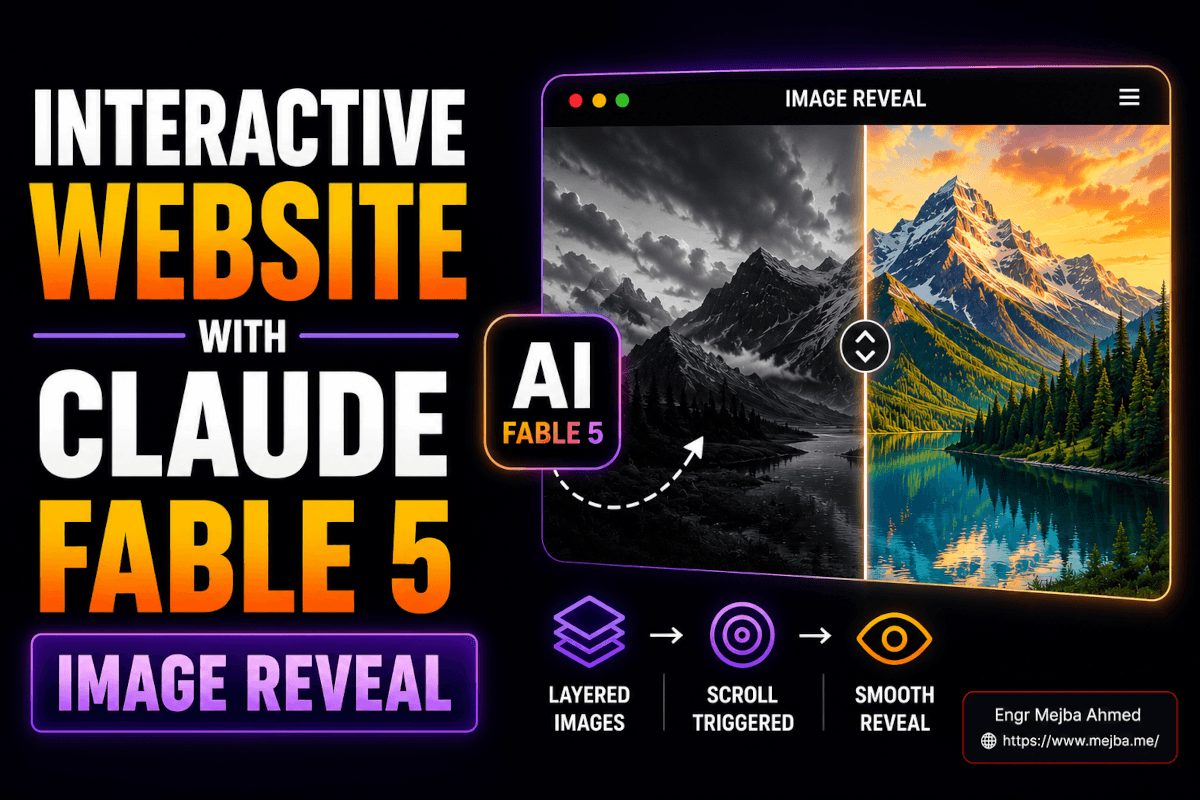
The Layered-Image Reveal: Two Pictures Pretending to Be One
The illusion is two images stacked dead-center, one on top of the other, with the top one progressively clipped away as you scroll. Underneath is the "after." On top is the "before."
For my build that meant:
- Base (top layer): the rock face, bare, dark.
- Reveal (bottom layer): the same rock, now with grass — same camera angle, same lighting, same crop.
The two images have to match perfectly except for the one thing that changes. That's where AI image generation earns its keep. I generated the bare rock first, then prompted: "Same scene, same angle and lighting, add lush grass growing across the rock surface, keep the dark background identical." Generating the variation from the original — rather than two independent images — is what keeps the edges aligned so the reveal doesn't jump.
Then the reveal itself. Most tutorials reach for GSAP ScrollTrigger, and that works, but for a single hero I let Fable do it with plain CSS clip-path driven by scroll — lighter, no library, and crisp edges. The technique: the top image starts fully visible, and as you scroll, a clip-path: inset(...) progressively hides it from one side, exposing the grass image underneath. Clips beat masks here because clip paths are vector and produce sharp edges while masks are heavier on memory and computation.
Here's the core of what Fable wrote, cleaned up:
.reveal-stack {
  position: relative;
  display: grid;
  place-items: center;
}

/* both images occupy the same grid cell, centered */
.reveal-stack img {
  grid-area: 1 / 1;
  width: 100%;
  height: auto;
}

/* the "before" image sits on top and gets clipped away on scroll */
.reveal-stack .top {
  z-index: 2;
  /* --p is updated from 0 to 1 as the section scrolls through view */
  clip-path: inset(0 0 calc(var(--p) * 100%) 0);
}
// drive --p from scroll position of the section
const stack = document.querySelector('.reveal-stack');
const onScroll = () => {
  const rect = stack.getBoundingClientRect();
  const progress = 1 - Math.min(Math.max(rect.bottom / window.innerHeight, 0), 1);
  stack.style.setProperty('--p', progress.toFixed(3));
};
window.addEventListener('scroll', onScroll, { passive: true });
onScroll();
The grass image is revealed from the bottom up as --p climbs from 0 to 1. Swap the inset direction and you reveal from a different edge. That's the entire mechanism. Everything else is decoration.
And here's the mistake I promised. My first version triggered the reveal on mouse hover, because that's what the original Pinterest pin implied. It felt cheap — you had to find the image and wave your cursor at it, and on mobile it did nothing at all. Switching to scroll changed the whole feeling. Now the reveal is part of the page's narrative: you scroll, the world changes, you keep scrolling. Scroll is a story you're already reading. Hover is a toy you have to discover. For visual storytelling, scroll wins every time — and it works on phones, where most of your traffic lives.
I lean on scroll-driven interaction constantly; I broke down the deeper version in my piece on building Apple-style 3D scroll animations with AI, and the same instinct applies here — tie the effect to the one input every visitor already uses.
One more move before we leave the reveal: I asked Fable to shrink both images by about 20%. At full bleed the effect was overwhelming and the seam was easier to notice. Pulled in 20%, framed by dark negative space, it suddenly looked composed — like a gallery piece instead of a screensaver. That single resize is the difference between "neat trick" and "this looks designed."
Building the Hero: How I Prompt Fable to Stop Adding Junk
Left to its own instincts, Fable will give you a "complete" hero: a looping video background, three feature cards, a gradient mesh, a testimonial, and a footer. All of it competes with your one good idea. The skill isn't getting AI to add — it's getting it to withhold.
My hero prompt is mostly a list of subtractions:
"Build a hero section. Pure black background, no gradients, no mesh, no video background. Keep only: a minimal top navbar and one line of large animated hero text. Remove any decorative sections, cards, or imagery you'd normally add. Animated text should react to scroll — drift downward and fade slightly as the user scrolls past. Preserve the font family, weight, and size you used; I want it consistent across every section we build next."
That last sentence does real work. The reason AI-built pages look disjointed is that each generated section reinvents the typography. By telling Fable up front to lock the font styles and sizes and carry them forward, every section that comes later inherits the same type system. Consistency is what reads as "a designer made this."
The scroll-reactive text is the second small dopamine hit on the page. The reveal handles the middle; the hero text handles the top. As you scroll, the headline drifts down and dims, handing the stage to the rock-and-grass effect below. Two scroll-linked moments, stacked, so the very first gesture a visitor makes is rewarded.
Quick gut-check before moving on: black background, one nav, one animated line of text, nothing else. If your hero has more than that, you have more than a hero — you have clutter wearing a hero's clothes. I wrote a whole piece on building animated hero sections with AI if you want the broader menu of effects, but for this build, restraint is the entire aesthetic.
Extending the Page: 3–4 Sections That Don't Fight Each Other
A hero alone isn't a landing page. I ask Fable for three to four more sections, and the prompt is engineered to preserve everything that's already working:
"Add 3–4 sections below the hero. Constraints, non-negotiable: same pure-black background, no gradients anywhere, reuse the exact font family and sizes from the hero, keep layouts simple and text-forward — no stock-photo clutter. Each section should feel like the same page, not a new template. Clean, modern, lots of negative space."
The phrase "non-negotiable" matters more than it should. Fable, on a long context, treats explicit constraints as guardrails it actively defends — and at a 1M-token window it can hold every prior section in view while writing the next one, so "reuse the exact font" isn't a hope, it's something it can verify against the files already on disk. Vague guidance ("make it consistent") drifts. Hard rules ("no gradients anywhere") hold.
What you get is a page where the eye never trips. Same black. Same type. Same generous spacing. The reveal effect is the one moment of motion, and because everything around it is calm, that moment hits harder. Restraint isn't the absence of design — it's the frame that makes your one bold choice readable.
Because Fable wrote this as real, semantic HTML and CSS in a project folder — not as a locked-down template — it's responsive by default. Flexbox, grid, relative units, and a couple of media queries the model adds without being asked. I tested mine at 375px and 1440px; the reveal scaled, the type reflowed, nothing broke. That's the quiet payoff of building in code instead of a drag-and-drop builder: mobile responsiveness comes free because the layout was never pinned to fixed pixels in the first place.
Turning the Build Into a Post People Actually Share
A beautiful page nobody sees is a journal entry. The reveal effect is built to be shared — it's a before/after in a single gesture — so the distribution should be as deliberate as the build.
Here's what I've learned posting these to X:
Post the video, never the screenshot. The whole value is the motion. A still image of a dark rock is nothing; the three-second clip of grass sweeping up the rock as you scroll is the entire hook. Video and the first three seconds of motion are exactly what the 2026 X algorithm rewards, and the platform now weights replies far above likes — so a clip that makes people ask "how did you do this" outperforms anything passive.
Lead with the speed and the gesture. My posts that land open with the friction-free version of the story: "I built this scroll reveal with Claude Fable 5 in one prompt 👇" then the clip. People reply to ask how. Those replies feed the algorithm, which surfaces it to more people, who reply to ask how. The mechanic is the marketing.
Customize every asset so yours is unique. This matters more than it sounds. If everyone posts the same rock, the effect stops being novel by Tuesday. Change the images. Change the headline. Build the reveal around your own subject — a product, a face, a city skyline. Uniqueness is what keeps something shareable after the trend peaks, because the technique is the trend, and a fresh subject makes it feel new again.
Name the tool. "Claude Fable 5" is a live search term right now — it's been covered widely since the June 9 launch. Putting the trending tool name in the post taps an audience that's already searching for it. You're not fighting for attention; you're standing where attention is already pointed.
Tag the people who'd care. Tag the creator whose pin you reverse-engineered. Tag tool accounts. Not to beg — to invite. Half my best collaborations started as a reply on a post where I tagged someone and they wrote back. Prompt examples and reusable assets float around communities like motionsites.ai; the point is to enter the conversation, not broadcast at it.
The deeper pattern: build something whose value is visible in three seconds of motion, then let the format do the selling.
What This Approach Gets Wrong (The Honest Part)
Two things, because pretending otherwise would make this another hype post.
The reveal is a trick, and tricks have a shelf life. The first time someone sees grass grow over a rock on scroll, it's magic. The fortieth time, it's a cliché. I'm not building my actual products around this — I'm using it as a hook to pull people toward work that has substance underneath. If the reveal is the only idea on your page, you've built a magic trick, not a product. Use it as a door, not a room.
"One prompt" is mostly a marketing story. I say "one prompt" in my posts because it's punchy and roughly true for the first draft. The reality is the first generation got me 70% there, and the remaining 30% — fixing the hover-vs-scroll trigger, the 20% resize, killing the gradients Fable kept sneaking back in — took a dozen iterations. Anyone promising flawless one-shot output is selling you the demo, not the workflow. The iteration is where the taste lives, and taste is still yours to bring. AI is a fast hands; the eye is on you. I made that case at length in why AI web design still needs human oversight.
There's also the cost wall. Build this while it's included in a plan and it feels frictionless; build it on metered credits at $50 per million output tokens and every regeneration has a price tag. Which loops back to working in the terminal with surgical edits instead of full-page re-emits — not a style preference, a budget one.
What to Realistically Expect When You Build This
A clean, responsive, single-page interactive site with a working scroll reveal, an animated hero, and three or four consistent sections — in well under an hour once you've done it once. The first time will take longer; you're learning where Fable over-delivers and where it needs hard constraints.
The page will be responsive without you writing media queries by hand, because it's real code, not a pinned template. It'll look like a small studio made it, because restraint plus one bold motion reads as intention.
What I won't promise: viral numbers. I've had reveal clips do well and I've had them land flat the same week with the same effect. Virality isn't a guaranteed output of a good build — it's a probability you raise by posting video, leading with the gesture, naming the tool, and customizing the asset so yours stands out. Do those four things consistently and the math eventually breaks your way. Do them once and hope, and you're rolling dice.
Measure the right thing, too. Not likes — replies and saves. On the 2026 X algorithm those are the signals that actually compound, and a "how did you build this" reply is worth a hundred silent likes. If people are asking how, you built the right thing.
FAQ
Frequently Asked Questions
Everything you need to know about this topic
Stack two matching images dead-center, then clip the top one away with CSS clip-path: inset() driven by scroll position. The bottom image is revealed as the top one is progressively hidden. Clip paths give crisp edges and don't need a JS animation library for a single hero — see the layered-image section above for the exact CSS and scroll handler.
Yes. Claude Fable 5 builds complete responsive interactive sites — hero, scroll effects, multiple sections — especially when run through Claude Code in a terminal where it can read and edit project files. Its 1M-token context lets it keep the whole page consistent. Working in a real folder beats a browser chat that forgets context between messages.
Generally yes, because Fable writes real semantic HTML and CSS with flexbox, grid, and relative units rather than fixed-pixel templates. Responsiveness comes from the layout method, not manual tweaking. I tested mine at 375px and 1440px and the reveal and type both scaled cleanly. Always verify on a real device.
Scroll triggers work on mobile, where hover does nothing, and they fold the effect into the page's natural narrative. Hover requires the visitor to discover and aim at the element; scroll rewards a gesture every visitor already makes. For visual storytelling and phone traffic, scroll is the stronger trigger.
Post a video of the interaction (not a screenshot), lead with the gesture in the first three seconds, name the trending tool, and customize your assets so the effect feels fresh. The 2026 X algorithm weights replies far above likes, so a clip that makes people ask "how" outperforms a passive image every time.
The Real Takeaway
That Pinterest pin was a static image of a rock. No code, no interaction, no instructions — just a vibe I had to reverse-engineer. Forty minutes and a stubborn afternoon later, it was a live, scrolling, responsive page that strangers were replying to.
The lesson isn't "AI builds websites now." It's that the gap between seeing something and shipping it has collapsed to about an hour — if you bring the taste. Fable supplies infinite fast hands. The eye that says "shrink it 20%," "kill the gradient," "trigger it on scroll, not hover" — that's still you. That's still the whole job.
So here's your next hour: find one pin where the interaction does the talking. Open Claude Code. Rebuild it. Then post the clip and watch who asks how. The first person who replies "wait, how did you do this" is the moment you'll understand what just changed.
Build Your Own Reveal
The whole point of this build is that it's yours to remix — swap the rock for your product, your face, your city, and the effect feels new again. If you'd rather have a scroll reveal like this dropped into a real client page instead of a demo, that's the kind of build I take on through my Fiverr profile. Otherwise, open Claude Code, find your pin, and go make something people reply to.