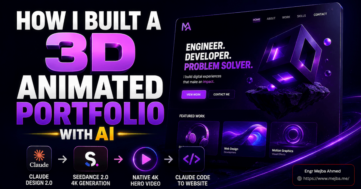
How I Built a 3D Animated Portfolio With AI
The clip that made me stop and rewatch it three times was ten seconds long. A 3D-illustrated version of me, walking slowly across an empty terracotta studio, pausing to glance at the camera, then looking away. Native 4K. No upscaler in the pipeline. And it was sitting behind the hero text of a portfolio site I'd sketched forty minutes earlier on the back of a napkin's worth of instructions.
That's the whole thing in one sentence: I built a 3D animated portfolio — a full homepage with a living, looping 4K character video in the hero — using two tools that didn't talk to each other and one handoff that stitched them together. Claude Design 2.0 for the site. Higgsfield's Seedance 2.0 4K for the video. Claude Code to take the whole thing to production.
I want to walk you through the actual build, not the highlight reel. Where it worked scary-well, where it got weird, and the two decisions upfront that made the difference between "AI slop landing page" and something I'd actually put my name on. Because the tools are impressive, sure. But the tools aren't the reason it came out good. Stick with me and I'll show you what was.
Why a 3D animated portfolio is finally worth building
For years, a hero-background video on a portfolio site was a tax you paid in three currencies: a videographer or motion designer, a render pipeline, and bandwidth. You either shot footage, licensed a stock loop that a thousand other sites also used, or paid a 3D artist for a bespoke animation that started at four figures. Most solo builders looked at that math and shipped a static hero image instead.
Two things changed in 2026 that flipped the equation.
First, AI web design tools crossed the line from "generates a wireframe you rebuild by hand" to "generates a real, editable, exportable site." I've been tracking this closely — my breakdown of the June 2026 Claude Design overhaul covered the moment the tool stopped being a token-burning demo and became something you could finish a project inside. Claude Design 2.0 is the next step past that: fully editable output, three distinct editing modes, and a clean handoff into Claude Code.
Second — and this is the part most people underrate — video models learned to generate native high resolution. Seedance 2.0 on Higgsfield generates in 4K directly, according to Higgsfield's model page. Not 1080p-then-upscaled. Actual 4K frames out of the model. That single detail removes an entire step, an entire quality-loss stage, and an entire category of "why does the upscaled version look like it's melting" frustration.
Put those together and a solo builder can now produce a portfolio that reads like an agency shipped it. The catch — because there's always a catch — is that the tools reward preparation and punish laziness harder than any design software I've used. Which brings me to the first real lesson.
The wireframe I sketched before touching any AI
Here's where most people go wrong, and where I almost went wrong too. The instinct with a tool like Claude Design 2.0 is to open it, type "build me a sleek modern portfolio with a video hero," and hit go. You'll get something. It'll look fine. It'll also look exactly like the something everyone else typing that prompt gets, because you handed the model zero constraints and it filled the vacuum with the statistical average of every portfolio it's ever seen.
So before I opened anything, I sketched. Nothing fancy — a rough wireframe of the page structure, top to bottom:
- Hero: full-screen,
100vh. Centered text. A call-to-action anchored to the bottom of the viewport, not floating in the middle. - Selected Work: a showcase grid of projects, directly under the fold.
- Large text callout: one oversized statement line, the kind that gives a site a point of view instead of just a portfolio dump.
- Journal / blog section: recent writing, because a portfolio without a voice is a résumé.
- Footer CTA: one more clear "let's talk" before they leave.
That's it. Five sections, sketched in about four minutes. But that sketch is the highest-leverage artifact in the entire build, and I'll explain exactly why in the next section — because what I did with it matters more than the drawing itself.
Setting up the build in Claude Design 2.0
Inside Claude Design 2.0, the first two choices set the ceiling for everything that follows.
Choice one: no template. Templates feel like a head start. They're actually a cage — you spend the rest of the session fighting the template's assumptions instead of expressing yours. I started from a blank canvas so the structure came from my wireframe, not from someone else's idea of what a portfolio should be.
Choice two: set the model to Claude Opus 4.8. Claude Design lets you pick the underlying model, and for a from-scratch build where layout reasoning and visual taste both matter, Opus 4.8 is the one I want driving. It's the strongest design-reasoning model in the lineup, and on a hero-driven site where the composition has to carry the whole first impression, that reasoning is worth the spend.
Then the actual move: I uploaded the wireframe sketch and wrote out the instructions alongside it. Not "make a portfolio." Instead — full-screen hero at 100vh, centered headline, CTA pinned to the bottom, selected-work grid below, oversized text callout, journal section, footer CTA. I described the feeling too: confident, editorial, a little bit gallery-like. Terracotta and black as the color story.
This is the difference-maker I promised you. A clear wireframe plus specific instructions doesn't nudge the output a little better — it changes the category of output entirely. The model stops guessing at your intent and starts executing it. When I hit generate, what came back wasn't a generic template. It was my structure: a 100vh hero with placeholder imagery, a terracotta-and-black scheme that felt like a design decision rather than a default, and every section from my sketch in the order I'd sketched them.
The placeholders were exactly that — placeholders. But the bones were right. And getting the bones right on the first generation is the whole game, because everything after this is refinement, not reconstruction. Now the site needed something real in that hero. Time to switch tools.
Generating the assets in Higgsfield
Higgsfield is a platform, not a single model — think of it as one login that fronts a whole shelf of image and video generators. On any given day you've got GPT Image 2, Nano Banana Pro, Seedance 2.0, and a long list of others, all sitting behind the same interface. Higgsfield's own model roundup keeps expanding, and I've used the platform enough now to have opinions about which model to reach for when — I dug into a full production pipeline in my automated creative agency build with Claude and Higgsfield.
For this portfolio, I needed two things: a 3D-illustrated character based on me, and then that character animated into a 4K hero loop. Two different jobs, two different models.
The star of the video job is Seedance 2.0 4K. The reason it matters isn't just quality — it's that it generates in native 4K. On most platforms, "4K video" means the model renders at 1080p and an upscaler stretches it afterward, which softens edges, introduces artifacts, and adds a render step. Seedance 2.0 skips all of that. The frames come out of the model at 4K. For a hero-background video that a visitor might view on a 27-inch monitor, that native sharpness is the entire point. No upscaling tax.
But before I could animate anything, I needed the character. That turned out to be the fiddliest part of the whole build.
Getting the 3D character right (past the uncanny valley)
I started from a single photo of myself. The prompt: a 3D-illustrated full-body character, terracotta studio background to match the site, framed 16:9 so it would drop straight into the hero.
First I tried GPT Image 2. Then Nano Banana Pro. And here's the honest part — the first several results were bad in a very specific way. They were too realistic. The models kept pushing toward a hyper-detailed, near-photographic render of my face, and the effect landed squarely in the uncanny valley. It wasn't a stylized 3D character anymore; it was a slightly-wrong clone of me, and my brain flagged it as off within half a second. Freaky is the technical term I used at the time.
The fix was to iterate toward less realism, not more. I dialed the prompts toward a clearly illustrated, stylized 3D look — the kind of proportions and surfacing you'd see in a good animated short, where the character reads as a designed object rather than a scanned human. A few passes in, I hit the balance: recognizably me, clearly a 3D illustration, zero uncanny-valley cringe. Full body, terracotta studio backdrop, 16:9.
Lesson worth pocketing: when an AI-generated character feels creepy, the instinct is to add detail and realism to "fix" it. That's backwards. Realism is what's breaking it. Push toward stylization and the discomfort disappears.
With a character I actually liked, I moved to the animation.
Animating in Seedance 2.0 4K
I fed the chosen character image into Seedance 2.0 4K with a tight prompt: the character walks slowly around an empty studio, glances at the camera, looks away. Ten seconds. 16:9. 4K. High bitrate.
The specificity there is deliberate. "Walks around and glances at camera" gives the model a clear, simple motion arc — nothing acrobatic, nothing that demands frame-perfect physics it might botch. A slow walk and a single glance is exactly the kind of restrained motion these models nail, and restrained is what you want behind hero text anyway. You're not making a music video; you're making ambient movement that draws the eye without stealing focus from the headline.
The download came back clean at 4K. No upscaling, no post-processing, no "let me run this through Topaz to salvage it" step. The clip was sharp enough to sit behind text at full viewport size and still hold up.
If you'd rather have someone build this kind of AI-driven site-and-video pipeline for you end to end, that's a chunk of what I do — you can see the range of work on my Fiverr profile. But honestly, the workflow is learnable, so let me keep showing you how the pieces fit.
Dropping the 4K clip into the hero
Back in Claude Design 2.0, integrating the video was the satisfying payoff. The clip went in as the hero background — and the settings here matter more than people expect:
- Muted. A hero video that plays sound on load is a bounce machine. Silent, always.
- Controls hidden. No scrubber, no play button. It's a background, not a media player.
- Looping. Ten seconds, seamless, on repeat.
- Text and CTA centered at the bottom, exactly as the wireframe specified, sitting on top of the moving footage.
The moment the 4K character started looping behind the headline, the site stopped looking like a generated draft and started looking like something with a pulse. That's the emotional turn a video hero buys you — a static site says "here's my work," a living one says "here's who I am." For a personal portfolio, that difference is the entire pitch.
Now the site was alive, but it wasn't right yet. The headline weight was too heavy, the orange felt muddy, and there was a gradient on the hero I didn't want. Which is exactly where Claude Design 2.0's editing modes earned their keep.
The three editing modes that saved me from re-prompting
Here's the feature that separates Claude Design 2.0 from the "regenerate and pray" era of AI design tools. Instead of re-prompting the whole page every time you want a small change — and risking the model rebuilding something you liked — you edit directly. Anthropic's rebuilt editor, per Anthropic's Claude Design announcement, gives you inline control so small adjustments don't burn a full model turn.
There are three modes, and knowing which to reach for is half the skill:
- Simple — direct manipulation. Select an element, drag it, resize it, retype text, nudge alignment. No prompt at all. This is where I left-aligned the hero content and lightened the headline font weight — changes that would've been absurd to describe in a sentence when I could just do them.
- Pro — deeper controls for spacing, color, and layout, with the ability to apply a change across the whole design. This is where I pushed the orange brighter site-wide and swapped the entire site to the "Enter" font in one move instead of hunting down every text block.
- Code — direct access to the underlying markup when you want surgical control the visual editor can't give you. This is where I killed the hero gradient cleanly.
Watch what that sequence actually was: left-align the hero (Simple), brighten the orange globally (Pro), site-wide font swap to Enter (Pro), remove the hero gradient (Code), lighten the headline weight (Simple). Five meaningful changes, zero full-page regenerations, and not once did I risk the model "helpfully" rebuilding a section I was happy with.
That's the real unlock. The old workflow's dirty secret was that every re-prompt was a gamble — you'd ask for one tweak and get three unrequested "improvements" you now had to undo. Editable modes turn design iteration back into what it should be: a series of small, safe, reversible moves. If you want the deeper strategic version of this handoff, I laid it out in my Claude Design to Claude Code website playbook.
Once the look was locked, one job remained before export: making sure it didn't fall apart on a phone.
Making the 3D animated portfolio responsive
A hero video and a tight desktop layout mean nothing if the site collapses on mobile, where more than half your visitors actually are. In Claude Design 2.0, I checked the small-screen behavior and fixed the obvious break: the Journal and Selected Work sections, which sat comfortably side by side on desktop, needed to stack vertically on narrow viewports instead of squeezing into unreadable columns.
This is a quick pass but a non-negotiable one. The 4K hero scales down gracefully — one advantage of native 4K is that it downsamples cleanly to smaller screens rather than looking soft. But layout logic has to be handled deliberately. Stacking the two-column sections, confirming the CTA stayed reachable, checking the headline didn't overflow — ten minutes of work that saves you from shipping something that looks broken on the exact device most people will open it on.
With responsive sorted, the prototype was genuinely good. But a Claude Design prototype, however polished, is still a prototype. To make it real, I needed it in code.
Exporting to Claude Code for real control
This is where a lot of AI-built sites hit a ceiling. They live inside the tool that made them, and the moment you want something the tool can't do, you're stuck. Claude Design 2.0 avoids that trap with a clean handoff.
Two paths out:
- Share → Send to Claude Code pushes the project straight into a Claude Code session.
- Download as ZIP hands you the raw files to open wherever you like.
I sent it to Claude Code, spun it up locally, and this is where the polish that separates "AI-generated" from "professionally built" happened — the stuff a visual tool genuinely can't reason about as well as a coding agent working in the actual codebase:
- Section flow and spacing — tightening the vertical rhythm between sections so the page breathes instead of feeling like stacked blocks. I've written before about how much of "premium" is really just spacing and flow discipline.
- Hover states on the portfolio items — the kind of micro-interaction that signals craft. A subtle lift, a shift, something that rewards the cursor.
- Fade-in animations — sections easing in on scroll rather than snapping into place.
- Footer CTA — refining the final call-to-action so the page closes with intent.
Claude Code operating on real files is a fundamentally different tool than a visual editor. It reasons about the whole codebase, makes consistent changes across it, and gives you the code-level control that turns a nice-looking prototype into something you'd actually deploy. The design tool gets you 85% of the way beautifully. Claude Code closes the last 15% that everyone actually notices.
At this point I had a genuinely shippable 3D animated portfolio: native-4K character hero, editorial layout, responsive, polished hover states and scroll animations, real code I owned. But it was still, fundamentally, a static homepage. And a portfolio you can't update is a dead end.
The step that turns a prototype into a platform
Here's the honest limitation, the thing the slick demo videos skip. Everything above produces a beautiful static site. The Selected Work is hardcoded. The Journal entries are baked into the markup. Want to add a new project? Edit code. Publish a new journal post? Edit code. That's fine for a one-time build and completely unsustainable for a living portfolio.
The fix — and this is the natural next build, done entirely in Claude Code — is a backend CMS. A content layer that lets me manage portfolio pieces, spin up individual project pages, and publish journal posts without touching the codebase every time. That's the difference between a homepage and a platform. I've built exactly this pattern before and documented it in making websites client-editable with Claude Code, and the same approach applies whether the client is a paying customer or just future-me trying to post a new case study on a Sunday night.
That CMS step is what quietly separates people who demoed an AI-built site from people who actually run one. The homepage is the easy, dopamine-hit part. The content infrastructure underneath is what makes it real — and it's where the AI-web-design conversation is heading next.
FAQ
Frequently Asked Questions
Everything you need to know about this topic
Yes — you can get a fully designed, responsive, video-hero portfolio without writing code, using Claude Design 2.0 for the site and Higgsfield's Seedance 2.0 4K for the animation. The catch is that the last mile of polish (hover states, scroll animations, a CMS) is far easier and more controllable once you export to Claude Code, so "no code" gets you a great prototype but light code gets you a real product.
Seedance 2.0 generates natively in 4K rather than rendering lower resolution and upscaling afterward. That removes a quality-loss step and an extra render stage, so the clip is sharp enough to sit behind full-viewport hero text on large displays without artifacts. It also supports multi-shot generation with consistent characters, per Higgsfield's model documentation.
An AI character usually looks uncanny because the model pushed the render too far toward photorealism, landing it in the uncanny valley. The fix is counterintuitive: prompt for more stylization, not more detail. Dial toward a clearly illustrated 3D look with designed proportions, and the discomfort disappears because the brain reads it as an intentional character rather than a flawed clone.
From Claude Design 2.0, use Share → Send to Claude Code to push the project directly into a Claude Code session, or download the project as a ZIP and open it locally. From there Claude Code works on the real files, which is where you handle code-level refinements the visual editor can't, like consistent spacing, hover states, scroll animations, and eventually a backend CMS. See the exporting section above for the full flow.
The napkin was the whole trick
Go back to that ten-second clip — the 3D version of me pacing an empty studio, glancing at the camera. It's the part everyone notices. But it's not the part that made the site good.
The site is good because of four minutes with a pen before I opened a single tool. The wireframe. The five clear sections. The specific instructions handed to the model instead of a vague wish. Every powerful thing that happened afterward — the terracotta scheme landing on the first generation, the editing modes refining instead of rebuilding, the clean Claude Code handoff — all of it compounded off a clear plan given to a capable model. The AI didn't design my portfolio. I designed it, and the AI executed at a speed and fidelity that would've cost me a month and a mid-four-figure invoice two years ago.
So here's your challenge for the next 24 hours: before you touch Claude Design, Higgsfield, or any AI builder, sketch the thing. Five sections, top to bottom, on actual paper. Write three sentences about how it should feel. Then — and only then — open the tools. You'll be genuinely startled how much better the first generation comes back when the model finally knows what you actually want.
Let's Work Together
Looking to build AI systems, automate workflows, or scale your tech infrastructure? I'd love to help.
- Fiverr (custom builds & integrations): fiverr.com/s/EgxYmWD
- Portfolio: mejba.me
- Ramlit Limited (enterprise solutions): ramlit.com
- ColorPark (design & branding): colorpark.io
- xCyberSecurity (security services): xcybersecurity.io