Claude Design Review: The AI Website Workflow I Actually Shipped
The first prompt I sent Claude Design was a lie. I told it I was a beginner. I'm not. I've been drawing pixels and pushing vectors around since the mid-2000s — fifteen-plus years of client work, brand systems, landing pages that had to convert or I didn't eat that month. But I wanted to know what this thing actually felt like to a person walking in cold.
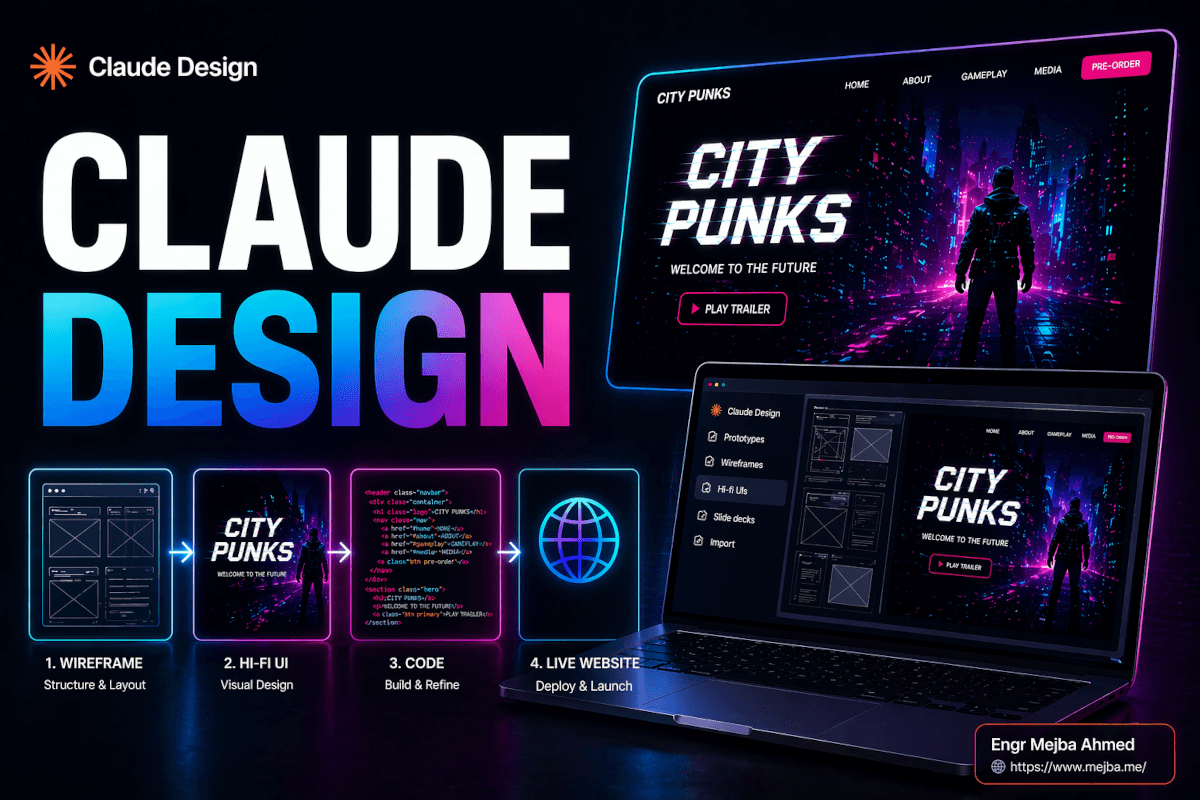
So I opened Claude, clicked the new Design tab, and typed a single sentence: "Design a landing page for a cyberpunk open-world game called City Punks."
Six minutes later I was staring at three wireframe variations and a working hi-fi UI. Not a Figma file. Not a static PNG. A living, breathing, inspect-element-able HTML page with glitch effects on the hero title, a working navigation, and a color palette that I would have billed a client three hours to build.
And my first reaction wasn't "Figma is dead." It was: "Oh, this covers maybe 80% of what I do. The other 20% is what nobody's talking about."
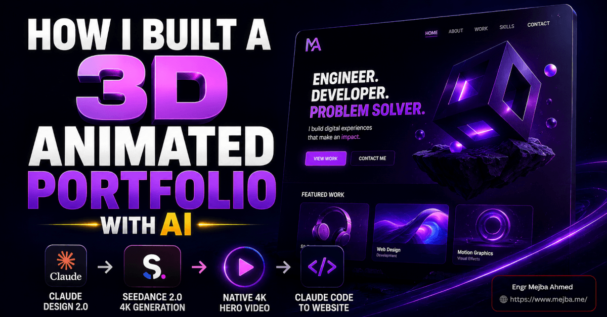
This is that other 20%. It's also the full workflow I used to ship a real-looking cyberpunk game site — Claude Design to Midjourney to Claude Code to Cloudflare — and the exact places where the AI hit a wall and a human (me) had to step in.
What Claude Design Actually Is
Anthropic launched Claude Design on April 17, 2026, as a research preview inside the Claude apps. It's available to Pro, Max, Team, and Enterprise subscribers — Free users are locked out. It runs on Claude Opus 4.7, the same model doing heavy lifting in Claude Code and the API.
When you open Claude, you now see a dedicated Design tab. Inside it, five options:
- Prototypes — clickable interactive flows
- Wireframes — low-fidelity layout exploration
- Hi-fi UIs — full HTML/CSS landing pages and product surfaces
- Slide decks — presentations built as HTML
- Import — pull in Figma files or upload screenshots as starting points
What separates it from v0, Lovable, and Figma Make isn't any single feature — it's the handoff. When you finish a design, Claude Design packages the entire thing (components, tokens, assets, markup) into a bundle you pass to Claude Code with one command. The jump from "cool mockup" to "real deployable site" is a single instruction, not a week of rebuilding.
That's the sales pitch. The reality is more nuanced.
My friend texted me a screenshot of a site he'd made with it the day after launch. Clean typography. Sensible grid. Background gradient that actually worked. "Took me 20 minutes," he said. "I can't even open Figma without crying." I bookmarked the message and promised I'd test it properly that weekend. Here's what happened when I did.
The Requirements (Before You Open Anything)
You need two things: a Claude subscription and a rough idea. That's it. I ran the entire first pass on the $20/month Pro plan, which Anthropic confirms includes Claude Design access during the research preview window. No separate license. No add-on fee.
But here's the catch nobody's talking about in the launch coverage — and I'll come back to this because it genuinely changed how I use the tool: Claude Design burns through your usage quota fast. Really fast. By the time I'd moved from wireframe to hi-fi UI to two rounds of edits, I'd consumed roughly half my daily window. The Register reported in March that Anthropic acknowledged "people are hitting usage limits in Claude Code way faster than expected" — and Design feels like it pulls from the same token pool. Plan accordingly.
If you want to follow along with the full stack I used, you'll also need:
- Midjourney — I'm on the $30/month Standard plan, which the official Midjourney pricing page lists as the sweet spot for anyone doing semi-regular image work (roughly 900 fast images plus unlimited Relax mode)
- Topaz Astra — optional, only if you want to upscale AI video. The Personal plan is $39/month
- Claude Code — part of the same Claude subscription
- A GitHub account and Cloudflare account — both free for this use case
That's the full stack. No Figma. No Webflow. No third-party hosting. Around $50-$60/month of tools for someone shipping regularly, or $20/month if you stay strictly inside Claude.
Before we get to the good part — the thing that actually blew me away — you need to understand the one concept Claude Design gets right that every other AI tool gets wrong.
The Design System Is the Real Unlock
Every AI design tool can spit out a landing page. That's table stakes in 2026. What Claude Design does differently is that on your very first project, it asks you a simple question: "Do you have existing brand assets, or should I build a design system from scratch?"
If you drop in a logo, a Figma file, or even a GitHub repo, it reads them. It extracts:
- Brand colors (primary, secondary, accents — with proper contrast ratios)
- Typography scale (font families, sizes, weights, line heights)
- Gradients, if your existing work uses them
- Stroke weights and border radius conventions
- Component patterns it detects in your code
Then it saves that as a persistent design system tied to your workspace. Every new project you start inherits it automatically. I can spin up a blog post layout at 2 AM and it already knows my typography is set to Inter 16px base with a 1.25 modular scale, because I defined it once three projects ago.
This is the thing Lovable and v0 don't do natively. They can import a Figma design, but they can't infer a consistent system from a GitHub repo. Claude Design does, because it's sitting on top of Opus 4.7's code-reading ability. Same model, different UI surface.
For City Punks — the cyberpunk game site — I had nothing. No logo. No brand. So I told Claude Design to build from scratch with these inputs:
- Vibe: Neo-Tokyo 2077, night market, neon haze
- Primary colors: electric cyan, hot magenta, chrome gray
- Type: a display face with sharp geometric cuts for headings; clean sans for body
- Stroke style: thin, precise — 1px borders, no heavy outlines
- Gradient appetite: heavy — use them as atmosphere, not decoration
It came back 40 seconds later with a design system preview: a color grid, five typography samples, three gradient options, and a component sheet showing what buttons, cards, and form inputs would look like. I approved the palette, nudged the heading font to something with sharper terminals, and locked the system.
Now every subsequent generation for that project inherited those decisions automatically. That's not marketing copy. That's the actual workflow.
The Wireframe Flow (Where Most People Will Start)
With the design system locked, I wrote a second prompt:
"Landing page for City Punks, an open-world cyberpunk game launching late 2026. Big video hero with character footage, two feature sections explaining gameplay pillars, a news/blog teaser section, a full-width CTA before footer. Bold, atmospheric, not busy."
Claude Design returned three wireframe variations in under a minute:
- Left-aligned hero — title stacked tight to the left, CTA immediately below, video frame on the right
- Centered hero — title dead center over full-bleed video, CTA stacked underneath
- Split-screen hero — 50/50 vertical split, title on left, short intro paragraph on right
This is where being a designer actually matters, and it's the first place I'd warn beginners. All three layouts were competent. None of them were right for a cyberpunk game site. The left-aligned version was too editorial — it read like a Medium article. The centered one was fine but generic. The split-screen one fought itself because cyberpunk visuals want to dominate, not share space.
I picked the centered layout and gave a single follow-up instruction: "Stretch the video to full-bleed. Push the title down and give it a glitch effect. Minimize the nav — I want a simple logo-plus-burger-menu setup, nothing else."
Eight seconds. Done. That's the speed advantage that makes this tool dangerous in the right hands.
At the wireframe stage, you can also tweak:
- Navigation style (minimal vs full with dropdowns)
- Section order (drag to reorder in the canvas)
- Grid density (tight, standard, spacious)
- Content hierarchy (H1-dominant, H1-with-kicker, H1-with-subhead)
Drop a quick instruction in chat, get an instant variant. This is the part where 20-year Figma veterans will feel the ground shift a little. I did.
Generating the Hi-Fi UI
Once the wireframe was locked, I said: "Hi-fi this with full visuals." The transition from wireframe to hi-fi UI took roughly 90 seconds.
What came back:
- A complete HTML page with the locked design system applied
- The heading "CITY PUNKS" with a CSS-based glitch animation (RGB split, horizontal jitter, three keyframes)
- Placeholder video in the hero (Claude Design's default looping gradient, ready to be swapped)
- Two feature sections with mock headings, sub-copy, and icon placeholders
- A news teaser with three card slots
- A full-width CTA section with a neon-bordered button
- A footer with social links, legal, and a language switcher
Everything was inline-editable. Click any text, type new copy. Click any color swatch, pick a new one from the palette — or type a hex value. Want to change the font weight? Right-click the heading, select "Typography," adjust.
This is where Claude Design does something I haven't seen done well in any other AI tool: inline style editing without losing the design system binding. If I change the primary accent from cyan to electric green, every element using that token updates across the entire page. Change it in one place, propagates everywhere. It's the behavior designers have been begging from every "AI website builder" since 2023, and Claude Design is the first one that actually nails it.
I made three edits at this stage:
- Swapped the default heading typeface to something more angular
- Pushed the glitch animation's intensity down from "aggressive" to "subtle" (they have a slider)
- Added a faint scanline overlay to the hero — two sentences in chat, done in six seconds
The hi-fi UI at this point looked like a designer had spent two days on it. Not polished, but very much in the ballpark. Ready for real imagery.
The Midjourney Handoff
This is where the workflow gets real, because no AI design tool generates its own production-quality imagery yet. Claude Design's built-in image placeholders are fine for wireframing. They are not what you ship.
I opened Midjourney and wrote three prompts:
- Hero image: a cyberpunk female character with neon-lit streets behind her, cinematic lighting, shallow depth of field, teal and magenta color scheme, 16:9 aspect ratio
- Feature section image 1: wide-angle shot of a Neo-Tokyo-style rooftop at night, rain-slicked surfaces, neon signage
- Blog card images: three variants of cyberpunk vehicle shots, gritty but cinematic
Around 40 fast images burned, maybe 20 minutes of iteration. I picked the three strongest and exported them at their largest sizes. This part of the workflow is craft. Midjourney prompting is its own skill and AI design prompting taste is the difference between images that feel premium and images that feel like every other AI tool's output.
Back in Claude Design, I dragged the hero image into the video placeholder slot. Claude automatically suggested an overlay gradient to improve text legibility — a dark-to-transparent vertical gradient sitting between the image and the headline. I accepted it, then asked Claude to add a faint grid overlay on top at 15% opacity to reinforce the cyberpunk feel.
Same treatment on the feature section images. Overlay gradients on any hero-sized image, light grids on the interior content blocks. Claude Design handles the CSS; I handle the taste decisions.
This is where I started feeling the quota pressure. By the time I'd finished swapping all the imagery and running three rounds of micro-edits, I'd consumed roughly half my daily Claude allowance. The tool is not free in the token sense, even when it's "free" in the subscription sense. Something to budget around.
The Responsiveness Problem
Here's the part the launch posts skipped. Claude Design's output is mostly responsive out of the box. I tested the City Punks site at desktop (1440px), laptop (1280px), tablet (768px), and mobile (375px).
Desktop: perfect. Laptop: perfect. Tablet: good, with one minor overflow on the feature section. Mobile: broken.
Specifically, the navigation tried to stay full-width on mobile and squeezed into an unusable horizontal scroll. The full-bleed hero's headline was too large and wrapped into four lines. The feature sections' two-column grid didn't stack. The CTA button overflowed its container.
Five issues in total. All standard responsive web dev problems. All fixable.
I typed: "Audit the mobile layout and fix the breakpoints. Navigation should collapse to a burger menu below 768px. Hero headline should scale down to fit in two lines on mobile. Feature sections should stack vertically on tablet and below. CTA button should go full-width on mobile."
Two minutes. All five issues resolved. The burger menu was implemented with a clean slide-in overlay, which I hadn't even specified. The headline scaled using a clamp() function. The feature sections restructured to stack properly. The CTA went full-width.
But I had to know to ask. A true beginner wouldn't have caught the mobile issues. They would have shipped a site that looked great on their MacBook and terrible on their client's iPhone. This is point #1 where a designer's trained eye still matters.
The Handoff to Claude Code (When You Blow Through Your Quota)
Around the fourth round of edits, I hit the Claude usage wall. The tool told me I had limited messages remaining for the next three hours.
This is where Claude Design becomes genuinely powerful in a way the other tools aren't. Click the Export to Claude Code button. Claude packages the entire design — HTML, CSS, JavaScript, assets, design tokens, component structure — into a bundle. You then open Claude Code in your terminal and paste a single instruction: "Continue working on this project locally."
Suddenly I had local files. I could open them in my IDE. I could edit directly. And crucially — Claude Code's quota is effectively separate from the conversational Claude quota for most practical purposes, so I could keep making changes when the web UI had locked me out. Boris Cherny's Opus 4.7 workflow has a great breakdown of how to stretch Claude Code sessions, and most of those tactics apply here too.
I used Claude Code to:
- Replace the hero image with a compressed background video (we'll get to the video in a second)
- Adjust parallax scroll effects on the feature sections
- Add hover states on the blog cards (subtle lift + glow on the border)
- Tweak the footer spacing
- Add meta tags and Open Graph cards
All of this happened in the terminal with Claude Code editing local files. The design system variables carried over cleanly — if I referenced --color-accent-primary in a new CSS rule, it pulled from the same tokens Claude Design generated. This is the integration story that actually matters.
The Video Animation Trick
For the hero, I didn't want a static image. Cyberpunk sites need motion.
Midjourney now supports short animated loops at two intensity levels — low motion and high motion. I generated a 4-second loop of my hero character with subtle neon glow movement and faint smoke drift. The output was decent but only 1080p.
Enter Topaz Astra. Their Personal plan at $39/month gave me enough credits to upscale my 4-second loop to genuine 4K with creative detail enhancement. The Astra docs note you get roughly 160 seconds of 4K creative-mode output per month on Standard — plenty for hero videos, not enough if you're doing full-length film work.
I compressed the 4K output to 1080p at high bitrate using ffmpeg (the 4K upscale improved quality even at the downscaled output — counterintuitive but true), dropped the file into the site assets folder, and told Claude Code: "Replace the hero image with this video as a looping background. Keep the overlay gradient and grid. Make sure it autoplays muted with playsinline attribute."
Eleven seconds. Done. The cyberpunk character now moved subtly behind the glitch-animated title. It felt like a site you'd actually see on launch day.
Where the Designer's Touch Still Mattered
Here's the honest 20% — the stuff Claude Design did not get right on its own, and where a designer's instincts made the difference between "AI site" and "real site":
Logo placement and sizing. Claude Design defaulted to a safe 40px logo top-left. For this brand, the logo needed to be bigger, pushed slightly right, and paired with a pixel-rendered tagline in a tertiary font. Took me five minutes in Claude Code. Would have taken a beginner an hour of guess-and-check prompting.
Navigation repositioning. The default put "Sign up" as a standard text link. I moved it to a bordered neon pill button in the top-right corner, made it sticky on scroll, and added a subtle glow on hover. Claude Design's first attempt was technically functional but visually weak.
Color calibration. The auto-generated cyan was too saturated for body text contexts. I dialed it back three shades and reassigned a paler cyan for secondary accents. Small change. Massive perceptual difference.
Parallax timing. The default parallax on the feature section was too fast — 0.5 multiplier. I slowed it to 0.2 and the whole section felt more cinematic. This is a taste decision, not a technical one.
Blog card hover states. Claude's default was a 2px lift and a shadow. I replaced it with a subtle border glow, a 1px lift, and a color shift on the title. The difference is what separates "hover works" from "hover feels good."
Multi-page continuity. When I asked Claude Design to generate an inner blog post page, it defaulted to a fresh layout that didn't match the homepage. I had to explicitly instruct it to reuse the design system variables and typography scale — and even then, I did a pass in Claude Code to tighten the header spacing and match footer styling. Design variables help. They don't eliminate the need for a final sanity check.
None of this is hard. None of it requires years of training, exactly. But it requires taste calibrated by years of feedback — from clients, from analytics, from failed pages. A beginner will ship without making these fixes. A designer won't.
Deploy: GitHub + Cloudflare
The last step was deploying the thing.
Claude Code initialized a Git repo, committed the project, and walked me through pushing it to GitHub. Zero friction. Then I connected the repo to Cloudflare Pages. Cloudflare's official docs walk you through the GitHub integration — it takes about five clicks. Every time you push to the main branch, Cloudflare auto-deploys.
Domain setup was another five minutes. Buy domain in Cloudflare, point Pages to it, enable HTTPS. Total deploy time from "it's done locally" to "it's live on the internet": about twelve minutes, including waiting for DNS propagation.
Free hosting. Free SSL. Global CDN. For a single landing page or small site, this entire stack — Claude Design for creation, Claude Code for editing, Cloudflare for deployment — costs $20/month if you already have the Claude subscription. Add Midjourney and you're at $50/month.
That's the full picture.
The Honest Verdict
I've been thinking about this for two weeks since the launch, and here's where I've landed:
Claude Design is the best prompt-to-prototype tool I've used. It beats Lovable on design system fidelity. It beats v0 on versatility and export options. It beats Figma Make on speed. VentureBeat's launch coverage wasn't wrong to call it disruptive — Figma's stock dipped 7% the day of launch, and that's a rational market reaction.
But it is not a Figma replacement. It is not a designer replacement. It is an 80% tool.
It's phenomenal for:
- Beginners who need a functional site and don't have $3,000 to hire someone
- Designers who want to concept fast — wireframe exploration in minutes instead of hours
- Startup founders validating ideas before committing real design budget
- Small businesses that need a decent web presence without hiring an agency
- Experienced designers using it as a rapid-prototyping layer before deeper craft work
It is not going to work as your only tool if:
- You care about pixel-perfect brand fidelity
- You're working on complex multi-page products with nuanced interaction patterns
- You need real-time multi-designer collaboration with version history
- Your project requires precise vector illustration
- Your mobile responsiveness standards are anything above "basically works"
Designers who panic about this tool are missing the point. Claude Design doesn't replace taste. It eliminates the grunt work around taste — the grid-drawing, the component-duplicating, the "now let me export this to HTML" phase — so the designer's time compresses onto the decisions that actually matter.
The developers who complained when Figma-to-code tools showed up in 2019 ended up just… being developers who designed faster. The designers who adapt to Claude Design will be the same. The ones who don't will be explaining to clients in 2027 why their quote is four times higher than the competition for work that looks 80% the same.
The Workflow I'll Use Going Forward
After two weeks of running this stack, here's my current default for any small-to-medium site:
- Claude Design — initial brand system, wireframes, and hi-fi UI. Burn 30-50% of daily quota.
- Midjourney — hero and section imagery. 20-40 images.
- Topaz Astra — only when I need hero video. Optional.
- Claude Design → Claude Code handoff — the moment I hit the quota wall, or when I need real local file editing for fine-tuning.
- Manual polish in Claude Code — logo work, navigation detailing, hover states, parallax timing, multi-page continuity, mobile responsiveness audits. This is where my actual design experience matters.
- GitHub push → Cloudflare Pages — auto-deploy, free hosting, global CDN.
Total time for a competent small site: 3-5 hours instead of 2-3 days. That's not a productivity improvement. That's a business model change.
For bigger projects — full design systems, multi-page apps, real client work with feedback rounds — I'll still open Figma. The handoff to engineering at scale, the collaborative editing, the component version history, the plugin ecosystem — those things still matter, and Claude Design doesn't solve them yet. My earlier piece on AI design system workflow goes deeper on the Figma side of that equation if you need it.
But for landing pages, concept work, rapid validation, and anything I'd call "small scope with clear intent" — Claude Design is now my default. And I don't think I'm going back.
Claude Design Review: Common Questions
Do I need a Claude Pro subscription to use Claude Design?
Yes, Claude Design requires a Pro, Max, Team, or Enterprise subscription as of April 2026 — it's not available on the Free tier. The Pro plan at $20/month includes it at no extra charge during the research preview period.
Can Claude Design replace Figma for professional work?
No, not for complex product design, component systems, or team collaboration. Claude Design is stronger for rapid prototyping and landing pages, but Figma still wins on collaborative editing, version history, plugin ecosystem, and precise vector work.
How does Claude Design compare to Lovable and v0?
Claude Design beats both on design system extraction — it can read a GitHub repo and infer your existing patterns, which Lovable and v0 don't do natively. Lovable is stronger for full-stack apps with backend; v0 is stronger for developer-ready React/Tailwind exports. See the design section above for the full breakdown.
Is the output mobile-responsive by default?
Mostly, but not completely. Desktop and tablet layouts ship clean. Mobile typically needs at least one pass of fixes — burger menu, stacked sections, scaled typography. Explicitly prompting Claude Design to audit mobile breakpoints solves most issues in under five minutes.
What's the handoff to Claude Code actually like?
Claude Design exports a complete bundle — HTML, CSS, JavaScript, assets, and design tokens — that Claude Code can open and edit locally. The design system variables carry over, so your color and typography tokens stay consistent when you continue editing in the terminal.
Whether Claude Design Belongs in Your Stack
Shipping a full cyberpunk site with Claude Design showed me where Anthropic's tool genuinely wins — the visual layer Claude Code always lacked — and where it still breaks. For front-end-heavy work, that gap it closes is real.
Try it on one real page before you rebuild your workflow around it. The exact steps I used are above; your mileage depends on how visual your work is.
If you want a design-to-code pipeline built for your brand, that's something I do through Ramlit. My honest review is above.