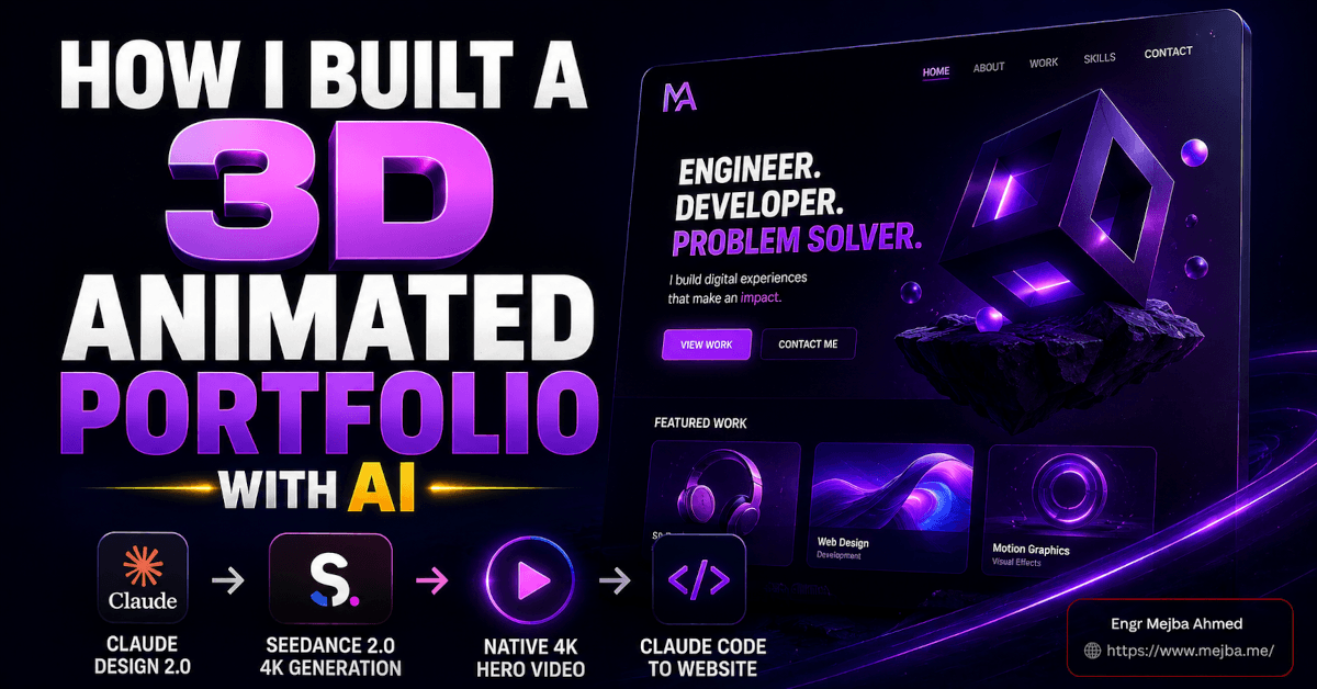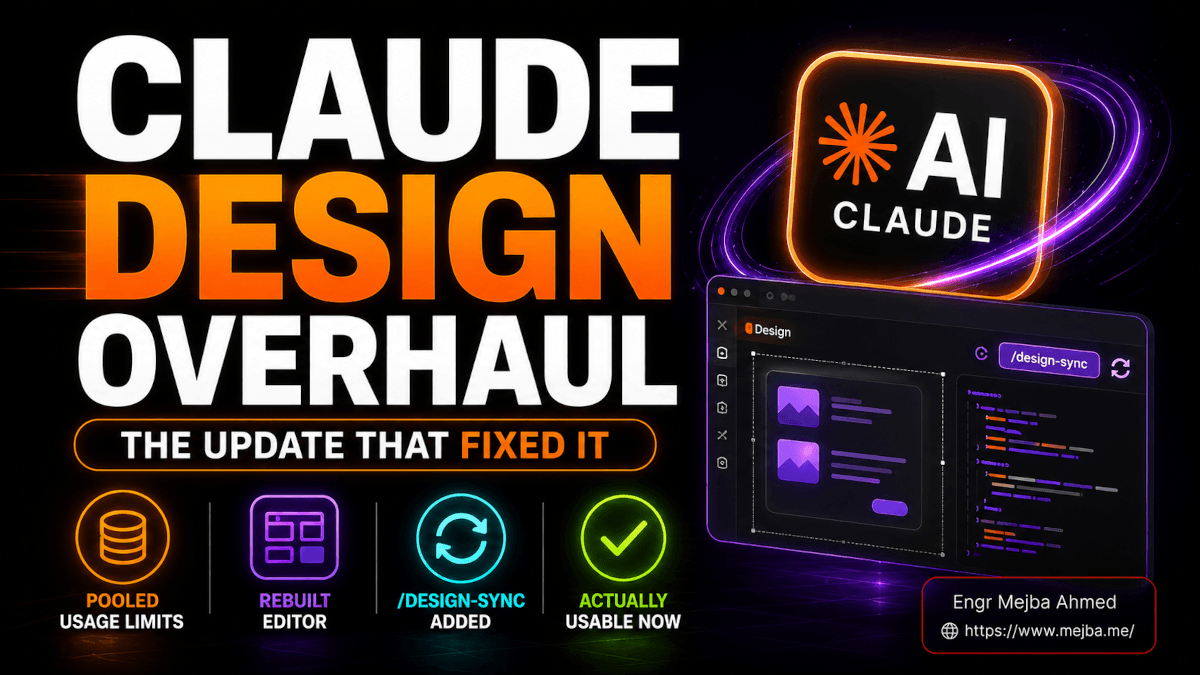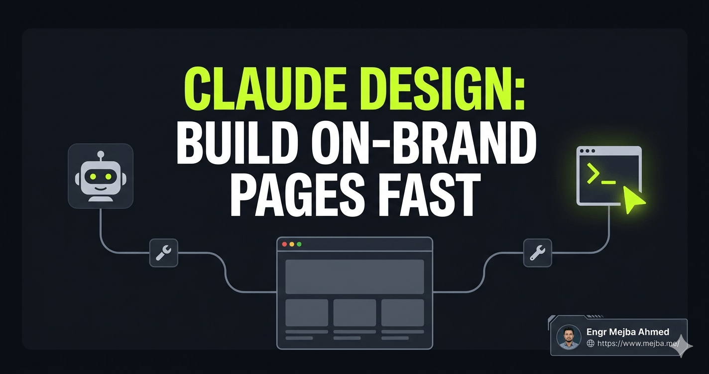
Claude Design: Hoe Ik Snel Merkconforme Pagina's Bouw
Mijn eerste ontwerp in Claude Design was waardeloos. Ik typte "bouw me een landingspagina voor een AI-coachingprogramma," keek toe hoe Claude Opus 4.7 even nadacht, en kreeg precies wat ik verdiende terug: een perfect competente, volledig vergeetbare pagina. Blauw verloop in de hero. Hetzelfde schreefloze lettertype dat iedereen gebruikt. Kaartafstand die schreeuwde "AI heeft dit gemaakt." Het was niet kapot. Het was gewoon generiek — het soort pagina dat eruitziet als tienduizend andere pagina's.
Ik had de hele tool bijna afgeschreven. Toen controleerde ik mijn gebruik en merkte iets op dat me deed opveren: die ene wegwerpprompt had een aanzienlijk deel van mijn wekelijkse tokenbudget opgegeten. Ik had echte credits uitgegeven om iets te genereren dat ik nooit zou publiceren.
Dus deed ik wat ik als eerste had moeten doen. Ik ging terug, bouwde een echt designsysteem, verfijnde mijn prompt in een gewone chat voordat ik het designcanvas aanraakte, en voerde het opnieuw uit. De tweede output zag eruit alsof een ontwerper die ik flink zou betalen het had gemaakt. Dezelfde tool. Hetzelfde model. Totaal ander resultaat. Het verschil zat volledig in hoe ik het gebruikte.
Die kloof — tussen "Claude Design is speelgoed" en "Claude Design is een echt onderdeel van mijn productpijplijn" — is het hele punt van dit artikel. Anthropic lanceerde Claude Design op 17 april 2026 als een research preview onder Anthropic Labs, en de meeste mensen gebruiken het als een gokautomaat: prompt invoeren, aan de hendel trekken, hopen. Ik ga je de werkwijze laten zien die het verandert in iets herhaalbaars, merkconform, en — met één MCP-verbinding waar ik later op terugkom — daadwerkelijk live op het internet in plaats van een statische mockup.
Wat Claude Design eigenlijk is (en wat het stilletjes vervangt)
Claude Design is Anthropic's prompt-naar-ontwerp-werkruimte. Je beschrijft wat je wilt — een landingspagina, een app-prototype, een presentatie, een stuk motion graphics — en het genereert het geheel, visueel, afgestemd op een merkstijl, zonder dat je Figma, Canva of PowerPoint hoeft te openen.
Die positionering is belangrijk. Dit is geen codeerassistent die een muur van HTML uitspuugt. Het is een ontwerpoppervlak. De output is iets dat je bekijkt, waarop je klikt en dat je visueel bewerkt — en het richt zich direct op de werkprocessen die mensen momenteel over drie of vier afzonderlijke tools verdelen.
Dit is het aanbod waarmee het stilletjes concurreert:
- Figma — voor prototypes, app-schermen en UI-mockups
- Canva — voor landingspagina's, social media-assets en one-pagers
- PowerPoint / Google Slides — voor pitchdecks en presentaties voor investeerders
- After Effects (licht) — voor snelle motion graphics en geanimeerde infographics
Volgens de lanceringsaankondiging van Anthropic draait Claude Design op het Claude Opus 4.7 vision-model en is het beschikbaar als research preview voor Pro-, Max-, Team- en Enterprise-abonnees. Het exporteert naar PDF, PowerPoint (PPTX), zelfstandige HTML, een ZIP-archief en — via een partnerschap dat dezelfde dag werd aangekondigd — direct naar Canva, waar het ontwerp volledig bewerkbaar en collaboratief wordt.
Eén ding om vroegtijdig verwachtingen over te scheppen: het is alleen web. Er is nog geen desktop-app. Je opent het binnen Claude.ai via een speciaal tabblad zodra je bent ingelogd — zoek het ontwerpicoon in de linkernavigatie. Als je hebt gewacht op een native Mac- of Windows-build, zul je nog even moeten wachten. Alles wat ik ga doorlopen, gebeurt in de browser.
Maar het formaat is niet het interessante deel. Het interessante deel is de ene fout die mensen die van deze tool houden scheidt van mensen die generieke rommel produceren en hun credits verbranden.
De fout die bijna iedereen maakt: vibe-ontwerpen
Er is een naam die ik gebruik voor de manier waarop de meeste mensen Claude Design benaderen. Ik noem het vibe-ontwerpen — het visuele neefje van vibe coding, en net zo gevaarlijk voor je outputkwaliteit.
Vibe-ontwerpen is wanneer je een losse, op gevoel gebaseerde prompt typt — "maak me een strakke moderne landingspagina voor mijn startup" — en het model elk ongespecificeerd detail laat invullen. Het probleem is dat elk ongespecificeerd detail is waar merkidentiteit leeft. Kleuren. Typografie. Knopradius. Afstandsritme. Sectiehiërarchie. Wanneer je die niet specificeert, grijpt het model naar zijn standaardinstellingen, en die standaarden zijn het statistische gemiddelde van het hele web. Statistisch gemiddeld is de definitie van vergeetbaar.
Dit is precies de valkuil waarin ik bij mijn eerste poging trapte. En het is dezelfde klacht die ik steeds terugzie in reviews — waaronder een MindStudio-artikel specifiek over het ontsnappen aan generieke AI-esthetiek — dat de tool de klassieke groen-en-blauwe "AI-coderingssfeer" produceert, tenzij je het echte beperkingen geeft om binnen te werken.
Vibe-ontwerpen kost je dubbel. Ten eerste krijg je een generiek resultaat. Ten tweede — en deze doet echt pijn — betaal je ervoor in tokens. Claude Design verbruikt credits veel sneller dan een normaal chatgesprek. Meerdere recensenten, waaronder een gedetailleerde tokenbeheergids van MindStudio, hebben opgemerkt dat zware ontwerpsessies alarmerend snel door limieten kunnen gaan, waarbij zelfs een enkele knop-met-staten ergens in het bereik van 1.000 tot 2.000 tokens kost. Zonder structuur kan één ongefocuste sessie een groot deel van je wekelijkse quotum opslokken en je met niets bruikbaars achterlaten.
De oplossing is mechanisch en het is het fundament van al het andere: stop met vibe-ontwerpen. Geef het model een blauwdruk voordat je het vraagt iets te bouwen. Die blauwdruk heeft een naam in Claude Design, en het is het meest impactvolle onderdeel van de hele tool.
Designsystemen: de 15 minuten die alles veranderen
Een designsysteem in Claude Design is een merkblauwdruk. Het vertelt het model je kleuren, je typografie, je componentstijlen — knoppen, kaarten, navigatie — en een geschreven beschrijving van je algehele visuele richting. Zodra het bestaat, haalt elk ontwerp dat je genereert er automatisch uit. Het model stopt met gokken en begint jouw merk uit te voeren.
Wanneer je Claude Design opent, is de lay-out overzichtelijk. Het linkerpaneel bevat je creatietypen: Prototype (apps, dashboards, landingspagina's), Presentatie, Sjabloon en een "Overig" vangnet. Het rechterpaneel toont je recente ontwerpen, enkele voorbeelden om mee te experimenteren, en — het belangrijkste — een tabblad designsystemen.
Je kunt een designsysteem op twee manieren bouwen, en ik heb beide gebruikt:
Optie 1 — Beschrijf het helemaal zelf. Je schrijft je stijl uit: "Primaire kleur diep indigo #4F46E5, accent elektrisch cyaan, neutrale slate achtergronden. Typografie is een geometrisch schreefloos voor koppen, een humanistisch schreefloos voor broodtekst. Knoppen zijn pilvormig met een subtiele schaduw. Algeheel gevoel: zelfverzekerd, technisch, veel ademruimte." Claude zet die beschrijving om in een gestructureerd systeem met een echt kleurenpalet en typografieschaal.
Optie 2 — Upload referenties. Dit is degene die als magie aanvoelt. Je kunt Claude het volgende geven:
- Screenshots van een bestaande website die je mooi vindt
- Een Figma-bestand
- Een GitHub-repo-link — en het crawlt de code, haalt je werkelijke kleuren en lettertypes eruit, en bouwt het systeem op basis van je echte tokens
Die laatste optie is de ultieme. De eigen helpcenter-walkthrough van Anthropic over het opzetten van een designsysteem bevestigt dat het je codebase en designbestanden leest en een UI-kit genereert — palet, typografie en herbruikbare componenten — op basis daarvan. Als je al een live product hebt, bestaat je merk al in je repository. Verwijs Claude ernaar en je designsysteem materialiseert zich in minuten.
Hoe dan ook, reken op ongeveer 15 minuten voor deze stap. Het voelt als een omweg wanneer je staat te popelen om iets te genereren. Dat is het niet. Dit is het verschil tussen professionele, merkconsistente output en de generieke brij die ik bij poging één kreeg. Ik heb er nooit spijt van gehad de 15 minuten te besteden, en ik heb er altijd spijt van gehad het over te slaan.
Als je dieper wilt ingaan op de strategie achter het bouwen van dergelijke systemen — het redeneren over tokens, schalen en componenthiërarchie — heb ik dat uiteengezet in mijn gids voor AI-app-designsystemen, en de Claude + Figma designsysteemworkflow beschrijft hoe dit denken zich vertaalt naar een meer traditionele designpijplijn.
Met het designsysteem op zijn plek is er nog één gewoonte die je een frustrerende hoeveelheid geld bespaart. En die vindt buiten Claude Design plaats.
Hoe voorkom je dat Claude Design je tokenquotum opbrandt?
Verfijn je prompt eerst in een gewone Claude-chat, waar geen visuals zijn en geen designtokens worden uitgegeven, en plak vervolgens de afgewerkte prompt in Claude Design voor een zeer nauwkeurige eerste generatie. Omdat Claude Design kosten rekent voor elke visuele render en iteratie, kost elke ronde van "nee, maak de hero feller, verplaats eigenlijk de prijzen naar boven, verander eigenlijk de kop" binnen het designcanvas echte tokens. Dat denkwerk in gewone chat doen is ter vergelijking effectief gratis.
Dit is mijn daadwerkelijke werkwijze. Voordat ik iets genereer in Claude Design, open ik een normaal Claude-gesprek en behandel het als een planningssessie:
- Ik beschrijf de pagina die ik wil en vraag Claude me te helpen deze te structureren — secties, hiërarchie, de exacte kop, de CTA-tekst, de prijsniveaus.
- We gaan heen en weer in tekst totdat de specificatie strak is. Geen visuals. Geen tokens die worden verbrand.
- Zodra ik een precieze, gedetailleerde prompt heb waar ik vertrouwen in heb, kopieer ik die.
- Ik plak die in Claude Design en genereer. Omdat de prompt al verfijnd is, is de eerste render meestal degene die ik wil.
Deze enkele gewoonte verlaagt mijn tokenuitgaven in Claude Design drastisch. De tokenbeheerdiscussies draaien allemaal om dezelfde conclusie: structuur en discipline vooraf zijn wat deze tool betaalbaar houden in research preview. Je doet het goedkope denkwerk in chat en bewaart het dure renderen voor wanneer je daadwerkelijk weet wat je wilt.
Goed. Designsysteem gebouwd. Prompt verfijnd buiten het platform. Laten we nu daadwerkelijk iets bouwen — en ik gebruik een echt project dat ik toch al nodig had.
Een echte landingspagina bouwen in Claude Design, stap voor stap
Het project: een landingspagina voor een AI-coachingprogramma — een echt programma dat AI-automatiseringsworkflows en prompt engineering onderwijst. Hier is precies hoe ik het bouwde.
Stap 1 — Kies het type. In het linkerpaneel koos ik Prototype en selecteerde vervolgens High Fidelity. Low fidelity is voor het wireframen van de structuur; high fidelity is voor de gepolijste, bijna definitieve look. Ik wilde iets dat ik bijna kon publiceren.
Stap 2 — Geef het een naam en, cruciaal, koppel het designsysteem. Dit is de stap die mensen overslaan en zich dan afvragen waarom hun output er generiek uitziet. Voordat je genereert, koppelde ik mijn coaching-merk-designsysteem aan het project. Als je het niet eerst koppelt, genereert Claude tegen zijn standaardinstellingen en ben je terug bij vibe-ontwerpen.
Stap 3 — Schrijf de gedetailleerde prompt (degene die ik al had verfijnd in chat). Die luidde ongeveer zo:
Bouw een high-fidelity landingspagina voor een AI-coachingprogramma. Hero-sectie met een opvallende kop en een enkele duidelijke CTA. Daaronder een programma-overzicht met secties over AI-automatiseringsworkflows en prompt engineering. Een testimonials-sectie met drie citaten. Een prijssectie met twee niveaus. Een afsluitende CTA. Gebruik het gekoppelde designsysteem voor alle kleuren, typografie en componenten. Houd het strak en conversiegericht, niet rommelig.
Let op de expliciete instructie aan het einde: gebruik het gekoppelde designsysteem, houd het strak en conversiegericht. Ik spell dat elke keer uit. Het is een kleine zin die het model verankerd houdt aan het merk in plaats van af te drijven naar zijn gemiddelden.
Stap 4 — Genereer en beoordeel. De output kwam merkconform terug: correcte typografie, het juiste palet, verstandige lay-out, een hero die er echt ontworpen uitzag. Niet "AI heeft een pagina gegenereerd." Meer als "een competente ontwerper heeft hier een middag aan besteed." Dat is de lat die de designsysteem-eerst-werkwijze haalt en die vibe-ontwerpen nooit zal halen.
Dit was het moment waarop de tool voor mij omsloeg van nieuwigheid naar oprecht bruikbaar. Als je liever de leercurve overslaat en iemand je conversiepagina's en merksystemen laat bouwen, is dat precies het soort werk dat ik aanneem via mijn Fiverr-profiel — maar eerlijk gezegd, zodra de werkwijze klikt, kun je verrassend snel zelf aan de slag.
Nu is de eerste generatie zelden perfect. De echte vaardigheid zit in hoe je het bewerkt — en het bewerkingsmodel van Claude Design is slimmer dan ik verwachtte.
Gericht bewerken: verander één ding zonder de rest te slopen
Wat me het meest frustreert aan veel AI-generatietools is dat het vragen om een kleine wijziging een volledige hergeneratie triggert — en nu is je hele lay-out verschoven, de delen die je leuk vond zijn weg, en je bent slechter af dan voorheen.
Claude Design werkt niet zo, en dit is een van de beste functies. Bewerken is gericht.
Een paar voorbeelden van mijn coachingpagina:
De hero-kop bewerken. Ik klikte direct op de koptekst en herschreef deze inline, alsof ik een document bewerkte. Klaar. Geen prompt, geen hergeneratie, geen wachten.
De prijskaarten aanpassen. Ik wilde dat het aanbevolen niveau visueel meer opviel dan het basisniveau. Dus liet ik een opmerking achter bij de prijssectie — in feite "maak het aanbevolen plan prominenter, voeg een aanbevelingsbadge toe" — en Claude wijzigde alleen die sectie. De hero, het programma-overzicht, de testimonials, de afsluitende CTA: alles onaangeraakt. Het wijzigde chirurgisch de prijskaarten en liet al het andere precies zoals het was.
Dat is het gedrag dat iteratie daadwerkelijk plezierig maakt. Je gokt niet je hele ontwerp weg elke keer dat je iets wilt aanpassen. Je wijst naar een sectie, beschrijft de wijziging, en Claude raakt alleen aan wat je hebt aangewezen. Geeky Gadgets noteerde dezelfde precisie in bewerking op sectieniveau in hun hands-on, en dat klopt met alles wat ik heb gezien.
Er zijn ook een paar snelle tools die het waard zijn om te kennen en die het prompten volledig overslaan.
Het Tweaks-paneel en de Tekentool
Het Tweaks-paneel is voor snelle aanpassingen waar je geen prompt aan moet verspillen. Het geeft je directe bediening voor zaken als:
- Het kleurenschema wisselen
- Lay-outdichtheid en afstand aanpassen
- Dark mode in- en uitschakelen
- De algehele lay-out strakker maken
Dit zijn aanpassingen met één klik. Geen tokens verspild aan het herschrijven van een prompt om te zeggen "maak het iets strakker." Je verschuift gewoon de schuifregelaar of zet de schakelaar om. Voor de kleine dingen is dit sneller dan typen.
De Tekentool is degene die me verraste. Je kunt een ruwe lay-out direct op het canvas schetsen — en ik bedoel ruw. Voor mijn testimonials tekende ik letterlijk drie vakjes op een rij om aan te geven dat ik een driekoloms lay-out wilde in plaats van de enkele gestapelde kolom die Claude had gegenereerd. Claude interpreteerde mijn ruwe schets en herbouwde alleen de testimonials-sectie als een driekoloms raster.
Denk na over wat dat betekent. Je hebt geen ontwerpvocabulaire nodig. Je hoeft het woord "grid" of "flexbox" of "kolom" niet te kennen. Je tekent een plaatje van wat je wilt, en het model leest je intentie en herbouwt die ene sectie om overeen te komen. Het is de meest natuurlijke ontwerpinterface die ik in tijden heb gebruikt.
Van begin tot eind kostte de volledige landingspagina me ongeveer vijf minuten actief werk. En het zag er productierijp uit.
Hier is de eerlijke kanttekening, en het is een grote: in dit stadium is het nog steeds een statisch ontwerp. Het is prachtig. Het is merkconform. Maar het is een mockup. Er is geen live URL. Het aanmeldformulier vangt niets op. De prijsknoppen verwerken geen betalingen. Om deze mooie statische pagina om te zetten in iets echts, heb je een brug nodig — en die brug is waar Claude Design van "mooi ontwerptool" naar "onderdeel van een echte productpijplijn" gaat.
Van statisch ontwerp naar live site: de Lovable MCP-brug
De output van Claude Design is statisch. Om er een echte, functionerende website van te maken met een live URL, werkende formulieren en betalingen, verbind ik Lovable via MCP — het Model Context Protocol — dat Claude een directe, real-time verbinding met Lovable geeft vanuit de chat.
MCP is de open standaard waarmee Claude met externe tools kan communiceren alsof het native functies zijn. In plaats van je ontwerp te exporteren, een ZIP te downloaden, een andere app te openen en te importeren — verbind je Lovable eenmalig met Claude, en vanaf dat moment kan Claude Lovable direct aansturen. Geen tabbladen wisselen. Geen handmatige overdracht. (Als MCP nieuw voor je is, heb ik een volledig overzicht geschreven van de onmisbare MCPs voor Claude Code dat het mentale model behandelt.)
Dit is de exacte setup, die je doet in een gewone Claude-chat (niet het ontwerptabblad):
- Ga naar Instellingen → Aanpassen → Connectoren.
- Klik op Aangepaste connector toevoegen.
- Noem het Lovable.
- Plak de Lovable MCP-URL — volgens Lovable's documentatie is dat
https://mcp.lovable.dev. - Log in bij Lovable wanneer Claude je daarom vraagt. OAuth is de enige ondersteunde authenticatiemethode, dus je doorloopt een normale inlogprocedure.
Zodra dat verbonden is, verschijnen de Lovable-tools in het toolmenu van je chatinvoer, en dan begint het leuke. Ik ga terug naar mijn chat en zeg simpelweg:
Bouw deze landingspagina als een live, functionele pagina in Lovable. Inclusief de hero, het programma-overzicht, de testimonials, de prijzen met twee niveaus en de afsluitende CTA uit het ontwerp dat ik zojuist heb gemaakt.
Claude stuurt de volledige lay-out en sectiegegevens via MCP. Lovable ontvangt het en genereert automatisch de daadwerkelijke site — geen handmatige exports, geen kopiëren en plakken, geen verlaten van het gesprek. De statische mockup wordt een levende website.
En het stopt niet bij "de pagina bestaat." Omdat ik nog steeds in dezelfde chat zit, met dezelfde connector live, kan ik echte functionaliteit toevoegen door gewoon te vragen:
- "Voeg een e-mail-aanmeldformulier toe aan de hero en koppel het aan een database voor leadregistratie." Nu slaat het formulier daadwerkelijk leads op.
- "Voeg gebruikersauthenticatie toe." Registreren en inloggen, geregeld.
- "Voeg Stripe toe zodat de prijsknoppen betalingen verwerken." Echte checkout, aangesloten.
- "Stel de database in voor het opslaan van gebruikers en leads." Backend ingericht.
Dit is het deel dat oprecht veranderde hoe ik over de ontwerp-naar-lancering-pijplijn denk. Ik ging van een tekstprompt, naar een merkconform statisch ontwerp, naar een live website met authenticatie, een database, leadregistratie en betalingen — zonder ooit Claude's interface te verlaten. Het hele "ontwerper maakt een mockup, gooit het over de muur naar een ontwikkelaar, die het helemaal opnieuw bouwt" proces? Samengevouwen in één gesprek.
Dat is de echte kop hier. Niet de presentaties. Niet de motion graphics. Het feit dat Claude Design plus de Lovable MCP-brug het ontwerpen van iets en het publiceren van een werkende versie daarvan omzet in één continue stroom.
Over presentaties en motion gesproken — die zijn ook een snelle rondleiding waard, want de werkwijze is identiek en de snelheid is wild.
Presentaties en motion graphics: dezelfde werkwijze, elk twee minuten
Zodra je het designsysteem-eerst-patroon begrijpt, is al het andere in Claude Design gewoon een variatie erop.
Presentaties. Exact dezelfde stroom: koppel je designsysteem, schrijf een gedetailleerde prompt, genereer. Ik bouwde een 5-slide investeerderspitch voor een AI-automatiseringsbureau — titel, probleem, oplossing, tractie, afsluitende CTA — en het kwam volledig merkconsistent terug in ruwweg twee tot drie minuten. Bewerken werkt hetzelfde als bij de landingspagina: ik liet opmerkingen achter bij individuele slides om ze aan te passen, en in de UI kon ik slides direct herordenen, toevoegen en verwijderen. Exportopties omvatten PDF, PowerPoint en — via de Canva-integratie — direct naar Canva voor collaboratief bewerken. Voor oprichters die een hekel hebben aan het bouwen van decks is dit een echte doorbraak. Als je de diepere Canva-specifieke invalshoek wilt, heb ik de Claude + Canva connector-workflow apart behandeld.
Motion graphics. Dit is meer een "snel asset"-tool dan een professionele animatiesuite, en ik wil daar eerlijk over zijn. Ik bouwde een geanimeerde infographic die AI-adoptiegroei over vijf jaar toont — geanimeerde balken die stijgen, getallen die optellen, vloeiende overgangen tussen datapunten. Het kostte ongeveer twee minuten. Het is perfect voor social media-content, een presentatie-asset of een snelle uitlegclip. Het is geen After Effects. Je doet hier geen broadcast-kwaliteit motion design. Maar voor de 90% van de gevallen waarin je gewoon een schone geanimeerde grafiek nodig hebt voor een tweet of een slide, levert het absoluut.
Die eerlijkheid is belangrijk omdat het je vertelt wanneer je de tool niet moet gebruiken — en de grenzen van een tool kennen is wat iemand die het goed gebruikt onderscheidt van iemand die ertegen vecht. Laat me je nu de paar gewoonten geven die dit allemaal sneller maken de tweede, derde en vijftigste keer.
De pro-gewoonten die zich opstapelen
Dit zijn de dingen die ik wenste te weten op dag één. Elk ervan bespaart tijd of tokens, en samen veranderen ze Claude Design van een eenmalige generator in een herhaalbaar systeem.
Sla je winnaars op als sjablonen. Wanneer je een ontwerp bouwt waar je blij mee bent — een decklayout, een voorstelformaat, een landingspaginastructuur — gebruik dan "dupliceer als sjabloon." Nu is het herbruikbaar. Het volgende investeerdersdeck begint niet vanaf een lege prompt; het begint vanaf degene die al werkte. Zo stop je met elke keer je eigen structuur opnieuw uit te vinden.
Verfijn prompts buiten het platform, altijd. Ik heb dit hierboven behandeld, maar het is het herhalen waard omdat het de gewoonte met de hoogste ROI is: doe je denkwerk in gewone Claude-chat waar het goedkoop is, en breng dan de afgewerkte prompt naar Claude Design waar renderen duur is. Behandel het designcanvas als een printer, niet als een brainstormblok.
Gebruik Skills om je herbruikbare content vooraf te definiëren. Dit is de geavanceerde zet. Claude's Skills-functie laat je veelgebruikte tekst, standaard sectie-inhoud en lay-outvoorkeuren vooraf definiëren en vervolgens projectbreed oproepen. Als elke landingspagina die je bouwt dezelfde drie vertrouwenwekkende secties en een bepaalde prijsstructuur heeft, kun je dat eenmalig coderen als een Skill en het direct ophalen in plaats van het opnieuw te typen. In combinatie met opgeslagen sjablonen is dit hoe teams een werkelijk consistente visuele identiteit opbouwen op snelheid in plaats van te vertrouwen op wie er die dag aan het prompten is.
Stapel die drie gewoonten bovenop een solide designsysteem en de werkwijze met promptverfijning buiten het platform, en Claude Design houdt op een nieuwigheid te zijn waar je af en toe aan peutert. Het wordt infrastructuur.
Wat het goed doet, en waar ik nog zou terugduwen
Ik ben door het grootste deel hiervan enthousiast geweest, dus laat me eerlijk zijn over de afwegingen, want geen enkele tool verdient blind vertrouwen.
Het is een research preview, en het gedraagt zich er ook naar. Dingen veranderen. Functies verschuiven. En de tokeneconomie is momenteel oprecht fors — Anthropic heeft erkend dat zware opzetsessies limieten snel opbranden en dat ze ernaar kijken. Als je Pro hebt en veel ontwerpt, zul je het voelen. De discipline om prompts buiten het platform te verfijnen is geen optioneel advies; bij de huidige prijzen is het hoe je voorkomt dat je halverwege de week tegen een muur loopt.
Alleen web. Geen desktop-app. Als je werkwijze offline leeft of je een native ervaring wilde, is dat er nog niet.
Standaard statisch. Zonder de Lovable-brug produceer je mockups. Dat is prima als een mockup is wat je nodig hebt — maar de marketingframing ("bouw een landingspagina!") kan iemand misleiden tot de gedachte dat ze een live site hebben terwijl ze een plaatje van een site hebben. Weet welke je daadwerkelijk nodig hebt voordat je begint.
Motion graphics hebben een plafond. Geweldig voor snelle grafieken en social clips. Breng het niet naar een klus die echt motion design vereist.
Geen van deze zijn dealbreakers voor mij. Het zijn de normale grenzen van een tool die twee maanden geleden is gelanceerd en snel evolueert. Wat ertoe doet is dat de kernlus — designsysteem, verfijnde prompt, gericht bewerken, MCP-naar-live — vandaag solide is, en het is een lus die concurrenten over vier afzonderlijke producten verdelen.
Het grotere plaatje: design is zojuist gestopt een aparte stap te zijn
Toen ik begon, keek ik naar Claude Design als "een ding dat mooie plaatjes maakt van prompts." Die framing is te klein, en het is de framing die leidt tot vibe-ontwerpen en verbrande credits.
Dit is de herformulering die bij me bleef. Combineer drie dingen — een echt designsysteem, de gewoonte om prompts buiten het platform te verfijnen en de Lovable-plus-MCP-brug — en Claude Design houdt op een ontwerptool te zijn en wordt een fase in je productpijplijn. De muur tussen "ontwerp het" en "publiceer het" verdwijnt. Je denkt hardop in chat, het ontwerp rendert merkconform, en een werkende versie met authenticatie, een database en betalingen gaat live — allemaal in één continue stroom, in één interface.
Dat is geen snellere versie van het oude proces. Het is een ander proces. De overdracht die vroeger een week kostte — ontwerper naar ontwikkelaar, mockup naar code — werd zojuist een zin in een gesprek.
Dus hier is je actie voor de komende 24 uur: open Claude Design niet en begin niet met prompten. Besteed de eerste 15 minuten aan het bouwen van een echt designsysteem vanuit je merk — of verwijs het naar je GitHub-repo en laat het er een extraheren. Dan pas ontwerp je iets. Die ene verandering in volgorde is het hele verschil tussen de rommel die ik maakte bij mijn eerste poging en de productierijpe pagina die ik maakte bij mijn tweede.
De tool is hetzelfde voor iedereen. Het resultaat niet. Nu weet je waarom.
Veelgestelde Vragen
Is Claude Design gratis, en wie kan het gebruiken?
Claude Design is beschikbaar als research preview voor Claude Pro-, Max-, Team- en Enterprise-abonnees — het is niet beschikbaar in de gratis versie. Het werd gelanceerd op 17 april 2026 onder Anthropic Labs en draait op het Claude Opus 4.7 vision-model. Er is geen aparte aankoop; het is gebundeld met in aanmerking komende Claude-abonnementen.
Waarom verbruikt Claude Design zoveel tokens?
Claude Design rendert volledige visuele ontwerpen en herrendert bij elke bewerking, wat veel meer kost dan tekstchat, waardoor zware sessies een groot deel van je wekelijkse quotum kunnen opbranden. De oplossing is om je prompt eerst te verfijnen in gewone Claude-chat en vervolgens de afgewerkte versie in Claude Design te plakken voor een nauwkeurige eerste generatie. Zie de tokensectie hierboven voor de volledige werkwijze.
Kan Claude Design een live website bouwen, niet alleen een mockup?
Op zichzelf produceert Claude Design statische ontwerpen zonder live URL of werkende formulieren. Om een ontwerp functioneel te maken, verbind je Lovable via een aangepaste MCP-connector en geef je Claude de opdracht de pagina live te bouwen in Lovable, waar je vervolgens formulieren, authenticatie, een database en Stripe-betalingen kunt toevoegen — allemaal vanuit dezelfde chat.
Heb ik echt een designsysteem nodig in Claude Design?
Ja — het overslaan van het designsysteem is de grootste reden waarom output er generiek uitziet. Een designsysteem geeft Claude je merkkleuren, typografie en componenten zodat elke generatie merkconform blijft in plaats van terug te vallen op gemiddelde AI-esthetiek. Het bouwen ervan kost ongeveer 15 minuten, of seconden als je Claude naar een bestaande GitHub-repo of Figma-bestand verwijst.
Hoe verschilt Claude Design van Figma of Canva?
Claude Design genereert complete, merkconforme ontwerpen vanuit tekstprompts en bewerkt ze op sectieniveau, waardoor het handmatige werk van Figma, Canva en PowerPoint op één plek wordt vervangen. Met de Lovable MCP-brug gaat het ook verder dan alle drie — door een statisch ontwerp om te zetten in een live, functionele website zonder het gesprek te verlaten.
Laten We Samenwerken
Op zoek naar het bouwen van AI-systemen, het automatiseren van workflows of het opschalen van je tech-infrastructuur? Ik help je graag.
- Fiverr (maatwerkoplossingen & integraties): fiverr.com/s/EgxYmWD
- Portfolio: mejba.me
- Ramlit Limited (enterprise-oplossingen): ramlit.com
- ColorPark (design & branding): colorpark.io
- xCyberSecurity (beveiligingsdiensten): xcybersecurity.io