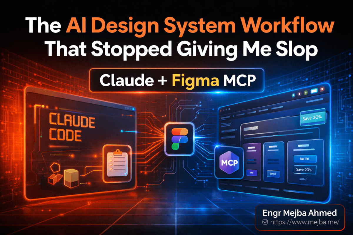
Impeccable Skill for Claude Code: I Tested It on My Site
I almost didn't install it. Another open-source Claude Code skill, another Tuesday, another GitHub repo promising it would fix the "AI looks like AI" problem. I'd seen this movie before. So I bookmarked it and went back to shipping.
Then I ran one command on my own portfolio.
impeccable critique returned a number I didn't want to see: 25 out of 40. Borderline AI slop. The skill pointed at five specific things — three of them were decisions I had personally made, defended in design reviews, and shipped with confidence. The other two were lazy defaults I had never noticed because I look at the same site every day.
That was the moment I stopped treating Impeccable as another skill in the directory and started treating it as a second pair of eyes. Over the next week I rebuilt sections of two projects with it, ran the craft interview from scratch on a fake SaaS landing page, and broke the alpha live mode about six different ways. This post is the honest report. What worked. What didn't. What I changed on my own site after the score came back ugly.
If you ship front-end code with Claude Code in 2026 and you've ever looked at a freshly generated landing page and thought "why does this look the same as every other AI output" — the answer is in the next 4,000 words.
What Impeccable Actually Is (Without the Marketing Spin)
Strip away the website copy and the Impeccable Claude Code skill is one thing: a folder of markdown files that loads into your Claude Code context and changes how the model thinks about front-end code.
That sounds boring until you read what's in the markdown.
Twenty-three commands. Seven domain-specific reference files — typography, color, spatial design, responsiveness, interactions, motion, and UX writing. A list of explicit "do not" rules baked into the model's working memory. The whole thing installs with one command and works inside Claude Code, Cursor, Gemini CLI, and Codex CLI. As of v1.5.1 (shipped March 17, 2026, currently sitting north of 10,000 GitHub stars), it covers the majority of the front-end design pipeline a solo builder or small product team would touch.
The author is Paul Bakaus. The accompanying site at impeccable.style hosts before/after galleries, docs, a Chrome extension, and a standalone CLI for scanning files outside an AI harness. There's marketing infrastructure around the project, but the core value lives in the skill itself. If you only install the skill and ignore everything else, you still get most of the benefit.
Here's the thing nobody else is saying clearly: this skill is fundamentally a vocabulary upgrade. Anthropic's own frontend-design skill (the one shipped with Claude Code) gives the model some design direction. Impeccable goes further by giving it words. Specific words. "Quieter." "Bolder." "Distill." "Polish." "Adapt." Each one is a command the model can execute against a component, with documented rules about what each word means visually.
Most AI design output looks the same because the model has no vocabulary for design direction. It can describe — "use a 16px font with a 1.5 line height" — but it can't direct — "make this section quieter so the CTA earns the eye." Impeccable installs that direction layer. That's the actual technical innovation.
The Anti-Pattern List That Made Me Quiet for Ten Minutes
Let me show you the thing that broke my brain when I first read the skill files.
Inside the repo, there's a list of explicit "DO NOT" rules. Things like: don't use gray text on colored backgrounds. Don't use the AI palette (cyan-on-dark, purple-to-blue gradients). Don't use pure black or pure white without slight tinting. Don't load three font families and only ship two. Don't decorate with clip-art mockups of phones. Don't bury the primary CTA inside a card with the same background as the surrounding section.
I sat there reading and thought: I have shipped every single one of these in the last six months.
Not because I don't know better. Because when I'm prompting Claude Code at 11 PM and I tell it to "build a hero section," the model gives me what its training data says a hero section looks like. The training data is the public internet. The public internet, as of 2026, is mostly Tailwind UI, Vercel templates, and AI-generated landing pages. The statistical center of that distribution is exactly the look Impeccable's anti-patterns describe.
Anthropic has a name for this — distributional convergence. The models reproduce the statistical center of design decisions because they were trained on the statistical center of design decisions. Impeccable's contribution isn't that it makes the model "smarter." It's that it pulls the model off-center by injecting opinionated constraints that no design committee on the public internet has ever agreed on.
That's a more important contribution than it sounds. Most "anti-slop" tools try to detect bad output after the fact. Impeccable prevents the output from happening in the first place by giving the model a different reference distribution. It's the difference between editing a draft and changing what gets drafted.
I'll walk you through the seven design pillars in a moment, but I want to plant a flag here: the anti-pattern list alone is worth installing the skill. Even if you never use a single command, having those rules in your Claude Code context will measurably change what the model ships.
The Seven Pillars (And Why They Matter More Than the Commands)
The 23 commands get most of the press, but the load-bearing structure of the skill is the seven reference files. Each one is a deep dive into a single design domain, and Claude pulls from them whenever it touches that area of the code.
Typography. Not "use Inter" — actual rules. Optical sizing across breakpoints. The relationship between body line-height and surrounding paragraph spacing. When to use display fonts versus when to scale up the body font. The skill's anti-references explicitly call out Inter overuse, which I appreciated because I was guilty of it on three of my four projects.
Color. This is where most AI output drowns. The reference file pushes for restraint, accent discipline, and tinted neutrals over pure black and pure white. There's a specific section on what the skill calls "decoration discipline" — color used for hierarchy, not for excitement. After running this on my site, I removed two gradient backgrounds and the page got dramatically more confident.
Spatial Design. Padding, margins, and the rhythm between sections. The reference file is opinionated about consistent vertical rhythm across breakpoints — a thing AI-generated layouts almost never get right because the training data is full of inconsistent spacing.
Responsiveness. Specific rules about how layouts should change, not just resize, between breakpoints. This is one of the pillars where Impeccable's output noticeably differs from default Claude Code generation.
Interactions. Hover states, focus rings, and what the skill calls "stateful surfaces." There's a quiet but important rule about hover states needing to do something meaningful, not just darken slightly. After reading it I went through my own site and realized seven of my buttons had hover states that did basically nothing.
Motion. A reference file with strong opinions on easing curves, duration ranges, and when motion is appropriate at all. The anti-pattern callouts are sharp here — bounce easing on serious products, parallax on dense content pages, and animation that exists for its own sake.
UX Writing. This one surprised me. The skill includes guidance on how button labels, error messages, and headlines should sound. Not just grammar — voice. There's a rule about avoiding "Click here" and "Learn more" as link text that I shipped to Claude Code as a decoration discipline rule and now refuse to merge code that violates it.
The pillars matter more than the commands because the commands are shorthand for invoking the rules in the pillars. When you type impeccable polish, the model is reading the typography, color, spatial, and interactions pillars at once and applying them to the selected component. Without the pillars, the commands would be just verbs.
The Greenfield Workflow — Running impeccable craft From Scratch
I tested this on a fake SaaS product called Lighthouse — a customer-feedback aggregation tool. New repo, fresh Claude Code session, no prior design context. I wanted to see what impeccable craft would do without any prior input shaping the output.
The command kicks off an interview. Around 13 questions, depending on how you answer the branching ones. The structure of the interview is the part nobody talks about, so let me walk through what it actually asks:
- Product type. App UI, marketing site, dashboard, editorial. The answer determines whether the skill runs in "brand" mode (design IS the product) or "product" mode (design SERVES the product).
- Audience. Who will use this. Not "everyone" — a specific persona with a specific job and a specific level of design literacy.
- Voice and tone. Confident, playful, restrained, technical. With sub-questions about whether the voice changes between different contexts (marketing vs. error messages, for example).
- Primary CTA. What's the single most important action the user takes. The interview pushes hard against vague answers — "sign up" gets a follow-up of "for what specifically."
- Visual scope. Light, dark, or both. Brand colors if any exist. Typography preferences with explicit warnings against generic choices.
- Anti-references. What you do NOT want it to look like. This was the smartest question. The skill asks you to name three competitor sites or aesthetic directions you want to actively avoid.
- Personality dimensions. Sliders along axes like "playful ↔ serious," "minimal ↔ maximal," "soft ↔ sharp." The output composition shifts based on where you land.
The interview takes between 5 and 8 minutes if you answer thoughtfully. At the end, the skill writes two files into your repo: product.markdown and design.md.
product.markdown carries the strategic layer — register, audience, voice, anti-references, design principles. The "who, what, why" of the product. design.md carries the visual layer — colors, typography, elevation, components, do's and don'ts, formatted in the same six-section structure Google Stitch popularized in 2025.
After those two files exist, every future Claude Code interaction reads them as context. That's where the real leverage compounds. You're not asking the model to design from scratch each time — you're asking it to extend a system that's already documented.
The Lighthouse Demo — First Pass, Then Three Variants
After the interview, I asked Claude Code (with the Impeccable skill loaded and the two new files in context) to build a landing page for Lighthouse. One prompt. No follow-ups.
The first pass was clean. Not exciting — but clean. A hero with a focused headline, a single primary CTA above the fold, a quiet feature grid, and a testimonial section that didn't shout. No glassmorphism. No purple gradient. Inter was nowhere in the file. The font was a serif display paired with a humanist sans, both choices that emerged from the interview answers about voice.
Then I ran the second command — impeccable variants — and asked for three layout directions: editorial, drenched, and brutalist.
The editorial variant looked like a long-form magazine article — full-bleed photography, drop caps in the headline, a sidebar pull-quote layout. The drenched variant pushed the brand color to occupy 70% of the visual field with high-contrast white type. The brutalist variant stripped decoration entirely — heavy black borders, raw HTML aesthetic, monospaced display type.
What surprised me wasn't that the variants were different. It was that they were legibly different. AI-generated variants usually look like the same design with three different color palettes. These actually committed to distinct aesthetic directions, the way a senior designer would commit when sketching options for a client.
The closest comparison I have is Google Stitch's variant generation, but Stitch operates inside its own canvas. Impeccable generates the same range of distinct directions but ships them as actual production code in your Claude Code workflow. That difference matters when the next step is "ship," not "screenshot."
I picked the drenched variant for Lighthouse and moved to live mode.
Live Mode — Where It Shines and Where It Stumbles
impeccable live is the alpha feature, and the alpha label is doing some work. Let me be honest about both halves.
The shine first. Live mode opens a browser session, loads your local dev server, and lets you select components directly in the rendered output. Click a hero. Run bolder. The hero gets visually heavier — more weight on the type, denser composition, deeper contrast. Click quieter. The opposite. Click distill. The component loses ornament and reduces to its core elements. Click polish. The model goes through and tightens spacing, alignment, and small visual rhythm issues without changing the structure.
There's a micro-variations mode that generates four or five small variations of the selected component side by side. You accept the one you want, reject the others, and the chosen variant gets written back to the file. This loop — select, vary, accept — is the closest thing I've used to real-time design iteration with an AI partner. When it works, it's genuinely fun.
The detect command runs the anti-pattern scanner against the live page and surfaces issues inline. On the Lighthouse demo, it caught a feature card with insufficient touch target size on mobile, a heading-skip from h1 to h3, and a CTA that was technically clickable but visually de-emphasized below a competing element. All three were real issues. None of them would have been caught by a standard linter.
Now the stumbles. Live mode is alpha, and it acts like it.
The browser session occasionally loses connection to the Claude Code process and you have to restart both. Component selection is finicky on pages with deeply nested DOM — you sometimes select a wrapper element when you wanted the visible card. The adapt command (which is supposed to translate a component into a different visual register) produced output twice that broke the existing layout, requiring a manual revert. And on one particularly long session, accepting a variant wrote the change to the wrong file in a monorepo and I lost about ten minutes recovering.
If you treat live mode as a working sketch tool — fast iteration, expect breakage, commit frequently — it's powerful. If you treat it as a finished feature, it will frustrate you. The author has been shipping fixes weekly, and the trajectory looks right, but as of late April 2026 it's still alpha.
The Mood-Board Trap — Why Detailed Prompts Beat Visual Inspiration
Here's a finding I didn't expect. Impeccable accepts mood-board input — you can drop in reference images and ask the skill to extract a visual direction from them. I tested this against detailed text prompts on the same project, twice.
The detailed text prompts won both times.
The reason is mechanical. When the skill ingests a mood board, it has to interpret the images and translate them into the same vocabulary the rest of the skill uses. That interpretation step adds noise. When you write the answer in words — "I want quiet typography, generous spacing, a single accent color, no decoration" — you skip the interpretation and the model executes against your direct intent.
Mood boards still work. They're not useless. But the people who get the best output from this skill are the people who can describe what they want in words. If your design vocabulary is weak, mood boards will fill the gap. If your design vocabulary is strong, words are faster and more accurate.
That trade-off has a useful implication: this skill is a vocabulary trainer. The more you use it, the better you get at describing design in words, and the better your outputs become. It's not just a tool — it's a practice.
Editing Existing Sites — Where I Got the 25/40 Score
Now let me get to the part that bruised my ego. I ran impeccable document on my own portfolio at mejba.me. This command reverse-engineers a design.md from an existing codebase, reading the actual styles, components, and patterns to produce a document that describes what the site currently is — not what you wish it were.
That document is brutal. It's an honest mirror.
Then I ran impeccable critique. The skill returned a design health score of 25 out of 40. The cutoff for "borderline AI slop" is 26. I was one point under.
Specific issues it flagged:
- Cognitive load on the home page. Three competing visual emphases above the fold. The eye didn't know where to go first. I'd defended this in design reviews as "rich" — the skill called it "scattered."
- Visual hierarchy on the blog index. Post titles and meta information had insufficient size contrast. I shipped this with custom CSS that I was proud of. The skill correctly identified that pride of authorship was overriding clarity.
- Ambiguous CTAs. Three buttons in the header, none of them clearly the primary action. The model called this out and recommended demoting two to text links.
- Glassmorphism overuse. Two cards on the project page used backdrop-blur effects with no functional reason. I had added them because they "looked modern." They looked modern in 2022.
- Unused fonts loaded. The page loaded three font families. Two were used. One was a leftover from a previous iteration that I never removed. Pure waste, both visually and on page weight.
I didn't fix all five at once. I picked the two that mattered most — the cognitive load issue and the ambiguous CTAs — and rebuilt the home page hero with impeccable craft running on a fresh interview answer set. Re-ran critique. The new score was 32 out of 40. Solid, not perfect.
The honest takeaway: the score isn't the point. The point is that the skill identifies specific, actionable issues with reasoning attached, and the issues are usually right. I've stopped trusting my own taste on layouts I've stared at for too long. I run critique instead.
decoration discipline and delight — The Two Commands Nobody Talks About
The widely-discussed commands are craft, polish, live, and critique. The two that quietly changed how I write CSS are decoration discipline and delight.
decoration discipline audits a component or page for unnecessary visual decoration. Every shadow, gradient, border, rounded corner, and color flourish gets evaluated against the question: "does this earn its place." Things that don't get removed. The output is usually 30-40% leaner than the input. Confident. Restrained. The kind of design that makes the user think "this is the best version of this product" rather than "this is a fancy product."
delight does the opposite. After a section has been disciplined, you run delight to add personality back in — but specifically, only in moments where it serves the user. A hover state that does something unexpected. An empty state with character. A loading skeleton that doesn't apologize for the load time. The skill's rules for delight are explicit: never decorative, always functional, always rare.
The order matters. Discipline first, delight second. If you delight before disciplining, the personality gets buried under noise. If you discipline without delighting, the result is competent but cold. The two commands are a pair, and most tutorials I've seen treat them as separate.
This is the kind of nuance that makes me think the skill was built by someone who has actually shipped product, not just written about design. Other Claude Code skills worth installing tend to focus on workflow speed; Impeccable focuses on craft.
Common Findings Across Five Sites I Tested
After the Lighthouse demo and my own site, I ran the skill against four more codebases — two client projects (with permission), one open-source repo I contribute to, and one Vercel-template-derived starter. Five sites total, including my own.
Some findings repeated across every single one:
- Clip-art mockups of phones or laptops in the hero section. Four out of five sites had this. The skill flags it because it adds visual complexity without communicating anything about the actual product.
- Glassmorphism overuse. Three out of five. Backdrop-blur on cards, on modals, on overlays. The skill recommends using glassmorphism only when it serves the meaning of the surface — a floating tooltip, a hover panel — never as decoration.
- Unused fonts loaded. All five sites had at least one font family loaded but unused on the rendered page. This is a page-weight issue and a visual coherence issue at the same time.
- Missing personal branding. Four out of five had no distinctive visual signature. They could have been any product in their category. The skill's
craftworkflow specifically pushes against this by asking for anti-references — what you do NOT want to look like — which forces differentiation. - CTAs that compete with each other. Every single site had at least two CTAs of equal visual weight on the home page. The skill consistently flags this and recommends a clear primary, secondary, and tertiary hierarchy.
If you're building or maintaining a front-end codebase right now and you want to know what an outside reviewer would catch, those are the five things to look for first. You don't even need the skill to find them — you need someone willing to be honest with you about what's actually on the page.
The Limitations I Should Be Honest About
I've been positive throughout this post and the skill earned it. But there are real limits.
It works best on Western, modernist design conventions. The training data and reference files lean heavily on a specific aesthetic tradition — clean type, generous space, restrained color, minimal ornament. If your project requires a different visual tradition (highly ornamental, culturally specific, or deliberately maximalist), the skill will push back. Sometimes that pushback is right. Sometimes it isn't. You have to know when to override it.
It cannot replace design judgment on novel decisions. The skill is excellent at applying known design principles to executed work. It's less good at originating a visual direction nobody has tried before. If you're building something genuinely new, the skill helps you ship a clean version of it, but the spark has to come from you.
Live mode is alpha. I covered this above, but it deserves restating. If you adopt this skill expecting live mode to work flawlessly, you will hit walls. The non-live commands are stable and excellent. Live mode is a preview of where the project is going.
It increases context usage. Loading 23 commands and 7 reference files into a Claude Code session uses more context than running without the skill. On large codebases this matters. I've started using impeccable selectively — loaded for design-focused sessions, unloaded for refactor sessions — to keep context spending balanced.
The Chrome extension and CLI are nice but optional. The companion site at impeccable.style ships supporting tools, but the core value is the skill itself. Don't get distracted by the surrounding infrastructure. Install the skill, run craft, run critique, ship better front-ends. Everything else is a bonus.
What I'd Recommend Doing in the Next Hour
If you've read this far, you have enough context to make a real decision. Here's what I would do if I were sitting next to you right now.
Open your terminal. Navigate to a side project — not your most important one, a project where you can experiment without consequence. Install the skill with npx skills add pbakaus/impeccable. Run impeccable document on the existing codebase. Read the output without defending yourself.
Then run impeccable critique. Get the score.
Whatever the score is, pick the single highest-impact issue from the list and fix it with the skill loaded in your Claude Code session. One issue. Don't try to fix everything. Ship the fix, run critique again, and notice how the score moved.
That's the loop. The first time through it takes an hour. After that it takes ten minutes. Within a week you'll have internalized enough of the skill's vocabulary that you start writing better front-end code with or without it loaded.
That's the second-order benefit nobody mentions in the marketing — using this skill makes you a better designer, not just a better prompter. The vocabulary transfers. The anti-pattern awareness transfers. The discipline-then-delight rhythm transfers.
I started this post saying I almost didn't install it. I'm ending it saying it's the second skill I load in any new Claude Code project, right after my agent definitions. The first time you watch a critique score move from 25 to 32 because you actually fixed the right things, you'll understand why.
If you're building front-end work with AI in 2026 and you're not running anti-pattern detection on your output, you are shipping the same landing page as everyone else. The skill is free. The install takes thirty seconds. The hour you spend running it through your existing codebase is the highest-leverage hour you'll have this month.
What's on your screen right now would probably score under 30. Mine did. The next move is yours.
Let's Work Together
Looking to build AI systems, automate workflows, or scale your tech infrastructure? I'd love to help.
- Fiverr (custom builds & integrations): fiverr.com/s/EgxYmWD
- Portfolio: mejba.me
- Ramlit Limited (enterprise solutions): ramlit.com
- ColorPark (design & branding): colorpark.io
- xCyberSecurity (security services): xcybersecurity.io