Most AI design tool roundups are written the same way: install the free trial, run the demo project, screenshot the output, publish. I know because an earlier version of this post leaned that direction too, and it deserved to be replaced. This version has a stricter filter. Every tool below earned its slot on one specific production job — the token-driven redesign of this blog, shipped across every surface of the site — and I can show you the receipts, down to the contrast ratios in the commit message.
That redesign is my testbed for a simple reason: it was real work with real constraints. Templates written over several years, some predating the light theme entirely with no dark-mode pairs at all. A brand green that turns out to be a typography trap. Shared partials that leak styling between contexts. If an AI tool survives that, it works. If it only survives a demo, it is content marketing.
The job the tools had to do
To judge the tools, you need the shape of the work. The redesign rebuilt the blog on a semantic CSS custom-property ramp — a --blog-* token set for surfaces, ink, lines, and interactive states, defined once in :root and .dark, and exposed to Tailwind through the rgb(var(--x) / <alpha-value>) pattern so one set of utility classes renders correctly in both themes. Type sits on a fluid clamp() scale anchored at 390, 768, and 1440 pixels. Contrast was measured, not assumed: body copy targets AAA, everything else AA.
The detail I keep retelling because it justifies the whole "measured, not assumed" rule: my brand green carries white text at a contrast ratio of 1.9:1. Unusable. So the system needed a dedicated --blog-on-link token whose value flips per theme — near-canvas ink on the brand fill in dark mode, landing at 10.0:1 — because a hardcoded text color could never be right in both themes. No amount of eyeballing screenshots finds that. Instruments find that.
Here are the eight tools that did the finding, the building, and the checking.
1. Claude Code — the workbench everything else plugs into
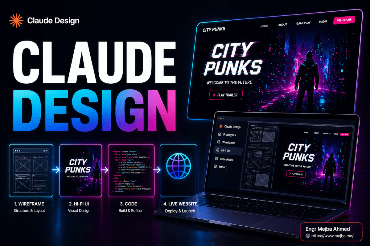
Claude Code is not a design tool in the Dribbble sense, and that is exactly why it leads this list. It is where the redesign actually happened: reading the old Blade templates, proposing the token ramp, converting index, category, tag, search, and single-post views to it, and refactoring shared components without breaking the surfaces that consumed them. The design work and the implementation work stopped being separate phases — every aesthetic decision was made in the same session that shipped it. Everything else on this list is a peripheral attached to this workbench, mostly through skills and MCP servers. My broader case for it as a design tool is in Claude Code as a UI designer.
2. The impeccable skill — design review with a checklist that bites
Skills are packaged instruction sets Claude Code loads for a specific kind of task, and impeccable is the one I run before any interface work ships. It is a structured design-review pass: hierarchy, spacing, accessibility, focus states, tap targets, responsive behavior, error states. On the redesign, the review passes are why the rebuilt subscribe CTA shipped with a real 44px tap target and a visible focus ring instead of the decorative-but-untouchable button it replaced, and why the pagination partial's 1.79:1 light-mode links got caught — a partial shared with the forum shell, which is hardcoded dark, silently poisoning its other consumer. I wrote up the skill in detail in my impeccable design skill review. The honest framing: it does not make you a designer. It makes you a designer who stops forgetting things.
3. The frontend-design skill — direction, not decoration
The second skill in my permanent rotation exists to fight the strongest gravitational pull in AI-generated UI: the templated look. Same border radius, same shadow recipe, same gradient hero every model reaches for by default. The frontend-design skill front-loads intentional aesthetic direction — typography choices, color logic, what makes this design this design — before any code gets written. On the redesign it is the difference between "a clean blog" and a blog whose type scale, ink ramp, and brand behavior feel decided rather than defaulted. If your AI-assisted interfaces all look vaguely alike, this category of tool is the missing piece.
4. Figma MCP — the design file finally talks to the code
The official Figma MCP server gives Claude structured access to design files: real component context, tokens, and layout data instead of a screenshot to squint at. In my workflow it runs in both directions — pulling design context into code when implementing, and pushing shipped decisions back into the design system so the file does not drift from production. It matters most at the boundaries where handoff used to live; my full setup is in the Claude Code Figma MCP workflow. The one-line verdict after months of use: it converts "implement this design" from an interpretation exercise into a data transfer.
5. Chrome DevTools MCP — where "measured, not assumed" happens
This is the tool behind every number in this post. The Chrome DevTools MCP server lets Claude drive a real browser — inspect computed styles, run accessibility and contrast audits, read actual rendered dimensions. Two concrete catches from the redesign: the contrast ratios (the 1.9:1 brand-green problem and the 10.0:1 fix were measured values, not guesses), and my favorite bug of the entire project — three article-metric icons styled with w-4.5, a Tailwind class that does not exist because Tailwind has no 4.5 spacing step. They were silently rendering at 34px inside 36px tiles, off by one pixel per side, forever. You do not find a bug like that by looking at the page. You find it by having the tooling read the computed layout and compare it to the intent. That loop — AI writes the CSS, AI verifies the render — is the single biggest workflow upgrade on this list.
6. Playwright — responsive truth at three widths
The type scale is anchored at 390, 768, and 1440 for a reason: those are the widths I verify at, every time, using Playwright driven from Claude Code. Screenshot the surface at each anchor, compare against the previous state, catch the overflow. It was exactly this kind of pass that surfaced a site-wide tablet header overflow bug I had shipped long before the redesign and never noticed, because I personally browse on a laptop and a phone and tablets were nobody's job. Automated width verification makes them somebody's job. If you take one process change from this article: never accept an AI-built layout from the code alone — make the same agent open it and look.
7. Canva connector — production graphics without the tab dance
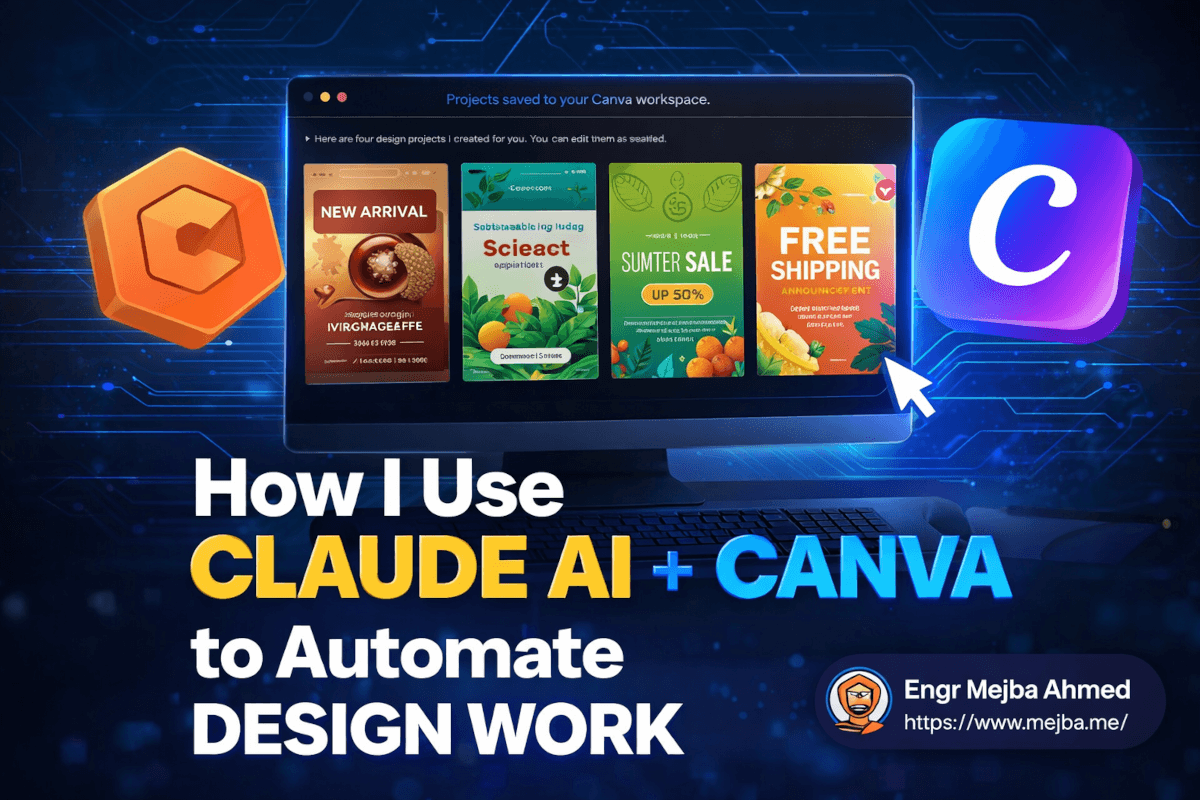
Design work does not end at the interface; every article and launch needs social assets, and the Claude-Canva connector moved that production into the same conversation where the content gets written. Brand kit colors and fonts apply automatically; carousels and promo graphics come out as editable Canva designs rather than flat images. It has real limits — brand-kit graphics retrieval is unreliable and final typography still happens by hand — and I documented both the wins and the failure modes honestly in my Claude + Canva workflow test. It earns slot seven because it deleted an entire category of context switching from my week.
8. Higgsfield — imagery that is not stock
The last slot goes to generation. Higgsfield is my current pick for produced imagery — blog art, video thumbnails, campaign visuals — because it is wired into my Claude workspace as a connector, which means image generation happens inside the same pipeline as everything above instead of in a separate app with a separate prompt box. The workflow that sold me is documented in my Higgsfield video production pipeline. A camera-honest note: generated imagery is a concept-and-illustration tool. Product screenshots, real UI, and anything factual still get captured, not generated.
What fell off the list, and the pattern behind it
The earlier version of this article recommended tools I had not shipped anything with, and rewriting it forced a useful audit. The ones that fell off shared a trait: each was a destination — another app demanding I come to it, learn it, and export from it. The eight that survived share the opposite trait: they are all peripherals of one workbench. Skills load into the session. MCP servers answer queries from the session. Connectors act inside the session. The design system, the verification, the assets — one pipeline, one context.
That is my actual thesis about AI design tooling after shipping a redesign with it, and it is a filter you can apply to whatever launches next week: do not ask "is this tool impressive?" Ask "does this plug into where my work already happens, and can it prove its output with measurements rather than screenshots?" Tools that pass both questions are rare. All eight above do.
So ask it of your own stack: does your design system survive being generated against, or does it only survive being looked at? Design systems built, audited, or rescued with the tools above are core service work I take on.