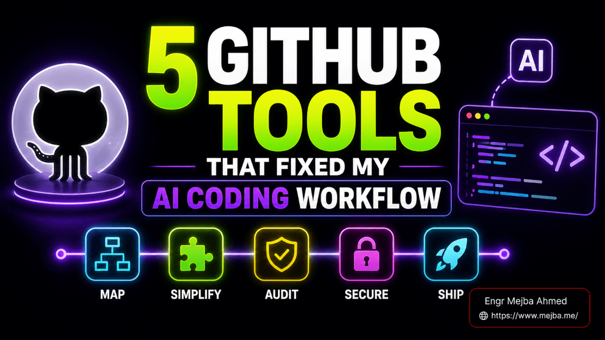
Claude Skills für Designer: Mein kompletter Workflow
Vor drei Wochen habe ich zugesehen, wie ein befreundeter Designer 45 Minuten lang mit Claude darüber gestritten hat, warum die Button-Hover-Status wie jede andere KI-generierte Landingpage im Internet aussahen. Lila Farbverläufe. Abgerundete Karten mit Schlagschatten. Inter-Schriftart bei 16 Pixel. Die ganze leblose, aussergewöhnliche Ästhetik, die dazu führt, dass Sie den Tab schließen, bevor die Seite überhaupt geladen ist.
Ich sagte ihm, er solle aufhören. Habe ein anderes Claude-Projekt auf meinem Laptop geöffnet. Eine Zeile getippt. Die zurückgegebene Ausgabe hatte absichtliche Abstände, eine zurückhaltende Farbpalette, Typografie mit echter Persönlichkeit und Hover-Animationen, die eher durchdacht als standardmäßig wirkten. Derselbe Claude. Völlig anderes Ergebnis.
Der Unterschied war kein besserer Hinweis. Es war eine Fähigkeit.
Nicht die Art von Fähigkeiten, die man sich im Laufe jahrelanger Übung aneignet – obwohl das auch wichtig ist. Ich spreche von Claudes Skills-Funktion, einem System, von dem die meisten Leute entweder nicht wissen, dass es existiert, oder das sie nur als eine weitere Plugin-Spielerei abgeschrieben haben. Ich habe fast das Gleiche getan. Ich habe mich geirrt, und die letzten Wochen, in denen ich diese Funktion auseinandergenommen habe, haben meine Herangehensweise an die Designarbeit als Entwickler, der echte Produkte liefert, grundlegend verändert.
Es gibt einen Grund, warum diese Funktion unter dem Radar bleibt, und das hat nichts mit der Leistungsfähigkeit zu tun. Ich komme dazu. Aber zuerst müssen Sie verstehen, was hinter einer Fähigkeit steckt – denn es ist nicht das, was Sie denken.
Was Claude-Fähigkeiten eigentlich sind (und warum „Plugin“ das falsche Wort ist)
Die meisten Leute hören „Fähigkeit“ und denken an eine Browsererweiterung. Etwas, das Sie einschalten und das eine Schaltfläche oder eine Menüoption hinzufügt. Dieses mentale Modell ist völlig falsch und das ist der Grund, warum so viele Entwickler einen Skill installieren, eine Eingabeaufforderung ausführen, ein mittelmäßiges Ergebnis erzielen und dann weitermachen.
Eine Fertigkeit ist ein strukturierter Satz von Anweisungen, Ressourcen und Einschränkungen, die die Art und Weise, wie Claude über eine bestimmte Art von Aufgabe denkt, neu definieren. Nicht nur, was es ausgibt, sondern auch, wie es über das Problem nachdenkt, bevor es etwas generiert.
Stellen Sie es sich so vor. Wenn Sie Vanilla Claude bitten, „einen Landing-Page-Hero-Bereich zu erstellen“, greift es auf seine allgemeinen Trainingsdaten zurück, ruft Muster aus Millionen von Websites ab und berechnet daraus den Durchschnitt. Das Ergebnis ist kompetent. Es ist auch generisch. Es sieht so aus, wie die KI denkt, dass eine Website aussehen sollte, denn das ist es im wahrsten Sinne des Wortes – ein statistischer Durchschnitt des Webdesigns.
Eine Fähigkeit fängt diesen Prozess ab. Bevor Claude eine einzige Codezeile schreibt, durchläuft dieser Skill ein Design-Thinking-Framework. Zweck – was soll diese Komponente eigentlich erreichen? Ton – welche Emotion soll das hervorrufen? Einschränkungen – wie sollte dies ausdrücklich NICHT aussehen? Differenzierung – was unterscheidet dies von den fünfzehntausend anderen Heldenbereichen im Internet?Das ist ein grundlegend anderer Ausgangspunkt. Und die Ausgabe spiegelt es wider.
Die Front-End-Designfähigkeit, die ich verwendet habe, enthält detaillierte ästhetische Richtlinien zu Typografiehierarchien, Prinzipien der Farbtheorie, Einschränkungen des Bewegungsdesigns und Regeln für die räumliche Komposition. Es gibt auch explizite Anti-Muster. Keine Farbverläufe von Lila zu Blau, es sei denn, es gibt einen echten Markengrund. Keine Karten mit identischen Randradius- und Schattenwerten, die in jeder Komponente wiederholt werden. Keine Standardeinstellung auf Inter- oder Systemschriftarten, wenn das Projekt etwas mit Charakter erfordert.
Ich las die vollständige Definition der Fertigkeit durch – es handelt sich im Grunde genommen um eine Markdown-Datei mit strukturierten Abschnitten – und merkte, dass ich über Richtlinien nickte, die ich normalerweise nur im persönlichen Styleguide eines leitenden Designers sehen würde. Wer auch immer diese Fähigkeit entwickelt hat, hat etwas Wichtiges verstanden: Das Problem bei der KI-Designausgabe ist nicht die Fähigkeit, sondern der Geschmack. Fähigkeiten verleihen dem Prozess Geschmack.
Aber hier ist, was mich am meisten überrascht hat. Die Fähigkeit wirkt sich nicht nur auf die visuelle Ausgabe aus. Es verändert Claudes gesamten Problemlösungsansatz für Designaufgaben. Bitten Sie es, bei aktivem Skill eine Preistabelle zu erstellen, und stellen Sie klärende Fragen zu Conversion-Zielen, bevor Sie sich mit dem Layout befassen. Fragen Sie es ohne die Fertigkeit, und Sie erhalten ein dreispaltiges Raster mit Häkchen. Gleiches Werkzeug, radikal anderes Denken.
Diese Unterscheidung ist es, die es wert ist, auf Fähigkeiten zu achten. Und es gibt sechs davon, die für die Designarbeit von Bedeutung sind – jede löst ein anderes Problem, auf das ich in den letzten zwei Jahren beim Bau von Produkten immer wieder gestoßen bin.
Die Front-End-Design-Fähigkeit: Wo sich für mich alles verändert hat
Ich muss genau sagen, was diese Fähigkeit in meinem Arbeitsablauf behoben hat, da „bessere Designausgabe“ zu vage ist, um nützlich zu sein.
Bevor ich anfing, die Front-End-Design-Fähigkeit zu nutzen, sah mein Prozess zum Erstellen von UI-Komponenten mit Claude so aus: Eingabeaufforderung, Ausgabe erhalten, sofort mit dem Neuschreiben von 60 % des CSS beginnen, weil sich die Abstände falsch anfühlten und die Typografiehierarchie flach war. Jede Komponente sah aus wie eine Bootstrap-Demoseite aus dem Jahr 2019. Funktional, klar. Aber ästhetisch gesehen tot bei der Ankunft.
An meinem typischen Freitagnachmittag würde ich ein Kunden-Dashboard für ein Ramlit-Projekt erstellen. Ich würde Claude um eine Statistikübersichtskarte bitten, etwas besorgen, das technisch funktioniert, und dann zwanzig Minuten damit verbringen, die Füllwerte manuell anzupassen, die Schriftstärke zu ändern, subtile Hintergrundtexturen hinzuzufügen und die Farbbeziehungen zu überarbeiten, damit die Hierarchie das Auge tatsächlich an eine sinnvolle Stelle führt.Wenn die Fertigkeit „Front-End-Design“ aktiv ist, erzeugt dieselbe Statistikkarten-Eingabeaufforderung eine Ausgabe, bei der der Abstand bereits einen Rhythmus hat. Die Typografie nutzt Gewichts- und Größenkontraste, um eine klare visuelle Hierarchie zu schaffen. Die Farbpalette weist bewusste Beziehungen auf – nicht nur „primäres Blau und Grau“, sondern auch durchdachte Kombinationen, bei denen Akzentfarben einen funktionalen Zweck erfüllen.
Ich habe es zeitlich festgelegt. Gleiche Komponente, gleicher Detaillierungsgrad der Eingabeaufforderung. Ohne das nötige Fachwissen: 35 Minuten von der Eingabeaufforderung bis zur Produktionsreife. Mit der Fähigkeit: 12 Minuten, und der größte Teil davon bestand darin, die Ausgabe zu überprüfen, anstatt sie neu zu schreiben.
Das ist keine marginale Verbesserung. Das ist eine Workflow-Transformation.
Hier ist ein konkretes Beispiel. Ich habe Claude aufgefordert, ein Dropdown-Menü für das Benachrichtigungscenter zu erstellen – die Art, die Sie sehen, wenn Sie in einer SaaS-App auf das Glockensymbol klicken. Ohne diese Fertigkeit erhielt ich eine Standardliste mit blauen Punkten für ungelesene Elemente, grauem Text für Zeitstempel und identischem Abstand für jedes Element. Mit der Fertigkeit umfasste die Ausgabe subtile Unterschiede in der Hintergrundtönung zwischen gelesenen und ungelesenen Zuständen, Mikrointeraktionen beim Schweben mithilfe von CSS-Übergängen mit geeigneten Beschleunigungskurven, gruppierte Benachrichtigungen nach Zeiträumen mit schlanken Abschnittstrennern und einen Vorschlag für eine leere Zustandsdarstellung statt nur einer Textnachricht.
Die Fähigkeit hat es nicht nur hübscher gemacht. Es brachte die Komponente dazu, über die Benutzererfahrung nachzudenken, bevor ich es tun musste.
Eines möchte ich jedoch ehrlich sagen. Die Fähigkeit eliminiert nicht das Design-Urteil. Dadurch entfällt das mühsame Problem, bei Null anzufangen. Sie müssen immer noch wissen, wann die Ausgabe das Ziel verfehlt. Ich hatte die Fähigkeit, Komponenten zu erstellen, bei denen das Bewegungsdesign für einen professionellen Dashboard-Kontext zu aggressiv war – federnde Animationen, die auf einer Marketing-Website funktionieren, sich aber in einem Unternehmenstool störend anfühlen. Das zu erkennen und es zurückzunehmen, erfordert immer noch Ihren eigenen Geschmack.
Die Fähigkeit erhöht den Boden dramatisch. Die Decke liegt immer noch bei Ihnen. Das ist eigentlich der richtige Kompromiss.
Figma-Integration: Die Brücke, von der ich nicht wusste, dass ich sie brauche
Ich entwerfe in Figma. Ich baue Code ein. Die Kluft zwischen diesen beiden Welten hat mehr Stunden verschwendet, als ich zugeben möchte.
Mein alter Arbeitsablauf lief folgendermaßen ab: Entwerfen Sie eine Komponente in Figma, überprüfen Sie manuell jeden Abstandswert, kopieren Sie Hex-Codes in benutzerdefinierte CSS-Eigenschaften, approximieren Sie den Typografiemaßstab, bauen Sie ihn in Code ein, vergleichen Sie nebeneinander, bemerken Sie zwölf Abweichungen, beheben Sie sie nacheinander, wiederholen Sie den Vorgang. Bei einer komplexen Seite kann dieser Übersetzungsprozess einen ganzen Nachmittag in Anspruch nehmen.
Die Figma-Integrationsfertigkeit verändert die Physik völlig. Und ich meine nicht, dass es irgendwie hilft. Ich meine, es strukturiert die gesamte Figma-zu-Code-Pipeline in etwas um, das tatsächlich funktioniert.Hier ist der Arbeitsablauf. Sie fügen eine Figma-URL in Claude ein. Der Skill analysiert den Dateischlüssel und die Knoten-ID dieser URL. Es kontaktiert den Figma MCP-Server – das ist die Model Context Protocol-Verbindung, die Claude direkten Zugriff auf die Datenschicht von Figma ermöglicht. Es ruft den gesamten Designkontext ab: Ebenen, Komponenten, Stile, Varianten, automatische Layout-Konfigurationen, alles. Anschließend erstellt es einen Screenshot des Designs als visuelle Referenz, lädt alle Assets (Symbole, Bilder, Illustrationen) herunter und generiert Code, der den Konventionen Ihres Projekts entspricht.
Aber der Teil, der mich tatsächlich dazu gebracht hat, diesem Tool zu vertrauen, ist die Validierungscheckliste, die es nach der Codegenerierung ausführt. Layoutgenauigkeit im Vergleich zur Figma-Quelle. Passende Typografie – nicht nur die Schriftfamilie, sondern auch Stärke, Größe, Zeilenhöhe und Buchstabenabstand. Farbtreue bis zum Hex-Wert. Interaktive Zustände für Schaltflächen, Eingaben und Links. Reaktionsfähigkeit über Haltepunkte hinweg. Barrierefreiheitsattribute einschließlich ARIA-Beschriftungen und Tastaturnavigation.
Ich habe dies mit einer mäßig komplexen Komponente getestet – einem mehrstufigen Formularassistenten mit Fortschrittsanzeigen, bedingten Feldern und Inline-Validierungsnachrichten. Die Art von Komponente, bei der die Übersetzung von Figma in Code normalerweise Dutzende kleiner Unstimmigkeiten mit sich bringt, die zu einem optisch inkonsistenten Ergebnis führen.
Der Skill hat beim ersten Durchgang etwa 85 % davon richtig gemacht. Bei den restlichen 15 % handelte es sich hauptsächlich um Randfälle, bei denen es darum ging, wie das automatische Layout von Figma in die CSS-Flexbox übersetzt wird, wenn Sie verschachtelte Gruppen mit gemischten Abstandsmodi haben. Ich musste ein paar Lückenwerte anpassen und einen Fall, bei dem eine prozentuale Breite in Figma zu einem calc()-Ausdruck in CSS werden musste.
85-prozentige Genauigkeit beim ersten Durchgang. Für ein komplexes Bauteil. Das ist nicht perfekt, aber es hat aus einem vierstündigen Übersetzungsauftrag einen vierzigminütigen Verfeinerungsauftrag gemacht. Ich werde diesen Handel jedes Mal eingehen.
Eine Anforderung, die es wert ist, erwähnt zu werden: Für diesen Skill muss der Figma MCP-Server verbunden sein. Wenn Sie Claude Code bereits mit MCP-Integrationen für andere Tools verwenden, ist das Hinzufügen von Figma unkompliziert – es handelt sich um eine Konfigurationsergänzung zu Ihren MCP-Einstellungen. Wenn Sie noch nie einen MCP-Server eingerichtet haben, müssen Sie zwar etwas lernen, es handelt sich jedoch um einmalige Einrichtungskosten, die sich anschließend bei jedem Projekt auszahlen.
Die Figma-Fähigkeit ist die praktischste Designfähigkeit für Entwickler, die mit Designern zusammenarbeiten. Wenn Sie in diesem gesamten Beitrag nur eine Fertigkeit eingerichtet haben, machen Sie es zu dieser. Aber lassen Sie sich nicht überraschen, was als nächstes kommt – die Theme Factory löst ein ganz anderes Problem, eines, das Sie gleich zu Beginn eines Projekts trifft, wenn Sie auf eine leere Leinwand starren.
Theme Factory: Zehn Ansatzpunkte, die nicht nach KI aussehenDie visuelle Identität eines neuen Projekts von Grund auf neu zu gestalten, gehört zu den Aufgaben, die scheinbar einfach sein sollten. Wählen Sie einige Farben aus. Wählen Sie eine Schriftart. Legen Sie einige Abstandswerte fest. Wie schwer kann es sein?
Es stellt sich heraus, dass es sehr schwierig ist, wenn das Ergebnis zusammenhängend und nicht zufällig zusammengesetzt aussehen soll. Allein die Farbtheorie ist tiefgreifend genug, um eine Woche Forschung zu verschlingen. Welches Blau? Welcher Akzent ergänzt es, ohne zu konkurrieren? Wie halten Sie die Kontrastverhältnisse zwischen hellen und dunklen Modi aufrecht und sorgen gleichzeitig dafür, dass sich die Farbpalette gewollt anfühlt?
Der Theme Factory-Skill wird mit zehn vorgefertigten professionellen Themes geliefert. Jede enthält kuratierte Farbpaletten (nicht nur primäre/sekundäre/Akzent-Farbpaletten, sondern vollständige semantische Token-Sets, die Oberflächen, Rahmen, Textzustände und interaktive Elemente abdecken), Schriftartenpaare, die tatsächlich zusammenarbeiten, und Abstandsskalen, die den visuellen Rhythmus aufrechterhalten.
Ich war skeptisch. Zehn Themen klangen einschränkend. Dann habe ich sie tatsächlich angeschaut.
Dies sind nicht die Art von Themes, die man auf einem WordPress-Marktplatz findet – sie sind überlastet und versuchen, für jeden alles zu bieten. Es handelt sich eher um Startpositionen in einem Spektrum. Eine davon ist warm und redaktionell und basiert auf Serifentypografie und gedämpften Erdtönen. Eine andere ist klinisch und präzise und kombiniert eine geometrische serifenlose Schrift mit kontrastreichen Schwarz- und Weißtönen und einem einzelnen Neonakzent. Ein dritter wirkt verspielt, ohne kindisch zu wirken, verwendet abgerundete Schriftarten und eine Farbpalette, die in Richtung Blaugrün und Koralle tendiert.
Ich begann damit, Theme Factory als schnelles Erkundungstool beim Projektstart zu verwenden. Anstatt einen halben Tag damit zu verbringen, Moodboards zu erstellen und Schriftartenkombinationen zu testen, gehe ich drei oder vier Themen durch, die zur Branche und Markenpersönlichkeit des Kunden passen. Innerhalb von zwanzig Minuten muss ich konkrete visuelle Anweisungen präsentieren – keine abstrakten Moodboards, sondern tatsächliche Farb- und Schriftsysteme, die auf echte UI-Komponenten angewendet werden.
Für einen aktuellen Ramlit-Kunden – ein Fintech-Startup, das sich an Kleinunternehmer richtet – habe ich das redaktionelle Thema als Ausgangspunkt genommen, die Serifenkopfzeilen gegen eine humanistische serifenlose Schrift ausgetauscht, um zugänglicher zu wirken, habe die Farbpalette um zwei Stufen wärmer verschoben und hatte in weniger als einer Stunde ein komplettes Design-Token-Set zur Implementierung bereit. Eine Stunde. Für die Grundlage der visuellen Identität eines gesamten Produkts.
Die Themen gelten auch über die UI-Arbeit hinaus. Ich habe sie für Pitchdecks, interne Dashboards und Berichtsvorlagen verwendet. Die Schriftart- und Farbempfehlungen lassen sich medienübergreifend übertragen, da sie auf Designprinzipien und nicht auf plattformspezifischen Einschränkungen basieren.Achtung: Die Themen sind gute Ausgangspunkte, keine fertigen Produkte. Wenn Sie eines direkt und ohne Anpassung anwenden, sieht Ihr Projekt ausgefeilt, aber generisch aus – nur eine andere generische Variante als die Standard-KI-Ausgabe. Der Wert liegt in der Beschleunigung. Sie beginnen mit etwas Überlegtem und nicht mit etwas Zufälligem, und dieser Vorsprung wirkt sich auf jede Designentscheidung aus, die Sie später treffen.
Markenrichtlinien-Fähigkeit: Konsistenz ohne Design-Systemmanager
Hier ist ein Problem, auf das ich bei fast jedem Projekt unter fünf Leuten gestoßen bin: Jemand legt früh eine Markenpalette und Typografie fest, und innerhalb von drei Monaten weist die Codebasis siebzehn leicht unterschiedliche Blautöne und vier Schriftgrößen auf, die nicht in der Originalspezifikation enthalten sind.
Das liegt daran, dass Menschen sich die genauen Werte schlecht merken können. Sie bauen eine neue Komponente, Sie benötigen das sekundäre Blau der Marke, Sie betrachten es, anstatt den Hex-Code nachzuschlagen, und jetzt haben Sie #2563EB neben dem tatsächlichen Markenwert von #2564EA eingeführt. Für das Auge unsichtbar auf jeder einzelnen Komponente. Schmerzlich offensichtlich, wenn die gesamte Benutzeroberfläche auf dem Bildschirm angezeigt wird.
Die Fertigkeit „Markenrichtlinien“ ist im Wesentlichen ein Leitplankensystem. Sie geben Ihre Markentokens ein – Hexadezimalcodes, Schriftartenstapel, Abstandswerte, Logo-Nutzungsregeln, sogar Tonrichtlinien für die Mikrokopie – und der Skill setzt sie bei allen Design- und Codegenerierungsaufgaben durch.
Ich habe dies für mein eigenes Marken-Ökosystem eingerichtet. mejba.me, Ramlit, ColorPark, xCyberSecurity – jedes hat unterschiedliche Farben, Typografie und Stimme. Vor dem Skill „Markenrichtlinien“ habe ich mich dabei ertappt, dass ich versehentlich die Akzentfarbe von mejba.me in einer Ramlit-Komponente verwendet habe, weil ich projektübergreifend gearbeitet habe und mein visuelles Gedächtnis sie zusammengeführt hat.
Wenn die Fertigkeit aktiv ist, verweist Claude automatisch auf die richtigen Markentokens. Ich bitte darum, eine Kartenkomponente für ein Ramlit-Dashboard zu erstellen, und die Ausgabe verwendet die genauen Hexadezimalwerte von Ramlit, den Schriftartenstapel von Ramlit und die Abstandsskala von Ramlit. Kein Beäugen. Keine Kreuzkontamination.
Für kleine Teams – und ehrlich gesagt für Einzelentwickler, die mehrere Marken verwalten – ist dies die Funktion, die die langsame visuelle Entropie verhindert, die Produkte mit der Zeit immer inkonsistenter aussehen lässt. Große Unternehmen lösen dieses Problem mit speziellen Design-Systemmanagern und ausgefeilten Token-Bibliotheken in Tools wie Style Dictionary. Die meisten von uns haben diesen Luxus nicht. Diese Fähigkeit füllt die Lücke.
Der Aufbau dauert etwa dreißig Minuten. Sie erstellen eine Skill-Datei mit den spezifischen Werten Ihrer Marke, organisiert in Abschnitte. Farben, Typografie, Abstände, Logoregeln, Stimme und Ton. Es handelt sich um eine Markdown-Vorlage – keine spezielle Syntax, kein proprietäres Format. Jeder Designer oder Entwickler kann es lesen und aktualisieren.Ist es so leistungsstark wie ein vollständiges Designsystem, das in Figma mit angeschlossenen Codebibliotheken und automatischer Token-Synchronisierung erstellt wurde? Nein. Nicht in der Nähe. Aber ist es besser als nichts, was die meisten kleinen Teams tatsächlich haben? Mit enormem Abstand.
Die Fertigkeit „Canvas Design“ knüpft dort an, wo die Markenrichtlinien aufhören, und bewegt sich über UI-Komponenten hinaus in ein Gebiet, von dem ich wirklich nicht erwartet hatte, dass Claude es gut beherrscht.
Leinwanddesign: Als ich um 23 Uhr ein Poster brauchte
Ich wurde gebeten, ein Werbeplakat für ein lokales Tech-Treffen zu erstellen. Zwei Tage vor der Veranstaltung. Der Designer des Veranstalters war gegeistert, das vorherige Poster war ein Word-Dokument mit ClipArt (ich wünschte, ich hätte übertrieben) und ich war die einzige Person im Gruppenchat, die jemals ein Design-Tool geöffnet hatte.
Dies war keine Aufgabe, die ich normalerweise Claude übertragen würde. Plakate sind visuelle Kunst. Sie erfordern Kompositionsinstinkt, Farbharmonie und typografische Wirkung – Dinge, die ich unter „Hierfür einen Designer engagieren“ abgelegt habe. Aber die Frist war in achtzehn Stunden und mein Budget betrug genau null Dollar.
Die Fähigkeit „Leinwanddesign“ erfordert einen zweistufigen Ansatz, den ich nicht erwartet hatte. Wenn Sie beschreiben, was Sie wollen, werden nicht sofort visuelle Elemente generiert. Erstens wird eine so genannte Designphilosophie erstellt – im Wesentlichen ein ästhetisches Manifest für das spezifische Stück, das Sie entwerfen. Farbbegründung. Begründung der typografischen Hierarchie. Kompositorischer Ansatz. Stimmungs- und Energieziele.
Für mein Meetup-Poster skizzierte dieses Manifest eine vertikal geteilte Komposition mit einem kontrastreichen dunklen Hintergrund, der technische Glaubwürdigkeit verankert, warmen Akzentfarben, die Gemeinschaft und Zugänglichkeit suggerieren, und einer kräftigen, komprimierten Schriftart im oberen Drittel für den Veranstaltungsnamen mit zunehmend geringerer Gewichtung, die sich durch Datum, Ort und Sprecherdetails abzeichnet.
Dann wurde das Poster erstellt.
War es Portfolio-würdig? Nein. War es wesentlich besser als ein Word-Dokument mit Clipart? Ja. Konnte ich es dem Organisator übergeben, als hochauflösendes PNG exportieren und es auf 11x17-Papier drucken lassen, ohne dass jemand beim Treffen dachte: „Das sieht schrecklich aus“? Absolut.
Der zweistufige Prozess – zuerst die Philosophie, dann die Umsetzung – erweist sich als wirklich nützlich für die schnelle Erkundung der kreativen Richtung. Seitdem habe ich die Canvas-Fähigkeit genutzt, um drei verschiedene ästhetische Richtungen für das Cover des Geschäftsberichts eines Kunden zu entwerfen. Anstatt zu versuchen, kreative Richtungen in einem Meeting verbal zu beschreiben, habe ich in zwanzig Minuten drei unterschiedliche visuelle Ansätze entwickelt und den Kunden durch tatsächliche Kunstwerke geführt. Das Gespräch ging von „Ich weiß nicht, lass es professionell, aber nicht langweilig aussehen“ zu „Mir gefällt der Ansatz in Option zwei, aber mit der Farbwärme von Option drei.“Das ist keine Kleinigkeit. Konkrete Bilder beschleunigen kreative Entscheidungen um Größenordnungen im Vergleich zu abstrakten Diskussionen über „Gefühl“ und „Stimmung“.
The Skill Creator: Aufbau Ihrer eigenen Design-Intelligenz
Hier wird es wirklich mächtig, und das ist der Teil, der mich dazu veranlasst hat, mich zurückzulehnen und über die langfristigen Auswirkungen dieser Funktion nachzudenken.
Der Skill Creator ist ein Meta-Skill – ein Skill, der andere Skills aufbaut. Sie sagen ihm, welche Art von Fähigkeit Sie entwickeln möchten, und es interviewt Sie. Kein einfacher Fragebogen. Ein tatsächliches Hin- und Her-Gespräch, bei dem es um Ihren Arbeitsablauf, Ihre Vorlieben, Ihre häufigen Frustrationen und die spezifischen Ergebnisse geht, die Sie erreichen möchten.
Basierend auf diesem Gespräch wird eine Fertigkeitsdefinition im Markdown entworfen. Anschließend werden Testaufforderungen generiert – realistische Szenarien, mit denen der Skill gut umgehen sollte. Es führt diese Eingabeaufforderungen für den Entwurfsskill aus, zeigt Ihnen die Ergebnisse und bittet um Feedback. Sie sagen ihm, was funktioniert hat und was nicht. Es revidiert. Du testest noch einmal. Der iterative Zyklus wird fortgesetzt, bis der Skill durchgängig eine Ausgabe erzeugt, die Ihren Erwartungen entspricht.
Ich habe einen benutzerdefinierten Skill für meinen eigenen Workflow erstellt: einen „Rapid Prototype“-Skill, der schnelle, aber visuell passable UI-Mockups nur mit HTML und Tailwind CSS generiert. Keine Frameworks, keine Build-Tools, keine Komponentenbibliotheken. Nur Prototypen einzelner Dateien, die ich ohne Einrichtung in einem Browser an einen Client senden kann.
Der Interviewprozess dauerte etwa fünfzehn Minuten. Der Skill Creator fragte mich, was „visuell passabel“ für mich bedeute (ich sagte: konsistente Abstände, lesbare Typografie, offensichtlich keine Standardvorlage, Platzhalterbilder, die echten Inhalt suggerieren). Es wurde nach meiner Tailwind-Versionspräferenz (3.4) gefragt. Es wurde gefragt, auf welchen Geräten ich diese Prototypen normalerweise vorführen würde (Laptop-Browser während Videoanrufen). Es wurde sogar nach meinen persönlichen ästhetischen Vorurteilen gefragt, was zu einer Richtlinie führte, neutrale Paletten mit einer Akzentfarbe gegenüber mehrfarbigen Schemata zu bevorzugen.
Die daraus resultierende Fähigkeit generiert Prototypen, die eher wie Produktkonzepte im Frühstadium als wie Codeexperimente aussehen. Sie sind gut genug, um eine Idee mit einem Stakeholder zu validieren oder eine Layout-Hypothese zu testen, bevor sie sich auf eine vollständige Implementierung festlegen. Und weil die Fertigkeit meine spezifischen Präferenzen kodiert, hat jeder Prototyp eine visuelle Konsistenz, die den Eindruck vermittelt, dass er aus derselben Design-Sensibilität stammt.Fertigkeiten können als .skill-Dateien gepackt und geteilt werden. Die Auswirkungen hier sind erheblich. Ein Designteam könnte Fähigkeiten entwickeln, die die ästhetischen Prinzipien, Komponentenmuster und Qualitätsstandards seines Studios kodieren. Ein Freiberufler könnte Fähigkeiten für die Marke jedes Kunden aufbauen und zwischen diesen wechseln. Eine Agentur könnte Fähigkeiten an Nachwuchsdesigner weitergeben, um die Konsistenz der Ergebnisse zu gewährleisten, während sich die Senioren auf die kreative Leitung konzentrieren.
Ich habe noch niemanden gesehen, der über Fähigkeiten als Mechanismus zur Wissenserfassung und -verteilung für Designteams gesprochen hat, aber genau das sind sie. Die Muster, Prinzipien und Vorlieben, die normalerweise im Kopf eines leitenden Designers leben – kodiert in einem Format, das Claude konsequent umsetzen kann.
Was ich falsch gemacht habe (und was immer noch nicht funktioniert)
Ich habe ein ziemlich enthusiastisches Bild gemalt, also lassen Sie mich den Maßstab ausgleichen. Diese Funktion weist echte Einschränkungen auf, und wenn Sie sie ignorieren, wird Ihre Zeit verschwendet.
Die größte Lücke besteht darin, dass Fähigkeiten den visuellen Kontext nicht so gut verstehen wie ein ausgebildeter Designer. Die Front-End-Designfähigkeiten können gute Typografieprinzipien durchsetzen, aber sie können nicht auf ein ganzes Seitenlayout schauen und sagen: „Dieser Abschnitt fühlt sich im Vergleich zu dem, was darüber liegt, visuell schwer an.“ Es wird lokal optimiert – jede Komponente wird sorgfältig behandelt – aber die ganzheitliche Seitengestaltung erfordert immer noch ein menschliches Auge.
Ich habe den Figma-Skill Code generieren lassen, der isoliert pixelgenau war, aber auseinanderfiel, wenn er neben anderen Komponenten platziert wurde, weil die visuelle Gewichtsverteilung nicht stimmte. Die Kartenschatten waren im Vergleich zur Navigationsleiste oben zu stark. Die Schaltflächengröße fühlte sich direkt innerhalb der Komponente an, war aber im Vergleich zum Heldenbereich darunter zu klein. Hierbei handelt es sich um relationale Designentscheidungen, die Fähigkeiten noch nicht treffen können, da sie sich auf einzelne Aufgaben beziehen und nicht auf die Gesamtseitenwahrnehmung.
Die Leistung ist ein weiterer Gesichtspunkt. Das Ausführen des Figma-Skills für eine komplexe Komponente mit verschachtelten Varianten und reaktionsfähigen Konfigurationen nimmt Zeit in Anspruch. Bei stark detaillierten Komponenten habe ich bis zu zwei Minuten auf die Ausgabe gewartet. Für einfache Elemente ist es schnell – fünf bis zehn Sekunden. Wenn Sie jedoch sofortige Ergebnisse für eine Komponente mit zwölf Zuständen und vier Haltepunkten erwarten, passen Sie Ihre Erwartungen an.
Die Fähigkeit „Leinwanddesign“ ist für Produktionsarbeiten die schwächste der Gruppe. Es eignet sich zum Erkunden und zur schnellen Richtungsbestimmung, die eigentliche visuelle Ausgabe muss jedoch für alles, was mit dem Kunden in Berührung kommt, erheblich verfeinert werden. Ich würde es auf etwa 60 % dessen schätzen, was ein Designer mittlerer Ebene produzieren würde. Gut genug für interne Diskussionen und Konzepterkundung. Nicht gut genug für ein Ergebnis.Und ein offenes Eingeständnis: Ich verstehe immer noch nicht ganz, warum Fähigkeiten bei manchen Aufgaben so gut funktionieren und bei anderen nicht funktionieren. Es gibt eine Konsistenzlücke. Die gleiche Fähigkeit, die gleiche Art der Eingabeaufforderung kann am Montag wirklich beeindruckende Ergebnisse und am Donnerstag mittelmäßige Ergebnisse liefern. Ich vermute, dass dies damit zusammenhängt, wie Fähigkeiten mit Claudes zugrunde liegender Modelltemperatur und dem Kontextfensterstatus interagieren, aber ich habe keinen Beweis. Es ist etwas, das ich verfolge.
Wenn Sie Perfektion erwarten, werden Sie enttäuscht sein. Wenn Sie eine deutliche Beschleunigung Ihres Design-Workflows erwarten und dennoch einige manuelle Verfeinerungen erforderlich sind, liegen Sie genau richtig.
Richten Sie Ihren ersten Skill in weniger als zehn Minuten ein
Okay, genug der Philosophie. Hier erfahren Sie, wie Sie tatsächlich anfangen können, und ich zeige Ihnen den schnellsten Weg, den ich gefunden habe.
Schritt 1: Öffnen Sie Claude Desktop oder claude.ai mit einem Pro-Abonnement. Für Skills ist ein kostenpflichtiger Plan erforderlich. Wenn Sie sich im kostenlosen Kontingent befinden, ist dieser Abschnitt eine interessante Lektüre, bis Sie ein Upgrade durchführen.
Schritt 2: Greifen Sie auf das Bedienfeld „Fähigkeiten“ zu. Suchen Sie in Claudes Benutzeroberfläche nach dem Abschnitt „Fähigkeiten“ – er befindet sich je nach Plattformversion in den Projekt- oder Arbeitsbereichseinstellungen. Sie sehen eine Liste der verfügbaren Fähigkeiten, einschließlich derjenigen, die ich in diesem Beitrag behandelt habe.
Schritt 3: Aktivieren Sie zuerst die Fertigkeit „Front-End-Design“. Dies ist der Ausgangspunkt mit der größten Wirkung. Schalten Sie es ein und Ihre nächste designbezogene Eingabeaufforderung wird durch das Design-Thinking-Framework des Skills geleitet.
Schritt 4: Testen Sie mit einer echten Aufgabe, nicht mit einem Spielzeugbeispiel. Bitten Sie Claude nicht, „einen blauen Knopf zu machen“. Bitten Sie es, diese Woche etwas zu bauen, das Sie tatsächlich brauchen. Ein Einstellungsseitenlayout. Ein Dashboard-Widget. Eine Benachrichtigungskomponente. Echte Aufgaben offenbaren echtes Können.
Schritt 5: Vergleichen Sie die Ausgabe mit Ihrer vorherigen Claude-Designausgabe. Öffnen Sie ein älteres Projekt, in dem Sie Vanilla Claude für die Designarbeit verwendet haben. Stellen Sie die beiden Ergebnisse nebeneinander. Der Unterschied sollte in den Abständen, der Auswahl der Typografie und der Farbanwendung sofort sichtbar sein.
Schritt 6: Richten Sie den Figma-Skill ein, wenn Sie Figma verwenden. Dies erfordert eine MCP-Serverkonfiguration. Das Setup umfasst das Hinzufügen des Figma MCP-Servers zu Ihrer Claude-Konfigurationsdatei, die Bereitstellung Ihres Figma-Zugriffstokens und den Neustart von Claude. Gesamtzeit: fünf bis zehn Minuten, wenn Sie bereits über ein Figma-Zugriffstoken verfügen, fünfzehn, wenn Sie eines aus Ihren Figma-Kontoeinstellungen generieren müssen.
Schritt 7: Erkunden Sie den Skill Creator, wenn Sie zur Anpassung bereit sind. Beeilen Sie sich nicht zu diesem Schritt. Nutzen Sie die integrierten Fähigkeiten zunächst mindestens eine Woche lang. Verstehen Sie ihre Muster und Grenzen. Erstellen Sie dann einen benutzerdefinierten Skill, der eine Lücke füllt, die Sie persönlich identifiziert haben.Profi-Tipp: Achten Sie beim Erstellen eines benutzerdefinierten Skills äußerst genau auf Anti-Patterns. Dem Skill zu sagen, was er NICHT tun soll, ist oft wirkungsvoller, als ihm zu sagen, was er tun soll. „Niemals Box-Schatten verwenden, die schwerer als 0 2px 4px rgba(0,0,0,0.1) sind“ ist sinnvoller als „Subtile Schatten verwenden“. Einschränkungen führen zu einer besseren kreativen Ausgabe als unbefristete Berechtigungen. Im Design immer treu geblieben. Es stellt sich heraus, dass dies auch für KI-Anweisungen gilt.
Die Ergebnisse nach drei Wochen täglicher Anwendung
Ich habe meine Design-Workflow-Zeit in drei Kundenprojekten verfolgt, seit ich Fertigkeiten als Standardbestandteil meines Prozesses übernommen habe. Die Zahlen erzählen eine klare Geschichte.
Komponentenentwurfszeit (sofort bis zur Produktionsreife): Verkürzung von durchschnittlich 40 Minuten auf 15 Minuten. Das ist eine Reduzierung um 62 %. Die Zeitersparnis ergibt sich fast ausschließlich aus einer reduzierten Iteration – die erste Ausgabe ist eher akzeptabel, sodass ich weniger Zeit mit Anpassungen verbringe.
Figma-zu-Code-Übersetzung: Rückgang von durchschnittlich 3,5 Stunden pro komplexer Seite auf 1,2 Stunden. Die Validierungscheckliste, die der Figma-Skill ausführt, erkennt Unstimmigkeiten, die ich zuvor zwanzig Minuten lang manuell durch visuellen Vergleich gesucht habe.
Markenkonsistenzfehler: Früher habe ich bei der Codeüberprüfung zwei bis drei Markentoken-Verstöße pro Woche festgestellt (falscher Hex-Code, falsche Schriftstärke, nicht standardmäßiger Abstandswert). Seitdem ich den Skill „Markenrichtlinien“ eingerichtet habe, habe ich null gefangen. Drei Wochen. Null Verstöße. Das ist keine geringfügige Verbesserung, sondern eine Eliminierung.
Erkundung der kreativen Richtung: Bisher dauerte es 2–3 Stunden, visuelle Anweisungen für ein Kundentreffen vorzubereiten. Dauert jetzt 30–45 Minuten, wenn Theme Factory und Canvas Design zusammen verwendet werden. Die Anweisungen sind nicht so ausgefeilt wie die, die ein engagierter Designer erstellen würde, aber sie sind konkret genug, um produktive Gespräche anzuregen.
Das sind keine theoretischen Prognosen. Sie werden anhand der tatsächlichen Projektarbeit gemessen, die den tatsächlichen Kunden in Rechnung gestellt wird. Die kumulierte Zeitersparnis über einen Monat aktiver Entwicklungsarbeit beträgt wahrscheinlich fünfzehn bis zwanzig Stunden. Das sind zweieinhalb Arbeitstage, bis ich zurückkomme. Jeden Monat.
Schnelle Erfolge im Gegensatz zu langfristigen Gewinnen – der schnelle Erfolg ist die Fähigkeit des Front-End-Designs. Schon bei der ersten Eingabeaufforderung werden Sie eine verbesserte Ausgabe feststellen. Der langfristige Gewinn ist der Skill Creator. Der Aufbau benutzerdefinierter Fertigkeiten nimmt im Vorfeld Zeit in Anspruch, aber die Erträge, die sich über Monate hinweg bei konsequenter Nutzung ergeben, stellen die Anfangsinvestition in den Schatten.
Wenn Sie es bis hierher geschafft haben, wissen Sie bereits, was die meisten Entwickler beim KI-gestützten Design übersehen: Das Tool ist nicht der Flaschenhals. Die Anweisungen, die Sie dem Tool geben, sind der Flaschenhals. Fertigkeiten sind eine strukturierte, wiederverwendbare und gemeinsam nutzbare Möglichkeit, dieses Unterrichtsproblem einmal zu lösen und unbegrenzt davon zu profitieren.
Wohin das als nächstes führtIch denke immer wieder an diesen Moment mit meinem Designerfreund – der mit Claude über violette Farbverläufe und Ausstechkarten stritt. Sein Problem war nicht Claude. Sein Problem bestand darin, dass er mit einer Allzweck-KI sprach und die Ergebnisse eines Spezialisten erwartete. Das ist so, als würde man einen Generalunternehmer beauftragen und frustriert sein, dass er ein Badezimmer nicht so verfliest, wie es ein Fachmann tun würde.
Fähigkeiten machen Claude zum Spezialisten. Nicht für alles – die Einschränkungen, die ich angesprochen habe, sind real und es wird einige Zeit dauern, bis sie behoben sind. Aber für die spezifischen Probleme, auf die sie abzielen, ist die Transformation echt. Bessere Ausgangspunkte. Schnellere Iteration. Konsistente Markenanwendung. Strukturierte kreative Erkundung.
Der Teil, der mich am meisten begeistert, ist der Skill Creator und seine Auswirkungen auf die Wissensverteilung im Design. Das beste Design-Denken lebt derzeit in den Köpfen erfahrener Designer. Es überträgt sich langsam, durch Mentoring und Osmose und jahrelange Zusammenarbeit. Fertigkeiten bieten einen neuen Mechanismus: Kodieren Sie Ihre Entwurfsprinzipien, geben Sie die Datei frei, und jeder mit Claude kann auf einer Ebene ausführen, die von Ihrem Fachwissen abhängt.
Das ersetzt keine Designer. Das verstärkt sie. Und für Entwickler wie mich, denen es wichtig ist, Produkte zu liefern, die gewollt aussehen und sich auch so anfühlen, aber nicht über den Luxus eines kompletten Designteams verfügen, kommt es dem am nächsten, einen designbewussten Mitarbeiter an einem Dienstag um 23 Uhr zur Verfügung zu haben, wenn man versucht, vor der morgendlichen Demo eine Kundenlieferung fertigzustellen.
Was würden Sie bauen, wenn die Kluft zwischen Ihren Designambitionen und Ihrem Designoutput nur halb so groß wäre wie heute?
Lasst uns zusammenarbeiten
Möchten Sie KI-Systeme aufbauen, Arbeitsabläufe automatisieren oder Ihre technische Infrastruktur skalieren? Ich würde gerne helfen.
- Fiverr (benutzerdefinierte Builds und Integrationen): fiverr.com/s/EgxYmWD
- Portfolio: mejba.me
- Ramlit Limited (Unternehmenslösungen): ramlit.com
- ColorPark (Design & Branding): colorpark.io
- xCyberSecurity (Sicherheitsdienste): xcybersecurity.io