

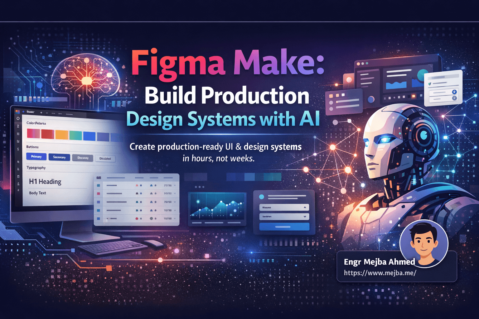
Figma Make: Build Production Design Systems with AI
I spent three weeks last year building a design system from scratch. Three weeks of manually defining color tokens, creating button states, establishing typography scales, and documenting spacing rules. The result was clean and consistent, but the process nearly broke me.
Last month, I rebuilt the same quality of design system in under four hours using Figma Make.
Not a rough draft. Not a starting point that needed heavy refinement. A legitimate, production-ready design system with components, states, tokens, and documentation that my development team could immediately consume. The shift in my workflow has been dramatic enough that I've restructured how I approach every new project.
If you're a developer who's been struggling with design consistency, a designer looking to accelerate your system creation, or a product builder tired of starting from blank canvases, here's exactly how I use Figma Make to generate professional design systems that actually work in production environments.
The Design System Problem Every Developer Knows
Here's the scenario that plays out in teams everywhere: You start building a product. The first few screens look decent because you're focused and intentional. Then feature requests pile up. Different team members touch different parts of the UI. Nobody remembers what shade of blue the primary button was supposed to be. Your spacing becomes inconsistent. Your tables don't match your forms. Your mobile views look like they belong to a different application entirely.
I've shipped products with this problem. I've inherited codebases where the same button exists in seven slightly different variations. The technical debt from inconsistent design decisions compounds faster than code debt because every new screen multiplies the inconsistency.
Design systems exist to solve this problem. A well-structured system provides your team with a shared vocabulary and component library that enforces consistency. But traditional design system creation has a brutal cost: time. Enterprise teams spend months defining their systems. Startups often skip the process entirely because they can't afford the delay, then pay for it later in refactoring costs.
The gap between "we need a design system" and "we have a design system" has historically been measured in weeks or months of dedicated effort. That's the gap Figma Make collapses.
What Figma Make Actually Does
Figma Make is an AI-powered tool integrated directly into Figma that generates UI designs and corresponding code from natural language prompts. But describing it that simply undersells the capability. The tool understands design context, component relationships, and visual hierarchy in ways that produce genuinely usable output rather than random layouts that need complete rebuilding.
When I first encountered Figma Make, I expected the typical AI design tool experience: impressive demos followed by disappointing real-world results. The generated designs would look plausible at thumbnail size but fall apart under inspection. The code would be a mess of absolute positioning and hardcoded values.
My skepticism lasted exactly one generation cycle. The output quality exceeded what I'd seen from any similar tool, and the approach to design system generation specifically felt like it was built by people who actually ship products.
The key insight I want to share isn't just that Figma Make exists—it's that there's a specific workflow that maximizes its effectiveness. Random prompting produces random results. Structured prompting with proper preparation produces professional results.
My Production Workflow: Preparation First
The workflow I've developed has distinct phases, and the preparation phase is where most people cut corners and then wonder why their generated designs don't feel cohesive.
Phase One: Gather Your Requirements
Before I touch Figma Make, I ensure three documents exist:
Product Requirements Document: What is this product actually supposed to do? What are the core user flows? What features need UI representation? I don't need extensive documentation, but I need clarity on scope.
User Stories: Who's using this product and what are they trying to accomplish? User stories inform component priority. If most of your users spend time in data tables, your design system needs robust table components with filtering, sorting, and bulk action states.
Page and Component Inventory: A simple list of every page type and component type you'll need. Homepage, dashboard, settings page, user profile, authentication screens. Tables, forms, cards, navigation, modals, buttons, input fields. Getting this inventory complete before generation prevents the common mistake of generating components ad-hoc and ending up with inconsistent patterns.
This preparation typically takes me 30-60 minutes. I resist the temptation to skip it because every minute spent here saves ten minutes of fixing inconsistencies later.
Phase Two: Build Your Mood Board
This phase fundamentally changed my results. Instead of describing what I want in abstract terms, I show Figma Make exactly what I mean through visual references.
I use Mobbin (mobbin.com) extensively for this. Mobbin aggregates UI patterns from thousands of real applications, organized by component type and use case. When I need table inspiration, I'm not imagining abstract tables—I'm looking at how Linear, Notion, Airtable, and dozens of other products handle tables.
My mood board structure follows my component inventory:
- Navigation: 3-5 examples of navigation patterns I want to reference
- Data Tables: How should tables handle headers, rows, bulk selection, empty states?
- Cards: Product cards, user cards, metric cards—what visual style resonates?
- Forms: Input field styling, validation states, form layout approaches
- Dashboard Widgets: Charts, stats, activity feeds
- Buttons and Controls: Primary, secondary, destructive, disabled states
I screenshot these references directly into a Figma file, organized by category. This mood board becomes my prompt input for Figma Make. Instead of saying "generate a modern table," I can reference a specific screenshot and say "generate a table component with this visual style adapted to my brand colors."
The difference in output quality between prompt-only generation and reference-based generation is substantial. References provide Figma Make with concrete design decisions rather than forcing it to interpret ambiguous descriptions.
Phase Three: Generate Your Core UI Pages
With requirements clear and references assembled, I start generating actual UI pages. My approach generates pages first, then extracts the design system from those pages—not the other way around.
This ordering matters. Generating a design system in isolation produces abstract components that may not actually fit your real UI needs. Generating pages first ensures your design system contains exactly what your product requires.
My minimum viable page set for most products:
- Navigation Bar Page: Global navigation component in multiple states (collapsed, expanded, mobile)
- Dashboard Page: Your primary data display screen with widgets, stats, and key actions
- Data Table Page: A full-featured table with sorting, filtering, bulk actions, pagination
- Form Page: Your most complex form with various input types and validation states
- Authentication Pages: Login, register, forgot password—these set your tone for new users
For each page, I import relevant mood board screenshots and craft prompts like:
Generate a dashboard page for a project management application.
Reference the attached screenshots for visual style direction.
Include: navigation sidebar, header with search, 4 metric cards,
activity feed, project progress chart, and quick action buttons.
Use a dark background theme with purple and cyan accent colors.
Figma Make typically produces results that are 70-85% of what I want on the first generation. The remaining work is adjusting specific elements, refining spacing, and ensuring brand consistency across all generated pages.
I generate multiple variations and pick the strongest elements from each. One generation might nail the navigation but produce a mediocre table. Another might reverse that. Combining the best elements gives me a cohesive foundation.
Phase Four: Extract Your Design System
Once I have 4-6 solid UI pages, I prompt Figma Make to extract a design system from them:
Analyze the attached UI pages and generate a complete design system including:
- Color palette with primary, secondary, neutral, and semantic colors
- Typography scale with heading and body styles
- Spacing system (4px, 8px, 16px, 24px, 32px, etc.)
- Border radius values
- Component library: buttons (all states), input fields, cards, badges, tables
- Icon set recommendations
This extraction approach produces a design system that's already proven by real usage. Every color in the system appears in your actual pages. Every component has context for how it's meant to be used.
Figma Make typically generates two types of output here:
Minimal Design System: Core components and foundational styles. This is easier to import into development tools like Cursor and produces cleaner code exports. I prefer this for projects where I'll be the primary developer.
Detailed Design System: Everything above plus modals, alerts, pagination, loading states, tooltips, and edge case components. More comprehensive but can overwhelm simpler projects or cause import issues with some development tools.
I default to the minimal system and add components as needed rather than starting with everything and pruning. Less cognitive overhead, faster iteration.
Code Export: From Design to Development
Figma Make generates code alongside every design. This is where the tool becomes a genuine development accelerator rather than just a design aid.
The exported code is React-based with Tailwind CSS by default. It's immediately runnable, not pseudocode. Components have proper structure, props are defined reasonably, and the styling matches the visual design accurately.
That said, the raw exported code is meant for speed, not production perfection. Hardcoded values appear where design tokens should exist. Component structure could be more modular. Some accessibility improvements are needed.
My post-export workflow:
Step One: Push to GitHub: I use Figma Make's GitHub integration to push the generated code directly to a new repository or branch. This gives me immediate version control and sets up collaboration infrastructure.
Step Two: Refactor to Design Tokens: I run a refactoring pass that converts hardcoded values to design tokens. Colors become CSS variables or Tailwind configuration. Spacing values reference a consistent scale. This is where the code becomes maintainable.
The refactoring prompt I use:
Refactor this component to use design tokens:
- Replace all hardcoded colors with CSS variables
- Convert pixel spacing values to a 4px-based scale
- Extract common patterns into utility classes
- Add TypeScript types for all props
Step Three: Accessibility Pass: Add proper ARIA labels, ensure keyboard navigation works, verify color contrast ratios. Generated code gets you to 80% accessibility, but the final 20% requires human attention.
Step Four: Integration: Drop components into your actual application architecture, connect to real data, and verify behavior matches expectations.
Alternative Workflow: Figma Board Collaboration
For projects with larger design teams, I sometimes skip the direct code export and instead use Figma Make purely as a design accelerator.
The workflow modification:
- Generate UI pages with Figma Make
- Import generated frames into a standard Figma board
- Share with design team for collaborative refinement
- Use Figma MCP (Multi-Component Platform) to rebuild in the development environment
This preserves Figma's collaboration features—commenting, version history, multiplayer editing—while still benefiting from AI-accelerated generation. The design team can adjust details, stakeholders can provide feedback on visual designs, and engineering rebuilds from an approved source of truth.
I use this workflow when design approval processes exist or when multiple designers need to contribute refinements. The direct code export works better for solo projects or small teams where I'm both designer and developer.
Real Results: What This Workflow Produces
Let me be concrete about outcomes. On my last project—a SaaS dashboard application—here's what the Figma Make workflow produced:
Time Investment:
- Preparation and mood board: 45 minutes
- UI page generation (6 pages): 90 minutes
- Design system extraction: 30 minutes
- Code export and refactoring: 120 minutes
- Total: Approximately 5 hours
Output:
- Complete design system with 12 component types
- Full color palette with 24 color values
- Typography scale with 8 text styles
- 6 production-ready page layouts
- React component library with TypeScript
- Tailwind configuration file
Compare this to building the same deliverables manually. I estimated it would take 40-60 hours of focused work. Even accounting for refinement time after Figma Make, the acceleration is an order of magnitude.
The quality question is legitimate: is AI-generated design actually good? From my experience, it's consistently professional. It's not going to win design awards for innovation, but it produces clean, usable, conventional interfaces that users understand immediately. For most products, that's exactly what you need.
Where I still see manual design work outperforming AI generation:
- Highly distinctive brand expressions that need to feel unique
- Complex micro-interactions and animation design
- Accessibility-first design requiring specific considerations
- Edge cases and error states that need careful UX thinking
For the foundational 80% of design work—establishing layouts, creating component systems, defining visual languages—Figma Make handles it competently.
Practical Tips From Heavy Usage
After using this workflow on multiple projects, here are the patterns I've identified:
Prompt Specificity Matters: "Generate a dashboard" produces generic results. "Generate a project management dashboard with a left sidebar navigation, 4 KPI cards in the header, a task table with status columns, and a team activity feed on the right" produces usable results. Be specific about layout, components, and content.
References Beat Descriptions: A screenshot communicates more design information than three paragraphs of description. Use visual references liberally.
Generate Variations: Don't accept the first generation. Generate 3-5 variations and composite the best elements. The tool's speed makes this practical.
Check Responsive Behavior: Generated designs are typically desktop-first. Explicitly prompt for mobile and tablet variations if you need them.
Design System Sizing: If your extracted design system is too large to import into your development environment, split it into multiple files by component category (buttons and controls, forms, data display, feedback, navigation).
Color Token Refinement: AI-generated color palettes are functional but sometimes lack the subtle relationships that make great color systems. I typically adjust saturation and lightness values manually after generation.
Integration with Development Tools
The code Figma Make produces is designed for modern development workflows. I've integrated successfully with:
Cursor: Push code to GitHub, open in Cursor, and the AI can immediately understand and extend the components. The two AI systems work together surprisingly well.
VS Code: Standard React component import. The Tailwind configuration exports cleanly.
Storybook: Generated components work in Storybook with minimal modification. I add story files manually, but the components themselves render correctly.
shadcn/ui: For projects already using shadcn, I use Figma Make primarily for layout inspiration and custom components, then implement using shadcn primitives.
The cross-tool compatibility has been reliable. Figma Make seems to generate code with standard patterns that other tools recognize and can extend.
Where This Workflow Fits
I don't use Figma Make for everything. Here's where it delivers the most value:
Ideal Use Cases:
- New product MVPs needing fast design foundations
- Redesigns where you want consistency from day one
- Projects with tight timelines that can't afford extensive design phases
- Developer-led products where design expertise is limited
- Prototypes that need to look professional without design investment
Less Suitable:
- Highly custom branded experiences
- Design exploration when you don't know what you want
- Incremental additions to existing established design systems
- Projects requiring specific accessibility compliance from the start
The tool is a force multiplier, not a replacement for design thinking. It executes quickly but still requires human judgment about what to execute.
The Shift in My Design Practice
Working with Figma Make has changed how I think about the design-to-development boundary. The traditional handoff—designer creates mockups, developer interprets and rebuilds—contained friction and information loss. Details were missed, intentions were misread, implementation diverged from design.
With AI-generated code, the design IS the implementation. What you see in Figma is what exists in code. The translation is handled by the AI, and my role shifts to quality control and refinement rather than interpretation.
This doesn't eliminate designers or developers. It eliminates the tedious parts of both roles. Designers can focus on higher-level decisions rather than documenting every spacing value. Developers can focus on logic and performance rather than pixel-pushing CSS.
I'm shipping better-looking products faster with fewer inconsistencies. That's the practical outcome that matters.
Your Next Step
If you haven't tried Figma Make, start with something specific. Don't generate a random dashboard. Take an actual project you're working on, spend 30 minutes gathering references, and generate one page with real requirements.
The tool's capability becomes obvious through practical usage. Reading about it explains the concept; using it reveals the potential.
I'm continuing to refine this workflow as Figma Make evolves. The tool is improving rapidly, and the gap between AI-generated and manually-created design work is narrowing with each update. Learning these skills now positions you for a future where design generation becomes a standard part of the development toolkit.
Build something with it this week. See what happens.
Let's Work Together
Looking to build AI systems, automate workflows, or scale your tech infrastructure? I'd love to help.
- Fiverr (custom builds & integrations): fiverr.com/s/EgxYmWD
- Portfolio: mejba.me
- Ramlit Limited (enterprise solutions): ramlit.com
- ColorPark (design & branding): colorpark.io
- xCyberSecurity (security services): xcybersecurity.io

