How I Use Claude AI + Canva to Automate Design Work
I needed twelve social media graphics for a product launch last month. Instagram posts, Facebook covers, story graphics -- the whole spread. Normally, I'd block out half a day for that. Open Canva, stare at templates, drag elements around, tweak colors, export, repeat. You know the drill.
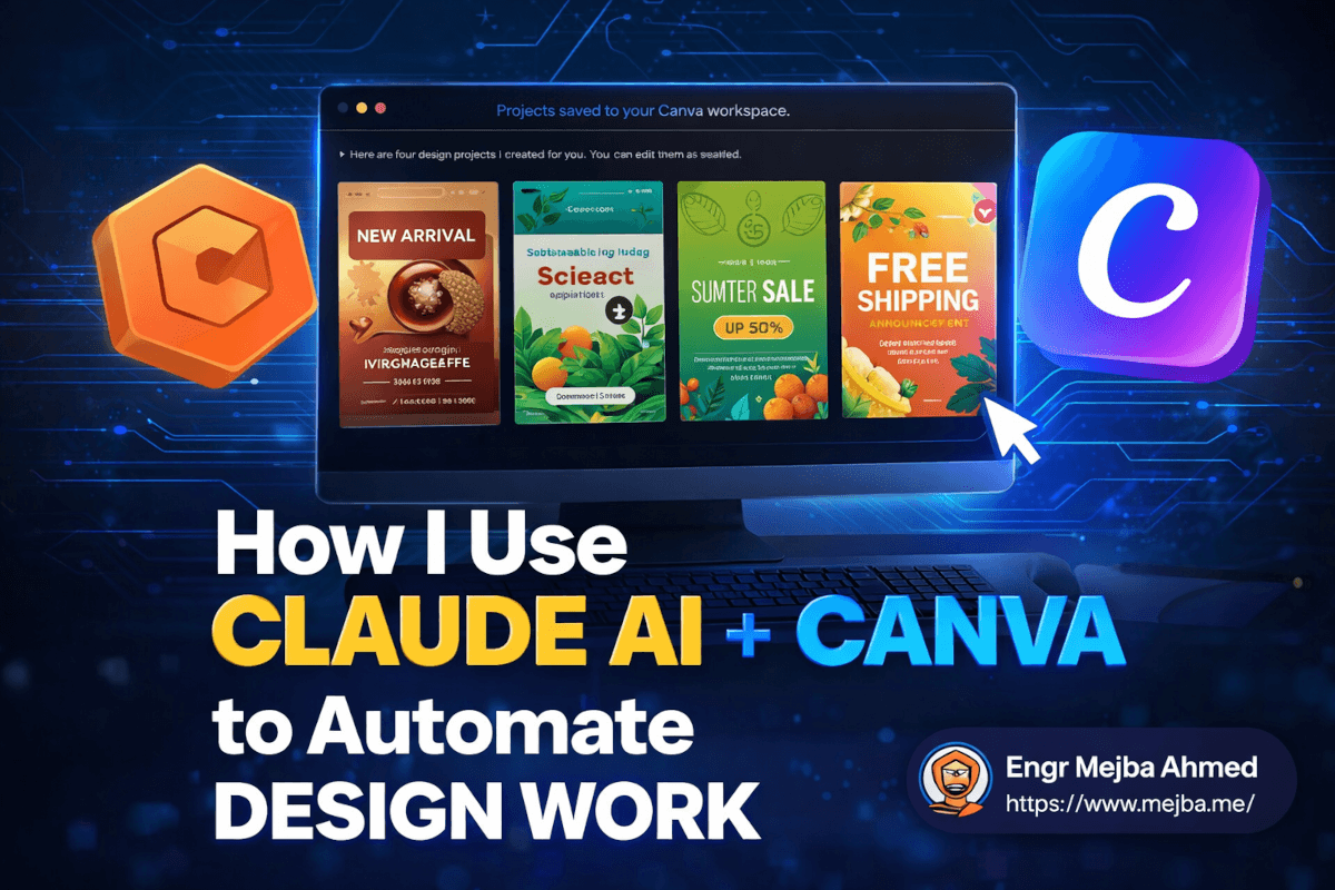
This time I typed a single prompt into Claude AI, walked away to make coffee, and came back to four fully editable Canva designs sitting in my workspace. Not static images. Not flat PNGs I'd need to rebuild from scratch. Actual Canva projects with layers, editable text, swappable colors, and proper layouts.
The coffee wasn't even cool enough to drink yet.
That moment changed how I think about design work in my development workflow. And I've spent the last several weeks pushing this Claude-Canva integration to its limits -- testing every design type I could think of, breaking it in ways I didn't expect, and figuring out exactly where it shines and where it falls flat. There's a gap between what this tool promises and what it delivers today, and understanding that gap is the difference between saving hours and wasting them.
Here's what I found.
Why a Developer Even Cares About Design Automation
I know what you're thinking. "You're a software engineer. Why are you messing around with graphic design?" Fair question. The honest answer is that the line between building software and shipping software keeps getting blurrier.
When I launch a side project or help a client at Ramlit get their product out the door, nobody cares if the code is elegant if the landing page graphics look like they were made in Microsoft Paint circa 2003. Social media posts need to exist. Pitch decks need to look professional. YouTube thumbnails need to not be embarrassing.
I used to solve this two ways: either spend money hiring a designer (expensive for quick-turnaround work) or spend my own time in Canva (which pulled me away from actual engineering). Neither option felt right for the kind of fast, iterative work I do.
The Claude AI integration with Canva hit a nerve because it attacks exactly this problem. You describe what you want in plain language -- the same way you'd brief a human designer -- and Claude generates editable designs directly inside Canva. No Figma-to-Canva exporting. No downloading AI-generated images and manually placing them. The output lives natively in Canva's editor, which means you can tweak everything afterward.
But I'm getting ahead of myself. The setup process has a few gotchas that tripped me up, and if I don't mention them now, you'll hit the same wall I did.
Getting Claude AI Connected to Canva (The Part Nobody Explains Well)
You have two options for running Claude AI: the browser version at claude.ai or the desktop application available for both Windows and Mac. I strongly recommend the desktop app. The browser version works fine for text-based tasks, but when you're doing design work that involves back-and-forth with Canva's API, the desktop app handles the connector handshake more reliably. I ran into timeout issues twice using the browser before switching, and haven't had a single hiccup since.
Here's the setup process, step by step.
Step 1: Install Claude AI Desktop App
Download it from Anthropic's official site. The installation is straightforward on both platforms. One thing worth mentioning -- on Mac, you'll need to grant it permissions in System Settings under Privacy & Security. Don't skip this or the Canva connector will silently fail without telling you why.
Step 2: Connect Your Canva Account
Inside Claude AI, navigate to the connectors section. You'll find Canva listed among the available integrations. Click connect, authorize access, and Claude gets permission to create and modify designs in your Canva workspace.
Here's the catch that burned me: this requires a paid Claude AI plan. The free tier doesn't include connector access. If you're already paying for Claude Pro (which, if you're a developer using Claude Code regularly, you probably are), you're covered. But if you were hoping to test this on the free tier first, that's not an option.
Step 3: Verify the Connection
Before you start prompting for designs, run a quick test. Ask Claude something simple like "Create a blank Instagram post design in Canva." If it generates a design and you can see it in your Canva workspace, the connection is solid. If it throws an error about permissions or access, re-authorize the connector -- sometimes the OAuth token doesn't stick on the first try.
Total setup time: about five minutes if everything goes smoothly, maybe fifteen if you hit the permission issue on Mac. Not bad for what you're about to unlock.
Now, here's where things actually get interesting.
Seven Design Types I Tested (And What Actually Happened)
I didn't just run one test and write this post. I systematically worked through seven different design categories, pushing Claude to handle increasingly complex requests. Some results genuinely impressed me. Others... didn't. I'm going to be straight about both.
1. Instagram Posts -- The Sweet Spot
My first real test: "Create an Instagram post for a specialty coffee shop announcing a new seasonal latte. Use warm autumn colors, modern typography, and include space for a product photo."
Thirty seconds later, Claude generated four distinct design options directly in my Canva workspace. Each one had a different layout approach -- one minimalist, one bold and graphic-heavy, one with a muted editorial feel, one that leaned into rustic textures. All four were genuinely usable as starting points.
I picked the minimalist option, swapped in an actual product photo, adjusted the hex code on the accent color to match the brand's exact palette, and had a post-ready graphic in under three minutes. Three minutes. For something that would've taken me 20-30 minutes doing manually, including the time spent scrolling through Canva's template library trying to find something that didn't look generic.
The key insight: Claude doesn't just pick a random Canva template. It assembles design elements based on your prompt's specifications -- color preferences, style direction, content requirements. The output feels curated rather than templated.
Verdict: 8/10. This is the use case where the integration shines brightest. If you create social media graphics regularly, this alone justifies the setup.
2. YouTube Thumbnails -- Solid but Basic
Next test: "Create a YouTube thumbnail for a video titled 'Build an AI Agent in 30 Minutes' with dimensions 1280x720 pixels. Make it eye-catching with bold text and a tech-themed background."
Four options appeared. They were... fine. Functional. The text was readable, the layouts followed standard thumbnail conventions (bold text, contrasting colors, visual hooks). But none of them had that "scroll-stopping" quality that the best YouTube thumbnails have. They looked like mid-tier thumbnails -- better than what a complete beginner would make, but not at the level of creators who've obsessed over click-through rates for years.
What worked well was the dimension accuracy. I specified 1280x720 and got exactly that. The text placement was readable at thumbnail size, which is something even experienced designers sometimes mess up. And because everything was editable in Canva, I could add my own face cutout, adjust the background gradient, and punch up the contrast in about five minutes.
Verdict: 6/10. Good starting point. You'll want to edit these significantly. Think of it as a wireframe for your thumbnail rather than a finished product.
3. Logo Design -- Surprisingly Creative
This one caught me off guard. "Design a modern, clean, futuristic logo with gradient colors for a tech startup called NovaByte. The logo should work on both light and dark backgrounds."
Claude produced multiple logo concepts, and a couple of them were legitimately interesting. One used a geometric N-shape with a blue-to-purple gradient that felt professional. Another played with negative space in a way I wouldn't have thought of. Were any of them ready to be a company's final logo? No. Logo design involves too much brand strategy, market positioning, and iterative refinement for any AI to nail in one shot.
But as a brainstorming tool? Genuinely useful. I've paid designers on Fiverr for initial logo concepts that weren't as creative as what Claude generated here. The difference is that a human designer would then spend hours refining, testing at different sizes, ensuring it works on business cards and billboards. Claude gives you the spark. You (or a designer) still need to build the fire.
Verdict: 7/10. Don't use this as your final logo process. Do use it to generate concepts and directions faster than sketching by hand.
4. Instagram Carousel Posts -- Where It Falls Apart
Here's where I need to be honest about a real limitation. "Create a 5-slide Instagram carousel post about morning habits for productivity. Each slide should build on the previous one with a consistent design theme."
What I expected: five separate, sequentially designed slides with a cohesive visual thread.
What I got: all the content crammed onto a single page.
Claude understood the content structure -- it identified five distinct habits and organized them logically. But it didn't generate a true multi-slide carousel. Everything appeared on one canvas. To actually make this work as a carousel, I had to manually split the content across five separate Canva pages, copy the design elements to each page, and adjust the layout for each slide individually.
That's not automation. That's creating more work than starting from a Canva carousel template would have been.
I tried rephrasing the prompt three different ways. "Generate five separate pages..." and "Create a multi-page design with five slides..." and "Design an Instagram carousel where each slide is a separate page." Same result every time. The Canva integration currently doesn't handle multi-page generation well for this specific format.
Verdict: 3/10. Skip this use case for now. Use Canva's native carousel templates instead. This is the kind of limitation I expect to be fixed as the integration matures, but as of right now, it's frustrating.
This limitation taught me something important about working with AI design tools, though -- and I'll circle back to that lesson in a minute.
5. Presentation Decks -- A Decent Starting Framework
"Create a 6-slide pitch deck for a fitness app called FitPulse. Include slides for: problem statement, solution overview, key features, market opportunity, team introduction, and a call-to-action with download link."
Claude generated all six slides with relevant content on each. The layouts were clean -- nothing revolutionary, but professionally acceptable. Each slide had a logical structure: headline, supporting text, and visual elements that matched the fitness theme.
Here's what was genuinely helpful: Claude wrote the actual pitch copy, not just placeholder text. The problem statement slide articulated a real pain point about fitness app fragmentation. The solution slide positioned FitPulse clearly. The market opportunity slide even included a reasonable framing of the addressable market (though the specific numbers were obviously fabricated -- always fact-check AI-generated statistics).
What was less helpful: the visual polish. Pitch decks live and die on their visual impact, and these slides looked like they came from a "Business Presentation" template pack. Functional, but not the kind of design that makes investors lean forward in their chairs.
I ended up using Claude's content structure and rewriting a few key phrases, then applying a more sophisticated Canva template to get the visual quality where it needed to be. Total time: about 25 minutes. Doing the same from scratch? Probably 90 minutes to two hours, especially the copywriting.
Verdict: 6/10. The content generation is the real value here. Think of it as a deck ghostwriter that also gives you a basic visual layout.
6. Design Editing via Commands -- The Underrated Feature
This is the use case that gets the least attention but might be the most practically useful for daily workflows. I had an existing Instagram post design in my Canva workspace -- a blue-themed promotional graphic for a webinar. I asked Claude: "Update this design to use green and gold colors instead of blue, and add a line of text at the bottom that says 'Limited seats available -- Register now.'"
Claude accessed the existing design, changed the color scheme, and added the requested text. It took about 45 seconds.
Now, could I have done this manually in Canva in about the same time? Honestly, yes. For a single edit, the time savings are marginal. But here's where it gets powerful: batch modifications. When you need to update the color scheme across a dozen existing designs, or add a new tagline to every graphic in a campaign, doing that through text commands instead of clicking through each design individually starts saving serious time.
The editing capabilities aren't perfect. I'd rate the current usability around a 4 or 5 out of 10. Claude sometimes misinterprets spatial instructions ("move the logo to the upper right" occasionally results in the logo ending up in the upper left). And complex layout changes -- like restructuring a three-column layout into a two-column layout -- tend to produce messy results.
But for color changes, text additions, font swaps, and simple element adjustments? It works. And it's getting better with each update I've tested.
Verdict: 5/10 for single edits, 7/10 for batch modifications. The real value emerges at scale.
7. Brand Kit Design Packages -- The Power Move
Saving the best for last. "Create three designs for a brand called EcoVibe: an Instagram post promoting a summer sale, a Facebook cover image with the brand tagline 'Sustainable Living Made Simple,' and an Instagram story graphic announcing free shipping."
This is where the integration flexes. Claude generated all three designs in a single session, maintaining visual consistency across formats. The color palette stayed cohesive. The typography choices matched. The overall brand feel carried through from the square Instagram post to the wide Facebook cover to the vertical story format.
Each design was independently editable in Canva. The Instagram post had the right dimensions (1080x1080). The Facebook cover was properly sized (820x312). The story graphic was vertical (1080x1920). All three landed in my Canva workspace ready for customization.
For anyone running a small business or managing social media for a client, this is the killer feature. Generating a coordinated set of brand assets from a single prompt -- assets that actually look like they belong together -- cuts out the most tedious part of multi-format design work: maintaining visual consistency.
Verdict: 8/10. This is the use case that sold me on the integration long-term.
The Prompt Engineering Reality Check
Here's the lesson I promised to circle back to. After testing all seven design types, a pattern became unmistakably clear: the quality of Claude's design output is directly proportional to the specificity of your prompt. This isn't a vague "garbage in, garbage out" platitude. The difference between a good prompt and a mediocre prompt is genuinely night-and-day in terms of output quality.
Let me show you what I mean with a real comparison.
Weak prompt: "Make me an Instagram post about coffee."
Strong prompt: "Create an Instagram post for a specialty coffee roaster called Bean & Barrel. The post announces their new Ethiopian single-origin roast. Use warm earth tones -- deep brown, cream, and a burnt orange accent. Modern sans-serif typography. Include the text 'New Arrival: Ethiopian Yirgacheffe' as the headline and 'Single-origin. Small-batch. Available now.' as the subtext. Leave a circular space in the center for a product photo."
The weak prompt gives you something generic. The strong prompt gives you something that looks like a professional designer briefed on the brand created it.
Here's my prompt formula that consistently produces the best results:
[Design type] + [Brand/product name] + [Specific purpose] + [Color/style preferences] + [Required text content] + [Layout specifications]
Each element in that formula gives Claude another constraint to work within, and counterintuitively, more constraints produce more creative and useful output. It's the same principle that makes sonnets more interesting than free-form poetry -- structure creates a framework for creativity rather than limiting it.
One more prompting tip that took me a few tries to discover: specify what you don't want. "No stock photo feel" or "Avoid clip-art style elements" or "Don't use more than two fonts" gives Claude important negative space to work within. Some of my best outputs came after I added exclusion criteria to my prompts.
What This Integration Can't Do (Yet)
I want to be upfront about the current limitations because overselling AI tools helps nobody. If you go in with unrealistic expectations, you'll be disappointed and dismiss a genuinely useful tool.
Multi-page designs remain problematic. As I showed with the carousel test, Claude struggles with generating true multi-page, multi-slide designs where each page needs to be separate but thematically connected. Single-page designs work great. Multi-page needs work.
Complex illustration is off the table. Claude isn't generating custom illustrations, hand-drawn elements, or intricate graphic compositions. It works with Canva's design element library, which means you're getting professional template-quality work, not custom art direction.
Photo manipulation doesn't happen. If you need background removal, color grading on photos, or complex image compositing, that's still manual work in Canva or a dedicated photo editor.
Brand guideline adherence is approximate. You can specify colors and fonts in your prompt, but Claude doesn't have access to your saved Canva Brand Kit. It interprets your verbal description of brand elements, which means the output might use a font that's close to your brand font but not exactly right. You'll still need to manually swap in your exact brand assets.
The "designer eye" gap is real. Professional designers make thousands of micro-decisions about spacing, alignment, visual hierarchy, and compositional balance that are invisible to non-designers. Claude's outputs are competent but rarely exhibit the refined polish that separates good design from great design. The kerning might be slightly off. The padding between elements might not follow a consistent spatial system. White space distribution might feel a little arbitrary.
These aren't dealbreakers. They're reasons to think of this tool as a first-draft generator rather than a final-output machine. And honestly? For the speed at which it works, "really good first draft" is more than enough.
The Workflow That Actually Works in Practice
After weeks of testing, here's the workflow I've settled into. This is what produces the best results with the least friction.
Step 1: Brief First, Prompt Second
Before I touch Claude, I spend two minutes writing a brief in plain English. What's the design for? Who's the audience? What's the one thing the viewer should notice first? What action should they take? What does the brand look like?
This sounds obvious, but skipping this step is how you end up regenerating designs five times because you didn't think through what you actually wanted.
Step 2: Generate with a Detailed Prompt
Using the formula I described earlier, I feed Claude a comprehensive prompt. I specify everything: design type, dimensions, brand name, colors (hex codes if I have them), text content, style direction, and layout preferences.
Step 3: Select and Customize in Canva
Claude usually generates multiple options. I pick the one closest to my vision, then spend 5-10 minutes in Canva's editor making it mine. Swapping in exact brand colors. Replacing placeholder text. Adding real photos. Adjusting spacing.
Step 4: Create Variations
Here's where the editing feature earns its keep. Once I have one design I'm happy with, I use Claude to generate variations. "Take this design and create a version with a dark background." Or "Adapt this Instagram post into a LinkedIn banner." The consistency across variations is noticeably better than starting each format from scratch.
Step 5: Export and Deploy
Standard Canva export. Nothing special here. But the total time from brief to finished assets? Usually 15-20 minutes for a single design, 30-40 minutes for a multi-format brand package.
Compare that to my old workflow: 45-60 minutes for a single design, 2-3 hours for a multi-format package. That's a 60-70% time reduction on design work. For someone whose primary job isn't design, those hours add up fast.
Where This Is Heading (And Why I'm Paying Attention)
I'll make a prediction that I think will look obvious in hindsight: within two to three years, the distinction between "designing something" and "describing something" will largely disappear for 80% of common design tasks.
Right now, Claude-Canva integration handles what I'd call junior-level design work. Social posts, basic thumbnails, simple brand assets. The output is competent but not exceptional. A professional designer would look at these and see room for improvement everywhere.
But the trajectory matters more than the current state. Six months ago, this integration didn't exist. Today, it produces usable designs in 30 seconds from a text prompt. The quality improvement curve on AI tools has been steeper than almost anyone predicted.
What excites me most isn't the tool itself -- it's what it enables. When design stops being a bottleneck, developers and indie makers can iterate faster on product presentation. Small businesses that couldn't afford a design agency can maintain professional-looking brand presence. Content creators can produce more visual content without proportionally increasing their design time.
The designers who should worry aren't the ones creating exceptional, strategic brand work. Those skills remain deeply human and deeply valuable. The ones who should worry are people whose entire value proposition is "I can make a decent Instagram graphic." That particular job is getting automated right now, in real time.
For everyone else -- developers, founders, content creators, marketers -- this is pure upside. A tool that handles the 80% of design work that's repetitive and template-adjacent, freeing you to focus on the 20% that actually requires human judgment and creativity.
My Actual Results After Three Weeks
I want to ground this in real numbers because vague productivity claims mean nothing.
Over the past three weeks, I've used the Claude-Canva integration to generate assets for three different projects. Here's what that looked like.
Project 1: Client social media package (Ramlit project)
- 8 Instagram posts, 3 Facebook covers, 5 story graphics
- Time with Claude-Canva: approximately 2.5 hours
- Estimated time without: 7-8 hours
- Time saved: roughly 5 hours
Project 2: Personal project launch graphics (mejba.me)
- 4 promotional graphics, 2 YouTube thumbnails, 1 presentation deck
- Time with Claude-Canva: approximately 1.5 hours
- Estimated time without: 4-5 hours
- Time saved: roughly 3 hours
Project 3: Brand kit exploration for a new side project
- 6 logo concepts, 3 social templates, 2 banner designs
- Time with Claude-Canva: approximately 1 hour
- Estimated time without: 5-6 hours (including initial concept exploration)
- Time saved: roughly 4 hours
Total time saved across three weeks: approximately 12 hours. That's 12 hours I spent writing code, building features, and shipping products instead of nudging text boxes around in a design tool.
The quality trade-off? On a scale where professional designer output is a 10, my manually-created Canva designs were probably a 5 or 6, and the Claude-assisted designs (after my customization) land around a 6 or 7. Slightly better than what I'd produce alone, primarily because Claude's initial layouts tend to follow design principles more consistently than my untrained eye would.
Not earth-shattering improvement. But faster, more consistent, and with a lower ceiling of "how bad could this look if I rush it." That lower floor might actually be the biggest win -- Claude doesn't produce designs that are embarrassingly bad, which is more than I can say for my own rushed attempts at 11 PM the night before a launch.
The One Thing That Changed How I Think About AI Tools
I want to leave you with something beyond the tactical how-to, because this experience taught me a broader lesson about working with AI that applies far beyond design.
The first time Claude failed to generate a proper carousel, I was frustrated. I almost wrote off the entire integration. "It can't even handle a basic carousel? What's the point?" That reaction -- dismissing a tool because it can't do everything -- is the most common mistake I see developers make with AI tools.
The right mental model isn't "Can this replace my current workflow?" It's "Which specific parts of my workflow can this absorb?"
Claude-Canva can't replace a designer. It can't handle every design format. It sometimes produces mediocre results. But it can generate a solid first draft of a social media graphic in 30 seconds. It can maintain brand consistency across multiple formats. It can handle the repetitive, template-adjacent design work that eats hours out of your week.
That's not a replacement. It's a force multiplier.
The developers and creators who'll get the most value from tools like this aren't the ones waiting for perfection. They're the ones who figure out exactly which 30% of their workflow a tool handles well, integrate it there, and keep doing the rest themselves. That's how you actually ship faster -- not by finding a silver bullet, but by accumulating small advantages across your entire process.
So here's my challenge: pick one design task you do repeatedly. Just one. Try running it through Claude-Canva this week. See what happens. You might be surprised -- not by how perfect the output is, but by how much time you get back to spend on work that actually requires your brain.
Let's Work Together
Looking to build AI systems, automate workflows, or scale your tech infrastructure? I'd love to help.
- Fiverr (custom builds & integrations): fiverr.com/s/EgxYmWD
- Portfolio: mejba.me
- Ramlit Limited (enterprise solutions): ramlit.com
- ColorPark (design & branding): colorpark.io
- xCyberSecurity (security services): xcybersecurity.io