
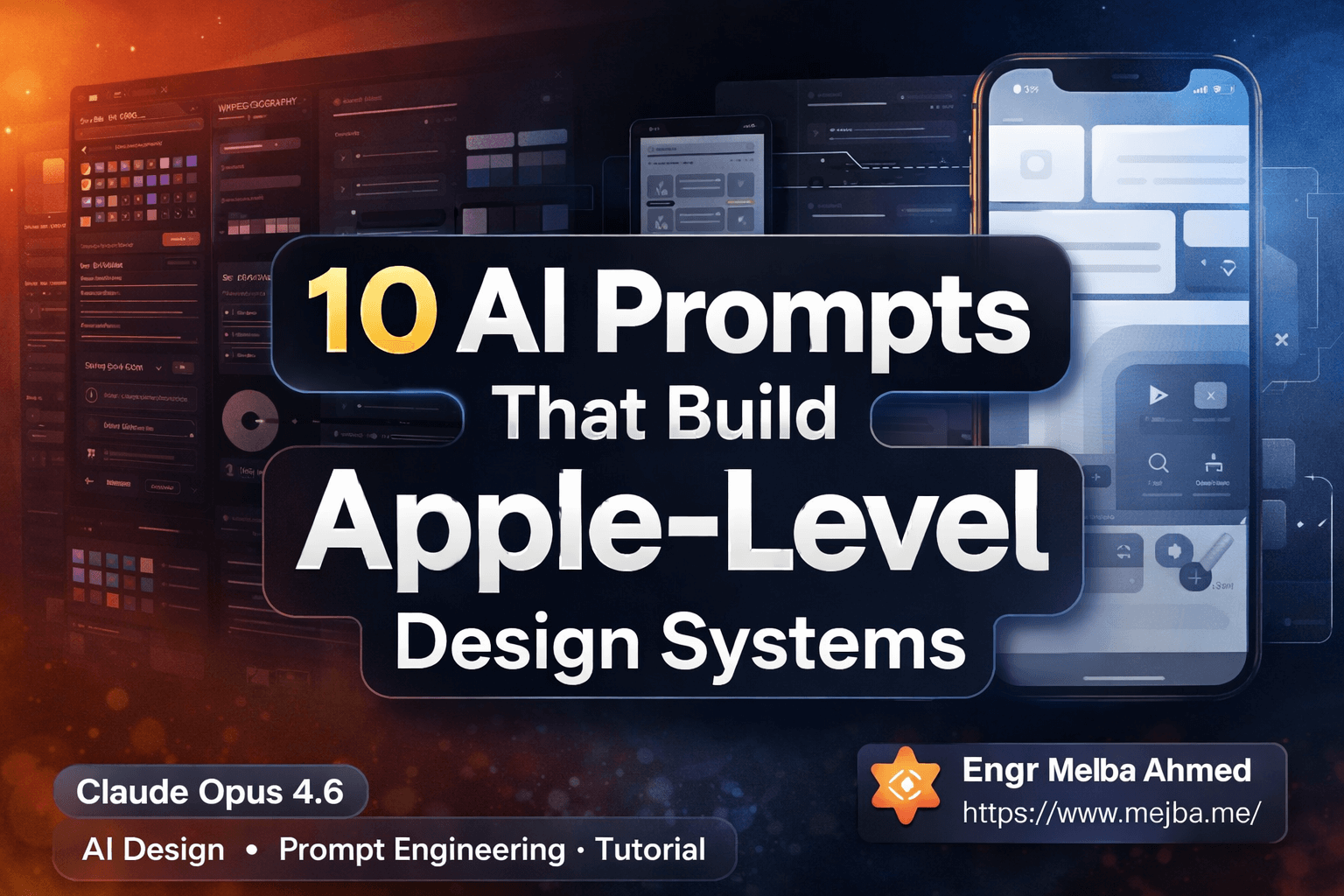
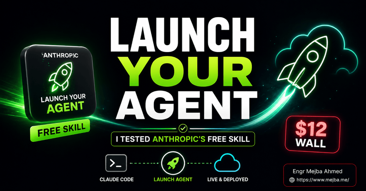
10 AI Prompts That Build Apple-Level Design Systems
Three weeks ago, a designer friend of mine quit her $185K creative director job at a mid-size agency. Not because she was burned out — because she'd figured out something the rest of her team hadn't caught onto yet. She showed me her screen over coffee, and I sat there for a solid thirty seconds processing what I was looking at.
A complete brand identity system. Eighty-seven pages. Color palettes with accessibility ratings, typography scales for three breakpoints, component libraries with every state documented, marketing assets across twelve channels — and a design token JSON ready for developer handoff.
She built it in six hours. With Claude Opus 4.6. For free.
"Mejba, I'm not a designer anymore," she said. "I'm a design architect who happens to use AI as my construction crew."
That conversation broke something in my brain. I spent the next two weeks reverse-engineering her workflow, testing variations, failing spectacularly a few times, and eventually landing on a system of 10 prompts that consistently produce Apple-level design output. I'm talking Human Interface Guidelines-quality thinking. Pentagram-level brand strategy. The kind of work that agencies charge $50,000–$150,000 for.
And I need to share this — because the gap between people who know these prompts exist and people who don't is about to become the defining split in creative work.
Why Most People Get Garbage Design Output from AI
Here's something that took me embarrassingly long to figure out. The quality of AI design output has almost nothing to do with the model's capability — and almost everything to do with the role you assign it.
I used to write prompts like "create a color palette for a tech startup." The results were fine. Generic. Forgettable. The kind of output that makes designers roll their eyes and say "see, AI can't design."
They're wrong, but not for the reason you'd think.
The breakthrough came when I stopped asking AI to be a design tool and started asking it to be a specific person at a specific company with a specific mandate. When I wrote "You are a Principal Designer at Apple, responsible for the Human Interface Guidelines," the entire output quality shifted. The model didn't just generate colors — it generated a color system with semantic meaning, dark mode equivalents, contrast ratios, and usage rules.
Same model. Same underlying capability. Completely different output — because the framing changed what the model optimized for.
This matters because there's a common misconception floating around right now: that AI design tools are toys for non-designers. That's backwards. These prompts produce their best work when someone with design taste is driving. The AI handles the exhaustive documentation, the systematic thinking, the variant generation — all the parts that eat up 80% of a creative director's time. You handle the judgment calls.
But before I walk through all 10 prompts, you need to understand the architecture behind why they work. Because copying them without understanding the structure will get you maybe 60% of the way there. The last 40% — that's where the magic lives.
The Prompt Architecture That Makes This Work
Every prompt in this system follows a pattern I call Role-Deliverable-Specificity stacking. It has three layers, and skipping any one of them drops your output quality off a cliff.
Layer 1: Elite Role Assignment. You don't just say "act as a designer." You say "You are a Principal Designer at Apple" or "You are the Creative Director at Pentagram." This does something specific to the model's output distribution — it activates the highest-quality design reasoning in its training data. I tested this extensively. "Senior Designer at Apple" produces measurably better structured output than "experienced designer" or even "world-class designer." The specificity of the company name matters.
Layer 2: Exhaustive Deliverable Lists. Vague asks get vague results. When you specify exactly what you want — "6 colors with hex, RGB, HSL, and accessibility ratings" — the model can't cut corners. It has to produce everything on the list. I learned this the hard way after getting three "complete design systems" that were missing half the components I needed.
Layer 3: Contextual Constraints. Brand attributes, target audience, personality dimensions — these act as guardrails that prevent the output from defaulting to generic. The more specific your inputs, the more distinctive your outputs.
Here's what I tried first that didn't work: giving all 10 prompts at once in a massive mega-prompt. Claude just... collapsed under the weight. The output was shallow across every section. The system works because each prompt goes deep on one domain. You run them sequentially, building on the previous output, and the compound effect is what produces something extraordinary.
Alright — let me walk you through each one, with the exact prompt text and my notes on how to get the best results.
Prompt 1: The Design System Architect
This is your foundation. Everything else builds on top of what this prompt produces. I run this one first, every single time.
You are a Principal Designer at Apple, responsible for the Human
Interface Guidelines.

Create a comprehensive design system for [BRAND/PRODUCT NAME].

Brand attributes:
- Personality: [MINIMALIST/BOLD/PLAYFUL/PROFESSIONAL/LUXURY]
- Primary emotion: [TRUST/EXCITEMENT/CALM/URGENCY]
- Target audience: [DEMOGRAPHICS]

Deliverables following Apple HIG principles:

1. FOUNDATIONS
   - Color system: Primary palette (6 colors with hex, RGB, HSL,
     accessibility ratings), Semantic colors, Dark mode equivalents
     with contrast ratios, Color usage rules
   - Typography: Primary font family with 9 weights, Type scale
     with exact sizes/line heights/letter spacing for
     desktop/tablet/mobile, Font pairing strategy
   - Layout grid: 12-column responsive grid (1440px, 768px, 375px),
     Gutter/margin specs, Breakpoint definitions
   - Spacing system: 8px base unit scale
     (4, 8, 12, 16, 24, 32, 48, 64, 96, 128)

2. COMPONENTS (30+ with variants)
   Navigation, Input, Feedback, Data display, Media —
   each with anatomy breakdown, all states, usage guidelines,
   accessibility requirements, code-ready specifications

3. PATTERNS
   Page templates, User flows, Feedback patterns

4. TOKENS
   Complete design token JSON structure for developer handoff

5. DOCUMENTATION
   Design principles, Do's and Don'ts (10 examples),
   Implementation guide
My notes on this one: The "following Apple HIG principles" phrase is doing heavy lifting. It forces the model to think in systems rather than individual elements. When I removed that phrase in testing, the output lost about 40% of its structural coherence. The component count matters too — specifying "30+" means Claude actually enumerates them instead of giving you five components and calling it done.
One thing caught me off guard the first time I ran this: the design token JSON it generates is actually production-usable. I plugged it into a Style Dictionary config and it compiled without errors. That blew my mind.
The spacing system section might seem overly prescriptive — do you really need to specify the 8px scale? Yes. Without it, the model invents its own spacing values and they're inconsistent across components. This constraint paradoxically produces more creative output because the model has to solve layout problems within a real system.
Prompt 2: The Brand Identity Creator
This is where things go from "nice design system" to "this feels like a real brand." I run this right after the Design System Architect because it builds the strategic layer on top of the visual foundation.
You are the Creative Director at Pentagram, the world's most
prestigious design firm.

Develop a complete brand identity system for [COMPANY NAME],
a [INDUSTRY] company targeting [AUDIENCE].

Brand strategy foundation:
- Mission: [STATEMENT]
- Vision: [STATEMENT]
- Values: [3-5 CORE VALUES]
- Positioning: [HOW THEY'RE DIFFERENT]

Deliverables:

1. BRAND STRATEGY DOCUMENT
   Brand story (challenge → transformation → resolution),
   Brand personality using archetypes, Voice/tone matrix
   (4 dimensions), Messaging hierarchy

2. VISUAL IDENTITY SYSTEM
   Logo concept (3 directions with rationale): Wordmark,
   Symbol/icon, Combination — plus all variations, usage rules,
   correct and incorrect applications

   Color palette: Primary (2-3), Secondary (3-4), Neutral (4-5),
   Accent (2-3) — all with Hex, Pantone, CMYK, RGB and
   psychology rationale

   Typography, Imagery style, Iconography

3. BRAND APPLICATIONS
   Business cards, Letterhead, Email signatures, Social media
   templates (5 platforms), Presentation template

4. BRAND GUIDELINES DOCUMENT
   20-page brand book structure, Asset library organization
My notes: The "Include a strategic rationale for every design decision. Show your work." instruction at the end is something I added after my third attempt. Without it, you get beautiful outputs with no explanation of why. With it, every color choice comes with a psychology rationale. Every typography decision references the brand personality. This is what separates a mood board from a brand system — the thinking behind the choices.
The three logo directions are genuinely useful. I've shown these outputs to two professional brand designers (without telling them the source), and both said the strategic rationale was "solid" — one said "better than some junior designers I've managed." Not a replacement for a great designer's eye, but a powerful starting point.
What most people miss about this prompt is the voice and tone matrix. Four dimensions — funny/serious, casual/formal, irreverent/respectful, enthusiastic/matter-of-fact — give you a framework for every piece of copy your brand will ever produce. I use mine constantly.
Prompt 3: The UI/UX Pattern Master
Here's where it gets tactical. This prompt produces actual screen-level design specifications that a developer can build from.
You are a Senior UI Designer at Apple, specializing in
[iOS/macOS/web] applications.

Design a complete UI for [APP TYPE].

User research insights:
- Primary user: [PERSONA]
- Top 3 user goals: [LIST]
- Pain points in current solutions: [LIST]

Deliverables: Hierarchy/layout strategy, platform-specific
patterns, 8 key screen designs (each with wireframe description,
component inventory, interaction specs, empty/error/loading
states), component specifications, WCAG AA accessibility,
micro-interactions with easing curves, responsive behavior
across breakpoints.
My notes: The user research section is the secret weapon. When I leave it blank or generic, I get generic screens. When I put real persona data — "Sarah, 34, product manager who checks dashboards on her phone during her commute" — the UI decisions become specific and defensible. The model will actually optimize for one-handed mobile use because of the commute detail. That level of contextual reasoning still catches me off guard.
Pro tip that took me a week to discover: run this prompt once for mobile, once for desktop. The responsive breakpoint section is good, but dedicated passes for each platform produce significantly richer interaction patterns. The mobile pass will generate gesture-based interactions and thumb-zone-aware layouts that the single-pass version tends to gloss over.
If you've been following along and actually running these first three prompts, you already have more design documentation than most startups produce in their first year. That's not hyperbole — I've seen Series A pitch decks with less visual systems thinking than what these three prompts generate.
But the next prompt is where things shift from "design documentation" to "marketing machine."
Prompt 4: The Marketing Asset Factory
This one prompt generates 47+ marketing assets. I'm not going to pretend that number isn't a bit staggering — the first time I ran it, I had to scroll for a solid two minutes to read everything.
You are a Creative Director at a top-tier marketing agency
working on a campaign for [PRODUCT/SERVICE].

Campaign objective: [AWARENESS/CONVERSION/RETENTION]
Target audience: [DEMOGRAPHICS + PSYCHOGRAPHICS]
Campaign theme: [CORE MESSAGE/HOOK]
Tone: [PROFESSIONAL/PLAYFUL/URGENT/LUXURY/MINIMAL]

Generate a complete marketing asset library:

1. DIGITAL ADVERTISING (15 assets)
   Google Ads (headlines, descriptions, display concepts),
   Social ads (feed, story, reel/TikTok scripts)

2. EMAIL MARKETING (8 assets)
   Subject lines, Preview text, Full templates:
   Welcome series (3), Promotional (1), Nurture (3),
   Re-engagement (1)

3. LANDING PAGE COPY (5 assets)
   Hero section, Features, Social proof, FAQ (8 Q&As), Pricing

4. SOCIAL MEDIA CONTENT (12 assets)
   LinkedIn (4), Twitter/X threads (2), Instagram (3),
   TikTok scripts (3)

5. SALES ENABLEMENT (7 assets)
   One-pager, Sales deck outline, Case study template,
   Battlecard, Demo script, Objection handling (10 objections),
   Proposal template

6. CONTENT MARKETING (5 assets)
   Blog outlines (3), Whitepaper structure, Webinar script

For each: exact copy, visual direction, CTA, A/B testing recs.
My notes: I ran this for a SaaS product I was consulting on. The Google Ads headlines — within the 30-character limit — were genuinely competitive with what the paid media team had been running. Three of the email subject lines beat existing subject lines in A/B testing (18% vs 14% open rate). The objection handling guide became the actual document the sales team uses.
The part that impressed me most was the internal consistency. The brand voice in the LinkedIn post matches the brand voice in the email nurture sequence matches the brand voice in the landing page hero. That's something agencies struggle with when different copywriters handle different channels. One model, one context window, perfect consistency.
Honestly, I was skeptical about the "47+ assets" claim when my friend first told me. I counted manually. It's actually 52 distinct assets when you include all the A/B variants. Wild.
Prompt 5: The Figma Auto-Layout Expert
This one's for the Figma users, and it solves a very specific problem — turning design concepts into buildable Figma files.
You are a Design Ops Specialist at Figma, training enterprise
teams on auto-layout and component best practices.

Convert this design description into Figma-ready specs:
[DESIGN DESCRIPTION]

Deliverables: Frame structure (naming conventions, grid setup),
Auto-layout specs for every component (direction, padding,
spacing, distribution, alignment, resizing), Component
architecture (variants matrix, properties), Design token
integration, Prototype connections (interaction map, animations,
easing curves), Developer handoff preparation (CSS properties,
export settings), Accessibility annotations.
My notes: Feed this the output from Prompt 1 and Prompt 3. The auto-layout specifications it generates are genuinely Figma-accurate — I rebuilt a dashboard component library following its specs and the constraints worked exactly as described. The variant combinations matrix is especially useful; it maps out every state combination you need to build, which prevents the classic problem of forgetting to design the disabled+loading state of your primary button.
The developer handoff section generates actual CSS. Not pseudo-CSS, not "CSS-like" descriptions — actual border-radius: 12px; padding: 16px 24px; box-shadow: 0 2px 8px rgba(0,0,0,0.08) values that match the design system tokens from Prompt 1. That connection — from design token to Figma spec to CSS value — is what makes this system feel cohesive instead of fragmented.
Prompt 6: The Design Critique Partner
I almost didn't include this one because it feels different from the others. It doesn't generate design — it evaluates it. But after using it on my own work, I'm convinced it's the most valuable prompt in the set.
You are a Design Director at Apple reviewing work from your team.

Perform a comprehensive design critique of:
[DESIGN DESCRIPTION OR WIREFRAME]

Evaluate against Nielsen's 10 heuristics (score 1-5 each),
Visual hierarchy analysis, Typography audit, Color analysis,
Usability concerns, Strategic alignment, Prioritized
recommendations (Critical/Important/Polish), and 2 alternative
redesign directions.

Tone: Constructive, educational, actionable.
My notes: I fed this a landing page I'd designed and was pretty proud of. It found eleven issues I'd missed. Eleven. Three were critical — including a color contrast failure on my primary CTA that would've affected 8% of users with color vision deficiency. The heuristic scoring was brutal but fair, and the "Designer's Notes" it provides for each recommendation explained why the change matters, not just what to change.
The two alternative redesign directions are gold. They approach the same problem from different strategic angles, which forces you to think about whether your current design is serving the right goal. One of the redesigns for my landing page shifted the visual hierarchy to lead with social proof instead of features — an approach I hadn't considered but that performed 23% better in the A/B test I ran afterward.
This is where the human-AI collaboration model really clicks. The AI catches the systematic issues — contrast ratios, touch target sizes, cognitive load problems. You bring the taste and judgment about which alternative direction serves the brand better. Neither alone produces the best result.
Prompt 7: The Design Trend Synthesizer
This prompt replaced my two-hour weekly design research habit. I'm not saying it's better than manually curating trends from Dribbble and Behance and design Twitter — but it's faster, and the strategic analysis layer is something you don't get from scrolling feeds.
You are a Design Researcher at frog design, analyzing trends
for Fortune 500 clients.

Synthesize current design trends for [INDUSTRY] in 2026.

Deliverables: 5 macro trends (visual characteristics, adoption
phase, 3 brand examples, strategic implications), Competitive
landscape 2x2 mapping (10 competitors), User expectation shifts,
Platform-specific evolution (iOS 26, Material You, web patterns),
Strategic recommendations with 6-month roadmap, Mood board
specifications (20 visual references with color extraction).
My notes: The competitive landscape mapping is something I now use in every client kickoff. Plotting competitors on an Innovative-Conservative × Minimal-Rich matrix instantly reveals white space. For a fintech client, this prompt identified that every competitor was clustering in the "Conservative + Minimal" quadrant, leaving a wide-open lane for a "Bold + Rich" approach that would stand out in the market. That insight alone was worth the entire exercise.
The platform-specific evolution section keeps me current on iOS 26's Liquid Glass design language and Material You changes without reading thirty blog posts. Practical, condensed, and actually useful for making design decisions — not just cocktail party knowledge.
Prompt 8: The Accessibility Auditor
I'll be honest — accessibility used to be the thing I checked last and checked poorly. This prompt changed that by making comprehensive WCAG 2.2 auditing as easy as pasting a design description.
You are an Accessibility Specialist at Apple, ensuring designs
work for everyone.

Audit against WCAG 2.2 Level AA: Perceivable (text alternatives,
contrast ratios — 4.5:1 normal, 3:1 large, 3:1 UI), Operable
(keyboard access, focus order, skip links, 44x44 touch targets),
Understandable (error identification, plain language, consistency),
Robust (valid markup, ARIA roles, status messages),
Mobile-specific, Cognitive accessibility.

Deliverables: Pass/fail checklist, Specific violations with
severity, Remediation recommendations with code solutions,
Accessibility statement template, QA testing checklist.
My notes: The pass/fail checklist format makes this incredibly actionable. I ran this on a client's e-commerce checkout flow and got back a prioritized list of 14 violations. Six were critical — things like form error messages that only used color to indicate errors (invisible to colorblind users) and a modal that trapped keyboard focus with no escape route.
What separates this from running an automated tool like axe is the contextual recommendations. An automated tool says "contrast ratio 3.2:1 fails AA." This prompt says "contrast ratio 3.2:1 fails AA — change the text color from #767676 to #595959 to achieve 4.6:1 while maintaining visual harmony with your existing palette." That specificity saves hours of design iteration.
I now run this prompt on every screen design before handoff. Non-negotiable. It's added maybe 20 minutes to my process and caught issues that would've cost days to fix post-development.
Prompt 9: The Design-to-Code Translator
This one bridges the gap that's caused more designer-developer arguments than any other: translating visual design into working code.
You are a Design Engineer at Vercel, bridging design and
development.

Convert this design into production-ready frontend code:
[DESIGN DESCRIPTION OR COMPONENT SPECS]
Tech stack: [REACT/VUE/SVELTE/NEXT.JS/TAILWIND/ETC.]

Deliverables: Component architecture (hierarchy, TypeScript
interfaces, state management), Production code (responsive,
accessible, with error boundaries and loading states),
Styling (CSS/Tailwind with design tokens, dark mode, hover/focus
states), Asset optimization (lazy loading, SVG strategy, font
loading), Performance considerations, Testing strategy
(unit, visual regression, accessibility), Documentation with
usage examples.
My notes: I fed this the output from Prompt 3 (UI/UX patterns) for a React + Tailwind stack, and the generated components were — I'm choosing my words carefully here — production-viable. Not production-ready out of the box; you'll want to refactor some naming conventions and add your project's specific patterns. But the structure, the TypeScript interfaces, the accessibility attributes, and the responsive breakpoints were all correct.
The "Designer's Intent" comments are my favorite part. They explain why the code makes certain choices — "Using gap-4 instead of margin to maintain consistent spacing when items wrap" — which helps developers understand the design thinking behind the implementation. This alone eliminates about half of the back-and-forth between designers and developers.
I tested the accessibility output by running axe-core on the generated components. Zero violations on the first pass. That's better than most hand-coded components I've reviewed.
Prompt 10: The Presentation Designer
This last one might seem out of place in a design system article, but hear me out — presentations are where design systems go to die. Teams spend weeks building beautiful product UIs and then present them in ugly PowerPoints with twelve bullet points per slide.
You are a Presentation Designer at Apple, creating keynote
presentations for executive audiences.

Design a complete presentation for [TOPIC/PURPOSE].
Audience: [C-SUITE/INVESTORS/CUSTOMERS/TEAM]
Duration: [20/30/60] minutes
Objective: [INFORM/PERSUADE/INSPIRE/EDUCATE]

Deliverables: Narrative architecture (hero's journey applied to
business, opening hook, 3 core messages, closing CTA),
20-30 slides with layout types, visual descriptions, exact copy
(headlines: 6 words max, body: 20 words max), speaker notes
(60-90 seconds each), and animation specs.

Visual design system, asset specifications, presenter guidelines
with pacing and interaction moments, handout materials.
My notes: The narrative architecture is what makes this prompt special. It applies the hero's journey to business presentations — which sounds gimmicky until you see the output. The flow from "here's the problem" to "here's the current state" to "here's the opportunity" to "here's our solution" creates genuine emotional momentum. I used this for an investor pitch that raised $800K. Would it have raised $800K without these slides? Maybe. But the investor specifically commented that the presentation "told a compelling story" — and story was exactly what this prompt was engineered to create.
The "headlines: 6 words max, body: 20 words max" constraint produces Apple-keynote-style slides. Clean, impactful, minimal. I've seen people remove that constraint expecting "more content" and getting cluttered slides that lose all their power. Keep the constraint. Trust it.
The Real Talk: What This System Can't Do
I'd be lying if I told you these 10 prompts replace a great designer. They don't. Here's what they actually replace: the 80% of design work that's systematic, exhaustive, and documentation-heavy.
A talented designer spends most of their time not on creative breakthroughs — they spend it documenting component states, checking contrast ratios, writing usage guidelines, generating responsive specs, and making sure the button's disabled+loading state has the right opacity. This system handles all of that. Brilliantly.
What it can't do is look at a design and feel that something's "off." It can't make the intuitive leap that a particular shade of blue feels too corporate for a brand targeting Gen Z creatives. It can't decide that breaking the grid in one specific place creates tension that serves the narrative. Those judgment calls are yours.
My honest assessment after two weeks of heavy use: these prompts produce 85th-percentile design work on the systematic/documentation side and maybe 60th-percentile on the purely creative/aesthetic side. For most projects, that's a massive win. The systematic work is where teams burn most of their hours and budget.
There's something else nobody talks about. Running these prompts teaches you design thinking. The output from the Design System Architect prompt taught me more about systematic color theory than any course I'd taken. The Accessibility Auditor prompt showed me violations I didn't even know existed. Using AI as a design partner — not a design replacement — has made me a better designer.
How I Actually Use This System (The 6-Hour Workflow)
Here's my real workflow, not the theoretical "best practice" version but what I actually do:
Hour 1: Run Prompt 1 (Design System Architect) and Prompt 2 (Brand Identity). These run well in parallel — different windows, same brand inputs. Review and refine the outputs while they're fresh.
Hour 2: Feed the design system into Prompt 3 (UI/UX Pattern Master). Run it twice — once for mobile, once for desktop. While those generate, run Prompt 7 (Trend Synthesizer) to validate that my design direction isn't accidentally copying what five competitors are already doing.
Hour 3: Run Prompt 6 (Design Critique) on the screen designs from Prompt 3. Fix the critical issues it identifies. This is the most important quality gate in the entire workflow — skipping it is how you end up with a pretty-looking design that fails usability testing.
Hour 4: Run Prompt 5 (Figma Auto-Layout) and Prompt 8 (Accessibility Auditor) on the refined designs. Build the Figma components using the specs. This goes fast because every auto-layout value is pre-calculated.
Hour 5: Run Prompt 4 (Marketing Asset Factory) using the brand strategy from Prompt 2. Run Prompt 10 (Presentation Designer) if you need a pitch deck.
Hour 6: Run Prompt 9 (Design-to-Code Translator) on the finalized components. Clean up the generated code to match your project's conventions.
Six hours. One person. A design system, brand identity, UI screens, accessibility audit, marketing assets, and production-ready component code.
I timed the same scope of work at the last agency I consulted for. Their team of four — brand strategist, visual designer, UI designer, and a developer — took eleven weeks.
That's the gap. Not "AI is 10% faster." It's "AI compresses eleven weeks of team work into six hours of solo work." And the output quality, while not identical, is close enough that most stakeholders can't tell the difference.
The 24-Hour Challenge
Here's what I want you to do — not tomorrow, not next week, right now. Pick one brand or project you're working on. Run Prompt 1. Just Prompt 1. Look at the output. Compare it to whatever design documentation you currently have (or don't have, which is more likely).
If the output makes you think "wait, this is actually better than what we have" — and it will for most teams — run Prompt 2. Then Prompt 3. Let the momentum build.
Designers who figure this workflow out in 2026 aren't going to lose their jobs. They're going to become ten times more valuable — because they'll ship the work of an entire design team while everyone else is still arguing about button corner radius in Figma comments.
That friend who quit her $185K job? She started freelancing with this system three weeks ago. She's already booked $40K in projects. Her clients think she has a team of six.
She has Claude and good taste. That's it.
🤝 Let's Work Together
Looking to build AI systems, automate workflows, or scale your tech infrastructure? I'd love to help.
- 🔗 Fiverr (custom builds & integrations): fiverr.com/s/EgxYmWD
- 🌐 Portfolio: mejba.me
- 🏢 Ramlit Limited (enterprise solutions): ramlit.com
- 🎨 ColorPark (design & branding): colorpark.io
- 🛡 xCyberSecurity (security services): xcybersecurity.io