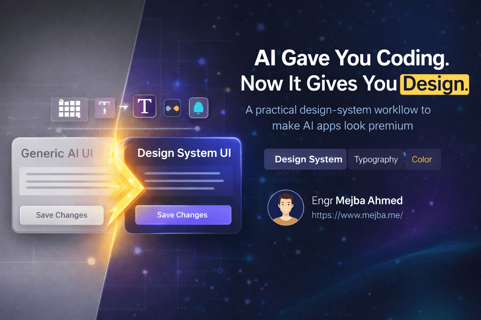
AI-built apps don't look generic because the model can't design. They look generic because you handed it a blank canvas and hoped, and a model with no constraints reaches for the same safe defaults every time. Design is not a talent problem anymore — it's a system problem. Give the model a documented set of tokens and rules and it applies them as reliably as it applies your linter config. Withhold them and every new feature drifts back toward washed-out gray.
I know this works because I shipped it on this site. In July I rebuilt every blog surface here on a token-driven design system, with Claude Code doing the implementation. The before and after taught me more about making AI output look designed than a year of one-off "make it prettier" prompts. Here's the workflow, with the real numbers.
Why AI-generated design all looks the same
When you ask an AI assistant to build a UI, it generates functional code with reasonable defaults: standard spacing, neutral colors, safe typography. You've seen the aesthetic — buttons just sitting there without hierarchy, white background, gray text, a palette that says "nobody made a decision here."
The deeper issue is that most developers don't know what to ask for. "Make it look better" gives the model nothing actionable — it's asking a chef to "make it taste good" without saying spicy or sweet. Breaking through requires two things: a precise vocabulary, and a written system the model can reference on every future change. The vocabulary gets you one good screen. The system keeps the tenth screen consistent with the first.
What my blog looked like before the system
The honest before-state: my blog templates predated the site's light theme entirely. They had no dark: class pairs at all. The newsletter widget was hardcoded dark and rendered as a black slab in light mode on three different pages. A pagination partial shared with the forum shell put links at 1.79:1 contrast in light mode — functionally invisible. Three metric icons used w-4.5, a class Tailwind never emits because there is no 4.5 spacing step, so they silently fell back to the wrong size inside their 36px tiles.
None of that was one bad AI generation. It was dozens of individually reasonable generations with no shared source of truth — which is exactly what your app looks like after six months of feature prompts.
The fix: a semantic token ramp, not a restyle
The redesign didn't start with colors. It started with roles. Every surface, text tone, and line in the blog now draws from a --blog-* custom-property ramp defined once in :root and once in .dark:
--blog-canvas: 248 250 252;    /* page background */
--blog-raised: 255 255 255;    /* cards — lift off the canvas */
--blog-sunken: 241 245 249;    /* wells, quiet panels */
--blog-ink: 15 23 42;          /* headings      17.9:1 AAA */
--blog-ink-body: 51 65 85;     /* body copy     10.3:1 AAA */
--blog-ink-muted: 100 116 139; /* meta, captions 4.8:1 AA  */
Those contrast ratios in the comments are not decoration — they're the spec. Body copy targets AAA, everything else targets at least AA, and every value was measured rather than eyeballed. The tokens are exposed to Tailwind through rgb(var(--x) / <alpha-value>), so one set of utility classes renders correctly in both themes instead of every element carrying its own dark: twin.
Three findings from that refactor are the kind of thing no generic design tutorial will tell you:
Your brand color probably can't carry white text. My brand green, #38D39F, holds white text at only 1.9:1 — catastrophically illegible, and it had shipped that way in multiple components. The fix was a dedicated --blog-on-link token that flips to near-canvas dark ink where needed, landing at 10.0:1 and 5.8:1. Without a token whose job is "text sitting on a brand fill," every AI generation re-makes that mistake, because white-on-brand looks right in a screenshot.
Shared partials need a theme boundary, not more overrides. The pagination partial served both the token-driven blog and a forum shell that is hardcoded dark. Instead of forking it, a .theme-dark class opts any subtree into the dark ramp. One partial, two contexts, zero conditional classes.
Delete the effects that do nothing. The newsletter widget carried a backdrop-filter over a fully opaque background — it cost a compositing layer and changed literally nothing on screen. AI-generated CSS accumulates these ornaments because each prompt adds and none subtracts.
Typography got the same treatment: a fluid clamp() type scale anchored at 390, 768, and 1440px viewports, so headings scale continuously instead of jumping at arbitrary breakpoints.
The workflow: mockup, extract, systematize, apply
With the principle established, here's the repeatable four-step loop I use for any app, including client work.
1. Generate a mockup for direction, not deployment. Screenshot your current app, hand it to a multimodal model, and prompt with structure: a theme, three to five emotional qualities, and constraints. "Redesign this UI as a visual mockup with a [theme] feel: open, lightweight, calm. Preserve the app structure and usability. Avoid purely decorative gradients." The output is ideation — you're mining it, not shipping it. Clean, simple mockups translate to code far better than graphic-heavy ones; visual noise in the mockup becomes ambiguity in the implementation.
2. Extract decisions. Sample 5-7 colors with a color picker: background, surface, text, one primary action, a couple of accents. Observe the typography characteristics instead of hunting the font name — heavy or light, geometric or organic, tight or loose. Note component grammar: corner radii, shadow softness, padding rhythm.
3. Write the system down — as tokens plus a concept. Two short documents. The concept captures the why in a paragraph ("clean surfaces, gentle motion, white space as focus"). The system captures exact values: type scale with weights, a spacing scale, colors with hex values and their measured contrast against their backgrounds, shadow definitions, radii. That contrast column is my addition after the blog refactor, and it's the difference between a palette and a system — it forces every color to declare what it sits on.
4. Reference the system in every prompt, forever. Both files live in the repo, and every design-touching prompt includes "follow design-system.md." This is the step that separates a one-off restyle from a lasting result. When I add a new blog surface now, Claude Code pulls from the ramp because the ramp is in its context, and the new component matches the old ones without me mentioning color once. The system is the taste; the model just applies it.
For heavier iteration I layer dedicated tooling on top — I've written up how I use Claude Code as a UI designer for iteration loops, the Impeccable design skill for audits, and the full Claude-plus-Figma design system workflow when a real design file is the source of truth.
The vocabulary that makes prompts land
The breakthrough in communicating design to a model isn't tools — it's terms. Specific vocabulary produces specific diffs:
- Contrast controls emphasis: "increase contrast on the key metric by reducing visual weight around it" — not "make it pop."
- Hierarchy organizes importance: "the conversion number is the primary focal point; everything else supports."
- Spacing creates the premium feel: "24px between content groups" beats "less cramped."
- Typography attitude sets tone by characteristics, not font names: "confident, geometric, medium weight, slightly condensed."
- Elevation guides attention: "subtle shadow to lift the card off the canvas."
- Saturation manages energy: "desaturate secondary colors so the primary action owns the screen."
Each of these maps to a measurable property, which means you can verify the model did what you asked — the same reason my token comments carry contrast ratios.
Mistakes I made so you don't have to
Restyling without a system. My blog's black-slab newsletter widget was born exactly this way — styled beautifully once, for one theme, with no token underneath. One-off fixes erode with every feature.
Trusting the render over the ratio. White-on-brand-green looked fine in every screenshot and was unreadable by the numbers. Check contrast with a tool, not your eyes, especially for text on colored fills.
Combining themes. Cyberpunk-meets-Scandinavian produces chaos. Pick one direction and commit.
Letting effects accumulate. Every prompt adds; none subtracts. Budget a pass where the only instruction is "remove any style that changes nothing" — my backdrop-filter find came from exactly that audit.
Assuming utilities exist. The w-4.5 icons shipped because generated code looks plausible. If your framework has a fixed scale, plausible is not the same as real — verify against the actual build output.
Where this leaves designers — and you
This doesn't replace professional designers. Brand identity, novel interaction patterns, and research-driven UX still benefit from human expertise. But the 80% of design work that is applying established patterns consistently — that's now a systems problem, and systems are what developers are good at.
After 8+ years and 1,500+ projects, the shift I'd point at is this: my apps stopped looking AI-made the day I stopped prompting for beauty and started prompting against a document. Take a screenshot of your app tonight. Generate one mockup. Extract one palette. Write the tokens down with their contrast ratios. Then make every future prompt answer to that file.
Every surface of the blog you're reading came off this ramp — tokens first, contrast measured, one set of utilities serving both themes. Other builds that went through the same process are collected on the projects page.