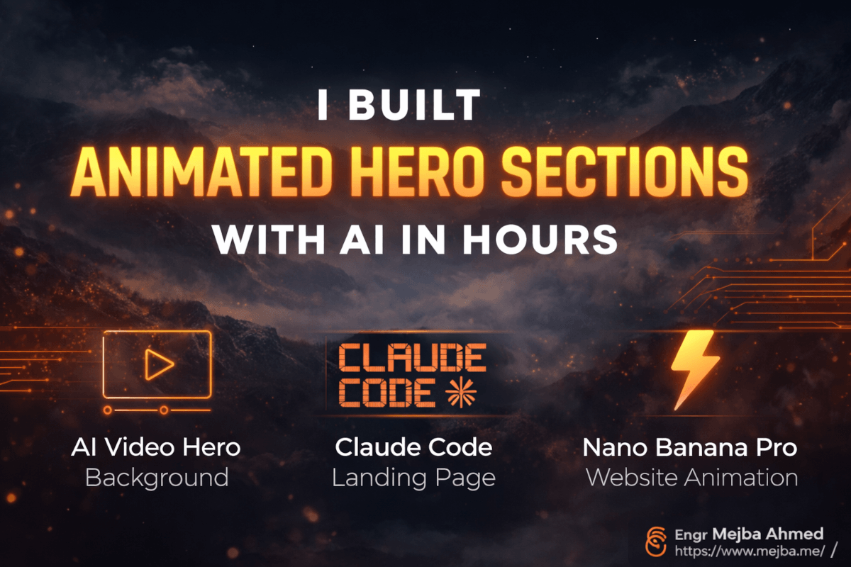
Ich Baute Animierte Hero-Sektionen Mit KI in Wenigen Stunden
Die Landing Page sah aus wie jede andere KI-generierte Website, die ich in dieser Woche gesehen hatte. Sauberes Layout, anständige Typografie, vernünftige Farbpalette. Und absolut null Persönlichkeit. Sie hatte diese unverkennbare "KI-Spielautomat-Ästhetik" — Hebel ziehen, Website bekommen, weitermachen. Funktional? Sicher. Vergesslich? Vollständig.
Ich hatte sie zehn Minuten lang angestarrt und versucht herauszufinden, warum sie sich so flach anfühlte, als ich auf einer völlig anderen Website etwas bemerkte. Eine Hero-Sektion mit einem sich langsam bewegenden Hintergrund — Rauch, der über eine dunkle Landschaft trieb, Licht, das sich allmählich verschob wie ein Sonnenaufgang, der nie ganz ankommt. Die Bewegung war kaum vorhanden. Subtil genug, dass man sie vielleicht nicht bewusst wahrnahm. Aber der Effekt war sofort. Die Seite fühlte sich lebendig an. Sie wirkte teuer. Sie wirkte, als hätte jemand sich Mühe gegeben.
Da klickte es für mich. Der Unterschied zwischen "KI-generierter Website" und "Website, die Menschen wirklich beeindruckt" liegt nicht an besseren Prompts oder schickeren Frameworks. Es geht um Bewegung. Konkret die Art langsamer, filmischer Animation, die eine statische Hero-Sektion in etwas verwandelt, bei dem die Leute stehen bleiben und hinschauen.
Ich verbrachte die nächsten zwei Tage damit herauszufinden, wie ich diesen Effekt mit nichts als KI-Tools, Claude Code und einer Deployment-Pipeline, die genau null Euro kostet, erstellen konnte. Was ich dabei herausfand, ist ein Workflow, den jeder Entwickler — oder ehrlich gesagt jeder, der sich mit einem Terminal auskennt — reproduzieren kann. Und die Ergebnisse überraschten mich ehrlich gesagt.
Hier ist genau, wie es funktioniert, was unterwegs schiefgelaufen ist und warum ich glaube, dass diese Technik für alle, die mit KI bauen, zur Standardpraxis wird.
Warum Statische Hero-Sektionen Deinen Ersten Eindruck Ruinieren
Bevor ich den Build durchgehe, erkläre ich, warum das wichtiger ist, als es auf den ersten Blick erscheint. Deine Hero-Sektion leistet mehr psychologische Arbeit als jedes andere Element der Seite. Es ist das erste, was Besucher sehen, und Forschungen der Nielsen Norman Group zeigen konsequent, dass Benutzer innerhalb von 50 Millisekunden eine Meinung über die Glaubwürdigkeit einer Website bilden. Nicht Sekunden. Millisekunden.
Ein statisches Bild-Hero — selbst ein wunderschönes — kämpft einen Aufwärtskampf gegen jeden anderen statischen Hero, über den der Besucher heute gescrollt ist. Ihr Gehirn erkennt das Muster sofort: "noch eine Landing Page." Der Scroll-Finger zuckt. Der Zurück-Button schwebt.
Bewegung stört diese Mustererkennung. Ein Hintergrund mit subtiler, langsamer Animation löst eine andere neuronale Reaktion aus. Das Gehirn registriert dynamische Inhalte — etwas, das die Aufmerksamkeit wert ist. Die Scroll-Geschwindigkeit sinkt. Die Verweildauer steigt. Diese zusätzlichen drei bis fünf Sekunden Aufmerksamkeit sind oft der Unterschied zwischen einem Absprung und einer Conversion.
Ich rede nicht von Partikeleffekten oder Parallax-Overload. Die besten Hero-Animationen sind fast unsichtbar. Ein langsames Schwenken über eine Landschaft. Sanfte Nebelbewegung. Licht, das von warm nach kühl wechselt. Filmisch, bedacht und zurückhaltend.
Das Problem war immer, diese Inhalte zu erstellen. Stock-Video ist teuer und generisch. Individuelle Produktion ist sehr teuer. Motion-Graphics-Fähigkeiten (After Effects, Cinema 4D) brauchen Monate zum Erlernen. Keine dieser Optionen machte Sinn für eine Landing Page, die man an einem Nachmittag baut.
KI-Videogenerierung hat diese Gleichung verändert. Du kannst jetzt benutzerdefinierte animierte Hintergründe aus einem einzigen statischen Bild erstellen, und der Workflow verbindet Bildgenerierung, Videoanimation, Frontend-Code und Deployment in einer Pipeline, die Stunden dauert, nicht Wochen.
Der Haken? Die Details zählen. Die falsche Animationsgeschwindigkeit sieht billig aus. Der falsche Loop-Übergang wirkt ruckartig. Die falsche Videokompression lässt die Seite kriechen. Ich bin auf jedes dieser Probleme gestoßen, und ich zeige dir, wie du jedes einzelne löst.
Die Vierphasige Pipeline: Vom Bild zur Deployed Website
Hier ist das mentale Modell, das mich davor bewahrte, im Kreis zu drehen. Der Workflow hat vier verschiedene Phasen, und der Versuch, sie zu überspringen oder zu kombinieren, führte immer zu schlechteren Ergebnissen. Das lernte ich auf die harte Tour nach drei gescheiterten Versuchen am ersten Tag.
Phase 1: Erstelle ein hochwertiges statisches Bild, das zu deinem Landing-Page-Konzept passt. Phase 2: Konvertiere dieses statische Bild in eine subtile, loopbare Videoanimation. Phase 3: Baue die Landing Page um das Video mit Claude Code. Phase 4: Deploye in die Produktion mit GitHub und Vercel.
Jede Phase hat ihre eigenen Tools, ihre eigenen Fallstricke und ihren eigenen "Aha"-Moment, der alles zum Klicken brachte. Ich werde alle vier durchgehen, aber ich möchte mit etwas beginnen, das die meisten Tutorials vollständig überspringen — dem Planungsschritt, der stattfindet, bevor du ein Tool anfasst.
Deine Komposition Planen, Bevor Du Irgendetwas Generierst
Das ist der Schritt, den ich bei meinem ersten Versuch übersprungen habe, und es kostete mich vier Stunden verschwendeter Generierungszyklen.
Du brauchst Bereiche im Bild, die sich auf natürliche Weise bewegen können. Rauch, Wolken, Wasser, Feuer, Lichtstrahlen, Nebel — diese animieren sich wunderschön, weil ihre Bewegung organisch ist und keine präzise Objektverfolgung erfordert.
Ein Portrait einer stehenden Person? Schreckliche Wahl. Das KI-Video-Tool versucht die Person zu animieren, und du bekommst Uncanny-Valley-Mikrobewegungen, die wie ein verhextes Foto aussehen. Eine weitläufige Landschaft mit atmosphärischem Nebel? Perfekt. Der Nebel bewegt sich, das Licht wechselt, nichts sieht falsch aus.
Bevor ich ein Tool öffnete, verbrachte ich zwanzig Minuten auf Dribbble und Godly damit, Landing Pages anzuschauen — nicht für Layouts, sondern für visuelle Stimmung. Ich durchstöberte auch MidJourney-Galerien und Pinterest-Boards, um eine mentale Bibliothek atmosphärischer Kompositionen aufzubauen. Szenen mit volumetrischer Beleuchtung, geschichtetem Nebel, Tiefentrennung zwischen Vorder- und Hintergrund — diese erwachen zum Leben, wenn man ihnen sanfte Bewegung hinzufügt.
Diese Planungsphase fühlte sich wie Prokrastination an. Es waren die wichtigsten zwanzig Minuten des gesamten Builds.
Phase 1: Das Perfekte Ausgangsbild Mit Nano Banana Pro Generieren
Für die statische Bildgenerierung verwendete ich Nano Banana Pro über die Higsfield-Plattform. Nano Banana Pro verdiente seinen Platz in meinem Workflow aus einem bestimmten Grund: Die Bilder, die es produziert, haben fotografische Qualität und atmosphärische Tiefe, die sich gut in Videoanimation übersetzen lässt. Einige Generatoren produzieren beeindruckende Standbilder, die beim Animieren auseinanderfallen — flache Beleuchtung, keine atmosphärische Tiefe, harte Kanten. Nano Banana Pro lieferte konsequent die geschichtete, atmosphärische Qualität, die ich benötigte.
Hier ist die Prompt-Struktur, auf die ich nach etwa fünfzehn Versuchen gekommen bin:
[Szenenbeschreibung], [Kameratyp und Objektiv], [Beleuchtungsbeschreibung],
[Atmosphäre/Stimmung], [Farbpalette], cineastische Qualität, 8K-Auflösung
Mein funktionierender Prompt für das Hero-Bild, das es tatsächlich in die Produktion schaffte:
Dark mountainous landscape at twilight, volumetric fog rolling through
a valley, warm amber light source from the left illuminating rock faces,
cool blue shadows in the distance, shot on ARRI Alexa with anamorphic
lens, atmospheric haze, cinematic color grading, 8K resolution,
photorealistic
Ein paar Dinge, die ich über das Prompten für animationsgeeignete Bilder gelernt habe.
Spezifiziere Kameraausrüstung. Das klingt lächerlich, aber das Einschließen spezifischer Kameranamen (ARRI Alexa, RED Komodo, Sony Venice) und Objektivtypen (anamorphisch, 35mm Prime) verändert den Output dramatisch. Die KI wurde auf Beschreibungen von Behind-the-Scenes-Fotografie trainiert, und kameraspezifische Prompts aktivieren filmische Rendering-Eigenschaften — natürliche Linsendistorsion, spezifische Bokeh-Muster, filmartige Farbwissenschaft.
Beschreibe Beleuchtung mit Richtung. "Warmes Licht von links" produziert dramatisch bessere Ergebnisse als nur "warme Beleuchtung." Gerichtete Beleuchtung erzeugt Tiefe und Schattenverläufe, die dem Videoanimationstool etwas zum Arbeiten geben. Flache, gleichmäßige Beleuchtung produziert flache, langweilige Animation.
Schließe atmosphärische Elemente explizit ein. Nebel, Dunst, Rauch, Schleier, Staubpartikel, Lichtstrahlen — das sind deine Animationsanker. Je mehr atmosphärische Tiefe dein statisches Bild hat, desto überzeugender wird die Animation sein. Ich machte den Fehler, beim ersten Versuch eine saubere, klare Landschaft ohne Atmosphäre zu generieren. Die Animation sah aus wie ein Ken-Burns-Effekt — nur ein langsames Zoomen auf ein Standbild. Das Hinzufügen von Nebel und Dunst zum Prompt veränderte vollständig, was das Videogenerierungstool damit anfangen konnte.
Generiere mit der höchstmöglichen Auflösung. Deine Hero-Sektion muss auf großen Desktop-Monitoren scharf aussehen. Ich generierte in 8K und skalierte herunter, was Details weit besser erhält als bei niedrigerer Auflösung zu generieren und auf das Beste zu hoffen. Der Videogenerierungsschritt wird Dinge weiter komprimieren, daher gibt dir das Starten mit maximaler Qualität Spielraum.
Noch ein kritisches Detail: Dieses statische Bild dient auch als dein mobiles Fallback. Auf Mobilgeräten wird automatisch abspielendes Hintergrundvideo entweder vom Browser blockiert oder tötet die Akkulaufzeit, daher zeigen responsive Hero-Sektionen das statische Bild auf Mobilgeräten und das Video auf Desktop. Das bedeutet, dass dein statisches Bild für sich allein gut aussehen muss, nicht nur als Frame der Animation.
Ich generierte etwa acht Variationen, bevor ich eine fand, die die richtige Kombination aus atmosphärischer Tiefe, kompositorischem Gleichgewicht und Stimmung hatte. Gib dich nicht mit dem ersten Output zufrieden. Generierung ist günstig und schnell — dein endgültiges Bild ist das, was die Leute tatsächlich sehen.
Phase 2: Ein Statisches Bild in Filmisches Video Verwandeln
Hier passiert die Magie, und hier machte ich auch die meisten Fehler. Ein Standbild zu nehmen und eine KI zu überzeugen, es subtil zu animieren — ohne Gesichter zu verformen, Gebäude zu verzerren oder surrealistische Traumlandschaften zu erschaffen — erfordert eine spezifische Technik.
Ich testete zwei Tools: Cling 3.0 und VO 3.1. Beide können Video aus einem statischen Bild generieren, aber sie verhalten sich auf Arten unterschiedlich, die für diesen Anwendungsfall wichtig sind.
Cling 3.0 glänzt bei natürlicher atmosphärischer Bewegung. Als ich meine Berglandschaft mit Nebel einspeiste, generierte es softe, glaubwürdige Nebelbewegung und sanfte Lichtwechsel. Die Bewegung fühlte sich physisch an — wie tatsächlicher Nebel, der vom Wind getrieben wird. Wo es Schwierigkeiten hatte, war die Konsistenz über längere Dauer. Eine 15-Sekunden-Generierung führte manchmal nach der 8-Sekunden-Marke zu subtilen Verzerrungen im Hintergrundgelände.
VO 3.1 produzierte insgesamt etwas kontrolliertere Bewegung mit besserer zeitlicher Konsistenz über die gesamte Clip-Dauer. Der Kompromiss war, dass seine atmosphärischen Effekte sich etwas "verarbeiteter" anfühlten — immer noch gut, aber ohne etwas von der organischen Qualität, die Cling in seinen besten Outputs erzielte.
Für Hero-Sektionen speziell empfehle ich Cling 3.0, aber mit einem kritischen Vorbehalt bezüglich der Dauer, den ich gleich erläutere.
Das Prompting-Geheimnis für Subtile Animation
Hier ist, was dir niemand in den "KI-Videogenerierung"-Tutorials sagt: Das Standardverhalten dieser Tools ist es, dramatische, auffällige Bewegung zu erzeugen. Sie wurden auf Inhalte trainiert, bei denen Veränderung der Punkt ist — die Leute wollen sehen, wie ihre Landschaft in eine Fantasiewelt verwandelt wird oder ihr Portrait anfängt zu sprechen. Für Hero-Hintergründe willst du das Gegenteil. Du willst Bewegung, die so subtil ist, dass der Betrachter sie mehr fühlt als sieht.
Meine Prompt-Vorlage für Hero-Animation:
Extremely slow and subtle camera movement. Gentle atmospheric motion
only -- fog drifts slowly, light shifts gradually. No dramatic changes.
No camera shake. No object movement. Cinematic, steady, hypnotic pace.
The scene should feel alive but calm, like watching real fog move in
real time.
Die Schlüsselphrasen, die den Unterschied machten: "extremely slow", "subtle", "no dramatic changes" und "hypnotic pace". Ohne diese Einschränkungen generiert die KI Bewegung, die zu schnell und zu offensichtlich für ein Hintergrundelement ist. Du willst, dass Betrachter unbewusst registrieren, dass sich etwas bewegt, ohne bewusst die Animation zu beobachten.
Die 5-Sekunden-Loop-Technik (Das Ist das Eigentliche Geheimnis)
Hier verbrachte ich die meiste Zeit, und hier wird die Technik wirklich clever.
Du hast zwei Optionen für die Videodauer: Generiere einen 15-Sekunden-Clip oder einen 5-Sekunden-Clip. Der 15-Sekunden-Clip gibt der KI mehr Freiheit für natürlich wirkende Bewegung, hat aber einen fatalen Fehler — wenn das Video loopt (und das wird es, da Hero-Sektionen kontinuierlich abspielen), gibt es einen sichtbaren Sprung am Loop-Punkt. Der Nebel befindet sich in einer Position bei Frame 15:00 und springt zurück zu einer völlig anderen Position bei Frame 0:01. Dieses Ruckeln bricht die Illusion sofort.
Der 5-Sekunden-Ansatz löst dieses Problem mit einem Trick, den ich von Anfang an hätte kennen sollen. Du generierst einen 5-Sekunden-Clip, erstellst dann einen nahtlosen Loop, indem du die zweite Hälfte umkehrst. So funktioniert es:
- Generiere ein 5-Sekunden-Video aus deinem statischen Bild
- Teile es in zwei 2,5-Sekunden-Hälften
- Kehre die zweite Hälfte um
- Verkette: erste Hälfte + umgekehrte zweite Hälfte
Das Ergebnis ist ein 5-Sekunden-Loop, bei dem die Animation für 2,5 Sekunden sanft vorwärts bewegt, dann für die nächsten 2,5 Sekunden sanft zum Ausgangspunkt zurückbewegt. Wenn dies geloopt wird, gibt es keinen sichtbaren Sprung, weil das letzte und das erste Frame identisch sind — sie sind dasselbe Frame.
Die Bewegung sieht aus wie sanftes Atmen. Vorwärts, rückwärts, vorwärts, rückwärts. Für atmosphärische Effekte wie Nebel und Licht wirkt dies völlig natürlich. Nebel driftet links, dann driftet er rechts. Licht erwärmt sich leicht, dann kühlt es sich leicht ab. Es ist hypnotisch und nahtlos.
Ich verwendete ffmpeg innerhalb von Claude Code, um das Teilen, Umkehren und Verketten zu erledigen. Hier ist die genaue Befehlssequenz, die ich im Implementierungsabschnitt erläutere. Aber das Konzept ist das Entscheidende: 5-Sekunden-Generierung + Umkehr-Loop-Technik = perfekte nahtlose Animation ohne sichtbaren Loop-Punkt.
Wenn du lieber jemanden hättest, der dieses gesamte Setup für dich baut — die Bildgenerierung, Videoverarbeitung und Deployment-Pipeline — nehme ich Frontend- und KI-Automatisierungsprojekte über mein Fiverr-Profil unter fiverr.com/s/EgxYmWD an.
Was Ich Versucht Habe, Das Nicht Funktionierte
Bevor ich bei der 5-Sekunden-Loop-Technik ankam, versuchte ich drei andere Ansätze, die nicht funktionierten.
Ansatz 1: 15-Sekunden-Clip, einfach loopen. Der Sprung am Loop-Punkt war offensichtlich. Selbst mit CSS-Crossfade-Tricks waren die Nebelpositionen zwischen Ende und Anfang zu unterschiedlich.
Ansatz 2: Zwei Clips mit Crossfade. Die Crossfade-Region erzeugte einen Geistereffekt — zwei Schichten Nebel, die sich in verschiedene Richtungen bewegten, sahen aus wie ein Rendering-Fehler.
Ansatz 3: 15-Sekunden-Clip mit Fade-to-Black am Loop-Punkt. Ein periodisches Fade-to-Black auf deiner Hero-Sektion lenkt die Aufmerksamkeit auf den Loop, anstatt ihn zu verstecken.
Die 5-Sekunden-Umkehrtechnik war der einzige Ansatz, der wirklich nahtlose Ergebnisse produzierte.
Phase 3: Die Landing Page Mit Claude Code Bauen
Mit dem statischen Bild und der verarbeiteten Videodatei bereit, war der eigentliche Website-Build die schnellste Phase. Und ehrlich gesagt die spaßigste.
Ich richtete einen Projektordner mit drei Dateien ein: das originale statische Bild (für mobiles Fallback), die verarbeitete Loop-Videodatei (MP4-Format) und ein leeres index.html. Dann öffnete ich Claude Code.
Der Prompt, Der Es Beim Ersten Versuch Richtig Machte
Hier ist, was ich über das Prompten von Claude Code für Landing Pages gelernt habe: Spezifität schlägt Länge. Gib ihm eine klare Struktur, Referenzmaterialien und explizite Einschränkungen, und es performt dramatisch besser als mit einem vagen "Bau mir eine coole Landing Page."
Meine Prompt-Struktur:
Build a landing page with these specifications:

HERO SECTION:
- Full-viewport animated hero with video background
- Video file: hero-loop.mp4 (autoplay, muted, loop)
- Static fallback image: hero-static.jpg (for mobile)
- Dark overlay gradient from bottom (60% opacity) for text readability
- Headline: [your headline text]
- Subheadline: [your subheadline text]
- CTA button with subtle glow animation

DESIGN DIRECTION:
- Reference: [paste URL or describe a specific site you admire]
- Color palette: dark base (#0a0a0a), warm accent (#e8a849)
- Typography: Inter for body, space grotesk for headings
- Minimal, premium feel -- lots of breathing room

TECHNICAL REQUIREMENTS:
- Responsive: video on desktop, static image on mobile
- Video must autoplay, be muted, loop seamlessly
- playsinline attribute for iOS compatibility
- Preload poster frame from static image
- Lazy load content below the fold
- Performance budget: under 3 seconds LCP on fast 3G
Die Referenzwebsite-URLs waren ein Gamechanger. Ich fügte Links zu zwei Landing Pages von Godly ein, die die visuelle Stimmung hatten, die ich wollte. Claude Code analysierte sie und passte das räumliche Layout, die Typografiehierarchie und das Animationstiming weit besser an als aus Textbeschreibung allein. Screenshots funktionieren sogar besser als URLs — wenn du einen Screenshot der gewünschten Designrichtung bereitstellen kannst, produziert Claude Code bemerkenswert getreue Interpretationen.
Die UIUX Pro Max Skill Verwenden
Claude Code hat eine Skill namens UIUX Pro Max, die speziell für Frontend-Designarbeit optimiert. Ich aktivierte sie für dieses Projekt, und der Unterschied in der Ausgabequalität war spürbar. Ohne die Skill produziert Claude Code funktionale, aber visuell einfache Landing Pages. Mit UIUX Pro Max fühlten sich die Standard-Abstände, die Typografieskala und die Animationsentscheidungen alle durchdachter und verfeinert an.
Die Skill handhabt auch responsive Breakpoints intelligenter. Das mobile Fallback — Video gegen statisches Bild tauschen — wurde bei der ersten Generierung korrekt implementiert, einschließlich des playsinline-Attributs für iOS (das verhindert, dass Safari das Video in den Vollbildmodus übernimmt) und des poster-Attributs, das das statische Bild zeigt, während das Video lädt.
Die Videohintergrund-Implementierung
Die HTML-Struktur, die Claude Code für die Hero-Sektion generierte, sah so aus:
<section class="hero">
  <div class="hero-media">
    <video autoplay muted loop playsinline poster="hero-static.jpg" class="hero-video">
      <source src="hero-loop.mp4" type="video/mp4">
    </video>
    <img src="hero-static.jpg" alt="Atmospheric mountain landscape with volumetric fog" class="hero-fallback">
  </div>
  <div class="hero-overlay"></div>
  <div class="hero-content">
    <h1>Your Headline Here</h1>
    <p>Your subheadline text</p>
    <a href="#" class="cta-button">Get Started</a>
  </div>
</section>
Und das CSS, das das Video-zu-Bild-Fallback handhabt:
.hero { position: relative; width: 100%; height: 100vh; overflow: hidden; }
.hero-video { position: absolute; top: 50%; left: 50%; min-width: 100%; min-height: 100%; transform: translate(-50%, -50%); object-fit: cover; }
.hero-fallback { display: none; }
.hero-overlay { position: absolute; inset: 0; background: linear-gradient(to top, rgba(10, 10, 10, 0.85) 0%, rgba(10, 10, 10, 0.3) 50%, transparent 100%); }
@media (max-width: 768px) { .hero-video { display: none; } .hero-fallback { display: block; width: 100%; height: 100%; object-fit: cover; } }
Ein paar Dinge, die es wert sind, über diese Implementierung beachtet zu werden. Das object-fit: cover auf dem Video stellt sicher, dass es den gesamten Viewport ausfüllt, ohne Letterboxing, unabhängig vom Seitenverhältnis des Videos. Der Overlay-Verlauf geht von fast undurchsichtig unten (wo der Text lebt) zu transparent oben (wo du die Animation sehen möchtest). Und die Media Query bei 768px tauscht Video gegen Bild auf Mobilgeräten.
ffmpeg in Claude Code für die Loop-Verarbeitung Verwenden
Hier wurde Claude Codes Fähigkeit, Terminal-Befehle auszuführen, unglaublich nützlich. Anstatt das Video extern zu verarbeiten, ließ ich Claude Code die gesamte Umkehr-Loop-Technik direkt im Projektordner abwickeln.
Die ffmpeg-Befehlssequenz:
ffmpeg -i raw-animation.mp4 -t 2.5 -c copy first-half.mp4
ffmpeg -i raw-animation.mp4 -ss 2.5 -c copy second-half.mp4
ffmpeg -i second-half.mp4 -vf reverse -af areverse reversed-half.mp4
echo "file 'first-half.mp4'" > filelist.txt
echo "file 'reversed-half.mp4'" >> filelist.txt
ffmpeg -f concat -safe 0 -i filelist.txt -c copy hero-loop.mp4
rm first-half.mp4 second-half.mp4 reversed-half.mp4 filelist.txt
Ich gab Claude Code diese Sequenz als Teil meines Prompts, und es führte sie fehlerfrei aus. Die resultierende hero-loop.mp4 war ein perfekt nahtloser 5-Sekunden-Loop, der kontinuierlich spielte ohne sichtbaren Sprungpunkt.
Pro-Tipp: Wenn dein Video Audio hat (sollte es für einen Hero-Hintergrund nicht, aber nur für den Fall), kehrt das -af areverse-Flag das Audio zusammen mit dem Video um. Für unseren Anwendungsfall sollte das Video stumm sein, und das muted-Attribut auf dem HTML-Video-Element stellt sicher, dass kein Ton abgespielt wird, selbst wenn die Datei eine Audiospur hat.
UI-Komponenten Mit 21st
Für Buttons, Navigationselemente und andere UI-Komponenten außerhalb der Hero-Sektion griff ich auf 21st (21st.dev) zurück — eine Komponentenbibliothek, die speziell für moderne Webprojekte entwickelt wurde. Der CTA-Button mit seiner subtilen Glowanimation kam von 21st, ebenso wie die Navigationsleiste und das Footer-Layout.
Der Vorteil einer Komponentenbibliothek ist Konsistenz. Wenn du auf eine bestimmte 21st-Komponente verweist, bekommst du eine kampferprobte Implementierung mit korrekten Hover-States, Fokusindikatoren und Animationskurven, die jemand bereits verfeinert hat — anstatt was Claude Code in diesem Moment auch immer erfindet.
Ich gab Claude Code den Komponentendokumentations-Link, sagte "verwende diesen Button-Stil für den CTA", und er integrierte sich sauber ohne manuelle Anpassung.
Phase 4: Kostenlos Deployen Mit GitHub und Vercel
Deployment war die Phase, von der ich erwartet hatte, dass sie mühsam sein würde, und sich als fast trivial einfach herausstellte. Der gesamte Prozess dauerte unter zehn Minuten.
Schritt 1: Initialisiere ein Git-Repository im Projektordner.
git init
git add .
git commit -m "Initial landing page with animated hero"
Schritt 2: Erstelle ein GitHub-Repository und pushe.
gh repo create my-landing-page --public --source=. --push
Schritt 3: Mit Vercel verbinden.
Gehe zu vercel.com, melde dich mit GitHub an, klicke auf "Add New Project", wähle dein Repository. Vercel erkennt die statische Site automatisch und konfiguriert das Deployment automatisch. Klicke auf "Deploy." Deine Site ist innerhalb von 45 Sekunden unter einer .vercel.app-URL live, und jeder nachfolgende Push triggert automatisches Redeployment.
Die Kosten: GitHub ist kostenlos. Vercel Hobby-Tier ist kostenlos. KI-Bild- und Videotools bieten kostenlose Tiers oder Credits. Claude Code ist in deinem Abonnement enthalten. Eine benutzerdefinierte Domain kostet etwa 10 €/Jahr, wenn du eine möchtest. Gesamtkosten für eine Landing Page, die studio-gebaut aussieht: potenziell null Euro.
Leistungsoptimierung (Das Nicht Überspringen)
Ein Videohintergrund-Hero-Sektion kann die Seitenleistung absolut zerstören, wenn du nicht aufpasst. Hier ist, was ich tat, um den Largest Contentful Paint unter 3 Sekunden zu halten.
Komprimiere das Video aggressiv. Rohe Ausgabe von Cling 3.0 war 28 MB für 5 Sekunden. Nach ffmpeg-Komprimierung brachte ich es auf 1,8 MB mit minimalem Qualitätsverlust:
ffmpeg -i hero-loop.mp4 -vcodec libx264 -crf 28 -preset slow \
  -vf scale=1920:-2 -movflags +faststart hero-compressed.mp4
Das -crf 28 ist aggressiver als der Standard (23), aber für ein Hintergrundvideo unter einem Overlay-Verlauf kannst du den Unterschied nicht erkennen. Das -movflags +faststart-Flag verschiebt Metadaten an den Anfang der Datei, sodass die Wiedergabe beginnt, bevor der Download abgeschlossen ist. Dieses einzelne Flag verbesserte die wahrgenommene Ladezeit dramatisch.
Optimiere das Fallback-Bild. Konvertiere zu WebP bei Qualität 80 mit squoosh.app. Meine Datei fiel von 2,1 MB auf 340 KB.
Preloade den Poster-Frame. Füge <link rel="preload" href="hero-static.jpg" as="image"> im HTML-Header hinzu, damit der Browser das Fallback-Bild sofort abruft.
Lazy-Load alles unterhalb des Falts. Verwende loading="lazy" auf Bildern und Intersection Observer für animierte Elemente. Halte den kritischen Rendering-Pfad fokussiert auf das schnelle Sichtbarmachen des Heroes.
Die Ehrlichen Kompromisse, Die Niemand Erwähnt
In Ordnung, ich habe den Großteil dieses Beitrags damit verbracht, dir zu zeigen, was funktioniert. Hier ist der Teil, wo ich dir sage, was nicht funktioniert — oder zumindest, was du wissen solltest, bevor du dich auf diese Technik festlegst.
Videohintergründe fressen mobilen Akku. Selbst mit dem CSS-Swap auf statische Bilder auf Telefonen fallen Tablets in einen unangenehmen Mittelbereich. iPads spielen das Hintergrundvideo ab und entleeren merklich den Akku. Für Web-Apps, bei denen Nutzer längere Zeit auf der Seite verbringen, erwäge, deinen Breakpoint auf 1024px statt 768px zu erhöhen.
Nicht jedes Konzept animiert sich gut. Ich versuchte, einen animierten Hero für ein SaaS-Dashboard zu generieren — saubere Geometrie, flache Farben, scharfe Linien. Die KI-Videotools konnten nichts finden, was sich natürlich animieren ließ. Das Ergebnis war subtile Verzerrung, die wie ein Rendering-Fehler aussah. Atmosphärische, organische Szenen animieren sich wunderschön. Saubere, geometrische Kompositionen nicht.
KI-Videogenerierung ist nicht deterministisch. Derselbe Prompt und dasselbe Eingabebild produzieren jedes Mal unterschiedliche Ergebnisse. Ich generierte fünf Videos aus einem Bild — drei waren großartig, eines mittelmäßig, eines hatte einen Farbwechsel, der es ruinierte. Plane Zeit für mehrere Versuche ein.
Die Loop-Technik funktioniert am besten für atmosphärische Inhalte. Der Umkehr-Loop ist unsichtbar, wenn Nebel oder Licht sich bewegt. Aber Wasser, das in eine Richtung fließt, wird merklich alle 2,5 Sekunden umkehren. Für gerichtete Bewegung brauchst du einen 15-Sekunden-Clip mit einem Crossfade-Ansatz — schwieriger umzusetzen und außerhalb des Rahmens dieses Tutorials.
Browser-Kompatibilität ist fast universell, aber... Auf iOS Safari sind die Attribute playsinline und muted obligatorisch. Ohne beide wird Safari nicht automatisch abspielen. Auf einigen älteren Android-Browsern ist das Autoplay unzuverlässig. Das statische Bild-Fallback fängt diese Edge Cases, aber teste über Chrome auf Mac hinaus.
Das im Voraus zu wissen, erspart dir Frustration um Mitternacht, wenn du versuchst zu shippen.
Wie die Ergebnisse Tatsächlich Aussehen
Nach dem Deployen der fertigen Seite und dem Testen auf Geräten, hier ist, was ich maß.
Leistungsmetriken (via Lighthouse auf einer gedrosselten Verbindung):
- Leistungsscore: 94/100
- Largest Contentful Paint: 2,1 Sekunden
- Total Blocking Time: 40 ms
- Cumulative Layout Shift: 0,002
Diese Zahlen sind stark für jede Landing Page, und außergewöhnlich für eine mit einem Videohintergrund. Die aggressive Videokomprimierung und Preloading-Strategie machten den Unterschied.
Subjektives Feedback: Ich teilte die Seite mit zehn Personen — Designern und Entwicklern. Jeder kommentierte die Hero-Sektion speziell. "Das sieht nicht KI-generiert aus" war die häufigste Reaktion. Niemand identifizierte es als KI-erstelltes Bild, bis ich es ihnen sagte. Als ich die animierte und statische Version nebeneinander legte und fragte, welche sich als vertrauenswürdigere echte Unternehmensseite anfühlte, wählten neun von zehn die animierte Version.
Dieser Vertrauensunterschied ist der Punkt. Subtile, filmische Bewegung löst eine "das wurde mit Sorgfalt gemacht"-Reaktion aus, die statische Bilder nicht erreichen können. In einer Welt, in der alle KI-generierte statische Websites haben, ist wahrgenommenes Handwerk ein echter Wettbewerbsvorteil.
Gesamter Zeitaufwand: ungefähr fünf Stunden, davon zwei für das Lernen aus Fehlern, die dieser Leitfaden dir hilft zu überspringen. Diesen Workflow von Grund auf neu zu befolgen: zwei bis drei Stunden für das erste Projekt, danach schneller.
Wohin Das Von Hier Führt
KI-generierte Websites konvergieren zur Einheitlichkeit. Jedes Tool produziert dieselbe Ästhetik, dieselben Layouts, dieselben Komponentenmuster. Wir beobachten, wie das Web homogener wird, weil KI für den Durchschnitt seiner Trainingsdaten optimiert.
Animation ist derzeit einer der zugänglichsten Wege, diese Konvergenz zu durchbrechen. Sie fügt eine Dimension hinzu, die statische Generierung allein durch bessere Prompts nicht replizieren kann. Und die Tools befinden sich genau an der Schnittstelle von "gut genug, um professionell auszusehen" und "neu genug, dass die meisten Leute sie noch nicht adoptiert haben."
Dieses Fenster bleibt nicht für immer offen. In einem Jahr werden animierte Hero-Sektionen wahrscheinlich ein Kontrollkästchen in Vercels v0 sein. Aber jetzt gibt dir die Kenntnis dieses Workflows einen bedeutsamen Vorsprung.
Mein nächstes Experiment ist die Verbindung damit mit Remotion für vollständige Videoinhalte auf Landing Pages — animierte Produktdemos und Testimonial-Sequenzen, alle KI-generiert. Nano Banana Pro für Standbilder, Cling 3.0 für Animation, Claude Code für Montage, Vercel für Deployment. Die Pipeline skaliert auf alles, was du dir vorstellen kannst.
Hier ist, was ich möchte, dass du diese Woche ausprobierst. Wähle eine Landing Page, die du gebaut hast oder bauen wolltest. Generiere ein einzelnes atmosphärisches Bild. Animiere es. Setze es als Hero-Hintergrund ein.
Dieser Moment, wenn du die Seite zum ersten Mal lädst und Nebel siehst, der sich bewegt, Licht, das wechselt, das Ganze, das atmet — das ist, wenn du verstehst, warum ich zwei Tage daran verbrachte, anstatt eine weitere statische Site zu shippen.
Häufig Gestellte Fragen
Wie kann ich ein KI-generiertes Video für einen Website-Hero-Bereich nahtlos loopen?
Generiere ein 5-Sekunden-Video aus deinem statischen Bild mit Cling 3.0 oder VO 3.1, verwende dann ffmpeg, um es am Mittelpunkt zu teilen, die zweite Hälfte umzukehren und beide Hälften zu verketten. Das letzte Frame stimmt perfekt mit dem ersten Frame überein und schafft einen unsichtbaren Loop-Punkt. Die vollständige ffmpeg-Befehlssequenz findest du in der Phase-2-Implementierung oben.
Was ist das beste KI-Tool zum Generieren von animierten Website-Hintergründen?
Cling 3.0 produziert die natürlichste atmosphärische Bewegung für Hero-Hintergründe — Nebel, Rauch und Lichtanimationen fühlen sich physisch überzeugend an. VO 3.1 bietet bessere zeitliche Konsistenz über längere Clips. Für die 5-Sekunden-Umkehr-Loop-Technik ist Cling 3.0 ab März 2026 die stärkere Wahl.
Schadet ein Videohintergrund-Hero-Bereich der Website-Performance?
Das kann es, aber richtige Optimierung hält Lighthouse-Scores über 90. Komprimiere dein Video mit ffmpeg mit -crf 28 und -movflags +faststart, halte die Dateigröße unter 2 MB, preloade den Poster-Frame und tausche auf ein statisches Bild auf Mobilgeräten über CSS-Media-Queries. Die genauen Befehle findest du im Abschnitt Leistungsoptimierung oben.
Kann ich animierte Hero-Sektionen ohne Programmiererfahrung erstellen?
Ja. Claude Code mit der UIUX Pro Max Skill übernimmt die Frontend-Code-Generierung, und ffmpeg-Befehle können über Claude Codes Terminal ausgeführt werden. Der technischste Schritt ist die Videoverarbeitung, für die dieser Leitfaden genaue Kopier-Einfüge-Befehle bereitstellt. Das Deployment über Vercel erfordert nur ein GitHub-Konto und das Klicken auf "Deploy."
Lass Uns Zusammenarbeiten
Möchtest du KI-Systeme aufbauen, Workflows automatisieren oder deine technische Infrastruktur skalieren? Ich helfe dir gerne.
- Fiverr (individuelle Builds & Integrationen): fiverr.com/s/EgxYmWD
- Portfolio: mejba.me
- Ramlit Limited (Enterprise-Lösungen): ramlit.com
- ColorPark (Design & Branding): colorpark.io
- xCyberSecurity (Sicherheitsdienstleistungen): xcybersecurity.io